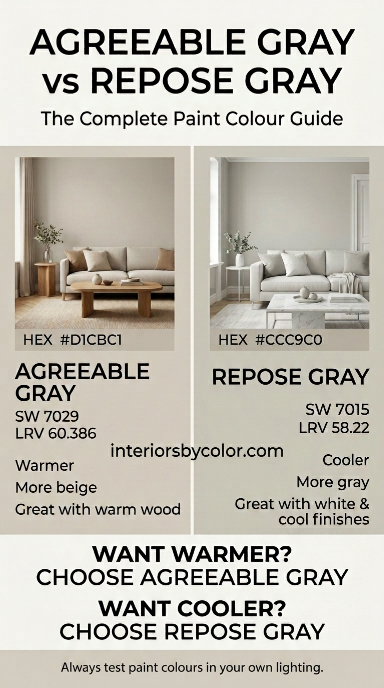
Agreeable Gray and Repose Gray are two of Sherwin-Williams’ most popular neutral paint colours, but they do not look the same on a wall. Agreeable Gray SW 7029 is the warmer, slightly lighter option, while Repose Gray SW 7015 is a little cooler and reads more clearly as gray. Both are versatile greiges, but the better choice depends on your room’s natural light, flooring, furniture and the overall feel you want to create.
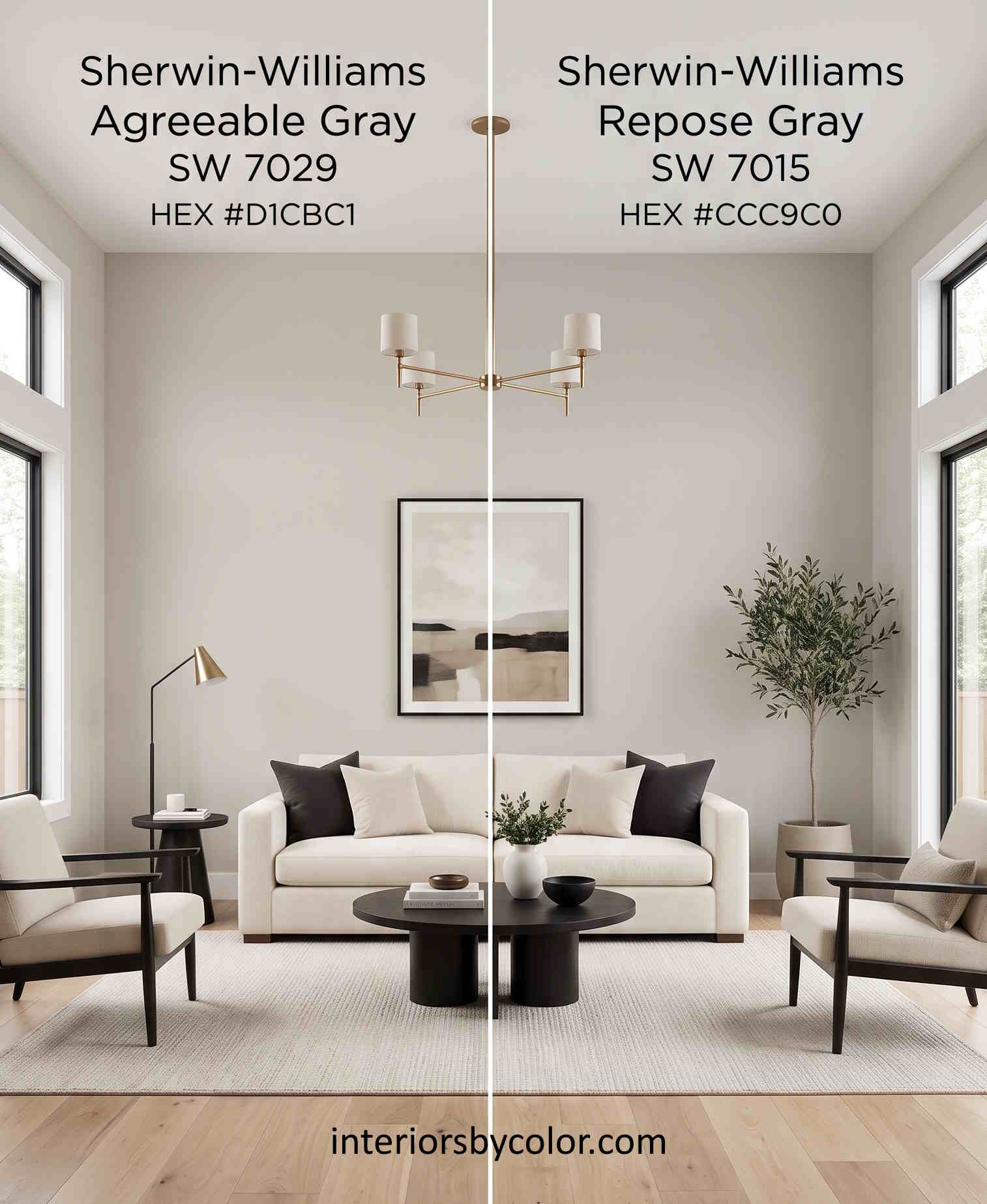
If you are trying to decide between Sherwin-Williams Agreeable Gray and Repose Gray, this guide breaks down the differences so you can choose with confidence.
Quick Verdict: Agreeable Gray vs Repose Gray
Choose Agreeable Gray if: you want a warm, soft neutral that works with warm wood, cream, beige and mixed finishes.
Choose Repose Gray if: you want a more traditional gray appearance with a slightly cooler, cleaner feel.
For most homes with warm flooring, timber furniture and cream or off-white finishes, I would choose Agreeable Gray.
For rooms with cooler finishes, white trim, gray furniture or a more contemporary look, Repose Gray is worth considering.
The difference between the two colours is subtle on a paint card. On a large wall, however, their undertones become much easier to see.
Agreeable Gray vs Repose Gray: At a Glance
| Feature | Agreeable Gray SW 7029 | Repose Gray SW 7015 |
|---|---|---|
| Brand | Sherwin-Williams | Sherwin-Williams |
| Colour family | Neutral | Neutral |
| LRV | 60.386 | 58.22 |
| Approx. Hex | #D1CBC1 | #CCC9C0 |
| Overall appearance | Warm greige | Soft gray-greige |
| Temperature | Warmer | Slightly cooler |
| Best for | Warm, mixed interiors | Cooler, contemporary interiors |
| Works well with | Warm wood, cream, beige, natural textures | White, gray, cooler neutrals |
| Small rooms | Excellent | Good |
| Whole-house use | Excellent | Very good |
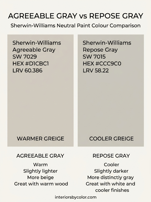
The official Sherwin-Williams colour data places Agreeable Gray at an LRV of 60.386 and Repose Gray at 58.22, making Agreeable Gray only slightly more reflective.
That means the difference in brightness is relatively small.
The undertone is more important than the LRV when choosing between these two colours.
What Is the Difference Between Agreeable Gray and Repose Gray?
The easiest way to think about the difference is this:
Agreeable Gray = warmer and more beige.
Repose Gray = slightly cooler and more gray.
Both sit in the popular greige family, somewhere between gray and beige.
Agreeable Gray tends to soften a room. It works particularly well when your interior already contains warm elements such as timber floors, tan leather, beige upholstery, cream fabrics or warm metals.
Repose Gray has a slightly more neutral gray appearance. It can work beautifully when you want gray walls without going all the way to a cold blue-gray.
This is why the two colours are frequently compared. They are close enough to be alternatives, but different enough that one may work considerably better in your particular room.
Agreeable Gray SW 7029
Sherwin-Williams Agreeable Gray SW 7029 is a warm neutral that sits comfortably between gray and beige.
Sherwin-Williams lists its LRV at 60.386 and its colour data includes the hex value #D1CBC1.
How Agreeable Gray looks on walls
Agreeable Gray is one of those colours that can look surprisingly different depending on the room.
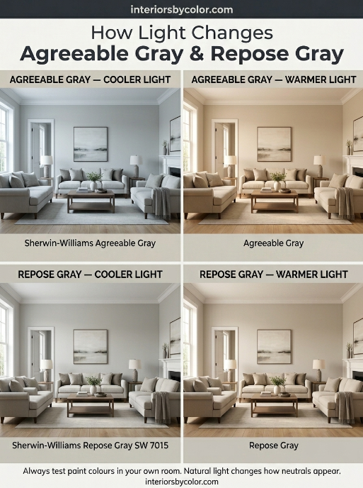
In a room filled with warm natural light, it can appear noticeably warmer and more beige.
In cooler natural light, the gray component becomes more apparent.
That ability to sit between gray and beige is part of what makes Agreeable Gray so useful as a whole-house neutral.
What colours work with Agreeable Gray?
Agreeable Gray works particularly well with:
- Warm white
- Cream
- Beige
- Natural timber
- Tan leather
- Soft brown
- Muted green
- Blue-gray
- Black accents
- Brass and aged metals
If your home has a mixture of warm and cool finishes, Agreeable Gray is often the easier colour to live with.
Best rooms for Agreeable Gray
I particularly like it for:
- Living rooms
- Open-plan living areas
- Bedrooms
- Hallways
- Dining rooms
- Home offices
- Whole-house colour schemes
It is especially effective where several rooms flow into one another because it does not demand that every piece of furniture belong to exactly the same colour family.
Repose Gray SW 7015
Sherwin-Williams Repose Gray SW 7015 is another soft neutral, but it generally reads a little more gray and slightly less beige than Agreeable Gray.
Sherwin-Williams currently lists Repose Gray at an LRV of 58.22 and gives it the hex value #CCC9C0.
How Repose Gray looks on walls
Repose Gray can look beautifully balanced in a room with plenty of natural light.
It is not a stark, cold gray. Instead, it has enough warmth to avoid looking industrial while still retaining a recognisably gray appearance.
This makes it particularly appealing if you like gray but find many gray paint colours too blue or too cold.
However, as with almost every neutral paint colour, the surrounding colours and lighting matter.
A north-facing room, cool LED bulbs, white flooring and blue-toned furniture can make a gray paint colour behave very differently from the same colour in a sunny room with warm timber floors.
Which Is Warmer: Agreeable Gray or Repose Gray?
Agreeable Gray is warmer than Repose Gray.
This is probably the single most useful distinction between the two.
If you are trying to create a room that feels:
- warm
- comfortable
- relaxed
- soft
- inviting
Agreeable Gray is usually the better starting point.
If you want something that feels:
- cleaner
- slightly cooler
- more contemporary
- distinctly gray
- less beige
Repose Gray may be the better choice.
Neither colour is extremely warm or extremely cool. The difference is relative.
Which Is Lighter: Agreeable Gray or Repose Gray?
Agreeable Gray is slightly lighter.
Sherwin-Williams gives Agreeable Gray an LRV of 60.386, compared with 58.22 for Repose Gray.
LRV stands for Light Reflectance Value and describes how much light a colour reflects.
The higher the number, the more light the colour generally reflects.
But don’t expect Agreeable Gray to suddenly look dramatically lighter than Repose Gray.
The difference is only around two LRV points.
If you are choosing between these colours for a dark room, I would not base the decision on LRV alone.
The undertone and the actual lighting in your room will have a much greater visual impact.
Agreeable Gray vs Repose Gray in North-Facing Rooms
North-facing rooms receive cooler natural light, which can make some paint colours appear cooler than expected.
This is where I would be cautious with Repose Gray.
If your room already has:
- cool daylight
- cool white LED lighting
- blue or gray furniture
- cool flooring
Repose Gray can appear noticeably cooler.
Agreeable Gray has more warmth to counteract that effect.
My pick for a north-facing room
Agreeable Gray.
It is not guaranteed to look warm in every north-facing room, but it gives you more warmth to work with.
If you love Repose Gray, test it on the wall before committing.
Agreeable Gray vs Repose Gray in South-Facing Rooms
South-facing rooms generally receive warmer, stronger natural light.
This can make Agreeable Gray appear more beige and warm.
That can be beautiful if you want a soft, welcoming room.
But if you are trying to maintain a cooler gray appearance, Repose Gray may be the better option.
In a bright south-facing room, Repose Gray can provide enough gray to balance the warmth coming from the natural light.
My pick for a south-facing room
Repose Gray for a cooler look.
Agreeable Gray for a warmer look.
Which Is Better With White Trim?
Both colours can work with white trim, but the white you choose matters.
With Agreeable Gray, a softer warm white can create a relaxed, cohesive combination.
With Repose Gray, a clean white trim can emphasise its slightly cooler character.
The important thing is to avoid choosing your trim colour in isolation.
A white that looks beautifully crisp against one gray may look too stark against another.
Always compare the wall colour and trim colour together.
Which Is Better With Wood Floors?
This is one area where I would generally give Agreeable Gray the advantage.
Natural timber contains warm undertones, and Agreeable Gray’s warmth tends to sit comfortably alongside them.
This can work particularly well with:
- Oak floors
- Honey-toned timber
- Walnut furniture
- Tan leather
- Natural rattan
- Warm beige rugs
Repose Gray can also work with wood, particularly when the timber has a more neutral or cool finish.
But if you have a lot of warm timber throughout the house, Agreeable Gray is usually the safer choice.
Which Is Better for a Whole House?
If you want one neutral paint colour throughout most of your home, I would choose:
Agreeable Gray
The reason is not simply that it is warmer.
It is that warm neutrals tend to work more comfortably with a mixture of existing finishes.
A typical home may have timber floors, white cabinetry, beige furniture, black lighting, stainless steel appliances and a mixture of warm and cool fabrics.
Agreeable Gray can sit between those elements without making the room feel overly cool.
That makes it a particularly strong candidate for:
Living room + hallway + kitchen + dining room + bedrooms
You can then introduce stronger colours through furniture, artwork, rugs and accessories.
Which Paint Colour Looks More Modern?
This depends on what you mean by modern.
If by modern you mean clean, restrained and slightly cooler, I would lean toward Repose Gray.
If by modern you mean warm, contemporary and neutral, Agreeable Gray can work beautifully.
Modern interiors don’t have to be cold.
In fact, a warm neutral paired with simple furniture, natural materials and strong architectural lines can feel considerably more contemporary than a room filled with cool gray.
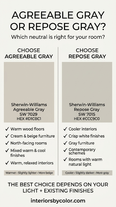
Agreeable Gray vs Repose Gray: Which Should You Choose?
Here’s the simplest way to make the decision.
| If your room has… | Choose |
|---|---|
| Warm timber floors | Agreeable Gray |
| Lots of beige and cream | Agreeable Gray |
| Tan leather furniture | Agreeable Gray |
| North-facing light | Agreeable Gray |
| Mixed warm and cool finishes | Agreeable Gray |
| Cool gray furniture | Repose Gray |
| Crisp white finishes | Repose Gray |
| A cooler contemporary scheme | Repose Gray |
| Strong warm southern light | Repose Gray |
| You want the walls to read more clearly gray | Repose Gray |
My overall choice
Agreeable Gray wins for versatility.
Repose Gray wins if you specifically want a cooler, more recognisably gray neutral.
Neither is objectively better.
The right choice is the one that works with the light and finishes already in your room.
Don’t Choose Either Colour From a Paint Chip
This is the part I would not skip.
A small paint chip cannot show you how a colour will behave across an entire room.
Before buying several litres of paint, test your shortlisted colours.
Paint a large sample board or apply a generous sample to the wall and look at it:
- In the morning
- Around midday
- In the afternoon
- At night
- With your normal lamps switched on
- Against your flooring
- Against your cabinetry
- Next to your trim
You are not really choosing a colour.
You are choosing how that colour behaves in your particular room.
Frequently Asked Questions
Yes. Agreeable Gray SW 7029 generally reads as the warmer and more beige-leaning of the two. Repose Gray SW 7015 has a slightly cooler, more gray appearance.
Yes. Agreeable Gray SW 7029 generally reads as the warmer and more beige-leaning of the two. Repose Gray SW 7015 has a slightly cooler, more gray appearance.
Neither is universally better. Agreeable Gray is the better choice if you want a warmer, versatile neutral. Repose Gray is better if you want a slightly cooler and more distinctly gray appearance.
Agreeable Gray is generally the safer choice if you want to maintain warmth in a north-facing room because its warmer character can help balance cooler daylight.
Agreeable Gray is usually the better choice with warm wood floors because its warm greige character works naturally with timber.
Yes. Its neutral greige character makes it a strong whole-house option, particularly when your home contains a mixture of warm and cool finishes.
Repose Gray is not a blue-gray paint colour, but lighting and surrounding colours can influence how any neutral appears. Test it in your room before committing.
Sherwin-Williams currently lists Agreeable Gray SW 7029 at LRV 60.386.
Sherwin-Williams currently lists Repose Gray SW 7015 at LRV 58.22.
If you want a warm, flexible greige that works with timber, beige, cream and a mixture of finishes, choose Agreeable Gray.
If you want a slightly cooler neutral that reads more clearly as gray and works particularly well with crisp whites and contemporary schemes, choose Repose Gray.
And if you’re still torn, don’t choose based on the colour card.
Put both colours on the wall and let your home’s light make the decision.