The 5 foolproof shades that brighten dim spaces without going cold
The Low-Light Problem (And Why Most Advice Fails)
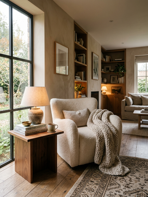
Living rooms with limited natural light are the most common pain point in home design. The standard advice—”just paint it white”—often backfires. In a north-facing room or a space shaded by trees and neighboring buildings, stark whites can turn flat, gray, and clinical. Cool neutrals feel even colder. What you need is a warm neutral with enough pigment to hold its own in the shadows—a color that reflects what little light exists while adding subtle warmth back into the room.
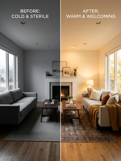
The five colors below are specifically chosen for this exact scenario. Each has been tested in real low-light living rooms and consistently delivers.
The 5 Best Warm Neutral Paint Colors for Low-Light Living Rooms
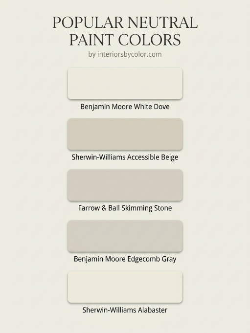
1. Benjamin Moore “White Dove” (OC-17)
| Attribute | Detail |
|---|---|
| Undertone | Soft warm yellow with a hint of gray |
| LRV | 85.4 |
| Best For | Rooms that need brightness without sterility |
White Dove is the undisputed champion of warm whites for dim spaces. Its high light reflectance value (LRV) bounces available light around the room, while the subtle warm undertone prevents that “hospital corridor” effect that plagues pure whites in low light. It reads as a clean, creamy white in shadowy corners and glows softly when light does hit it.
Pro tip: Pair it with warm wood tones (honey oak, walnut) and brass accents. Avoid pairing with cool grays or chrome, which will pull out the gray undertone and make it feel muddy in low light.
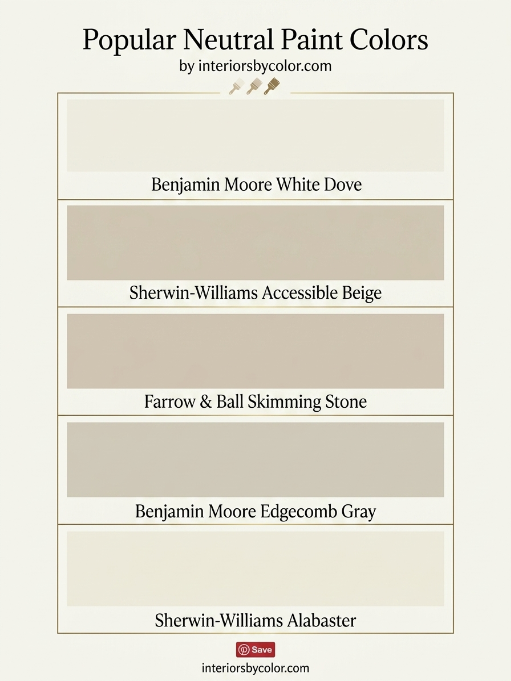
2. Sherwin-Williams “Accessible Beige” (SW 7036)
Table
| Attribute | Detail |
|---|---|
| Undertone | Warm gray with a subtle green-greige shift |
| LRV | 58 |
| Best For | Open-concept living rooms connecting to other spaces |
Accessible Beige is the color that launched a thousand Pinterest boards—and for good reason. In low light, it settles into a sophisticated warm greige that adds depth without darkness. Unlike lighter colors that can look washed out in dim rooms, this mid-tone has enough body to feel intentional and cozy rather than accidentally dim.
Pro tip: This color shines with layered textures—linen sofas, jute rugs, woven baskets. The slight green undertone harmonizes beautifully with indoor plants, making it ideal for plant-filled living rooms.
3. Farrow & Ball “Skimming Stone” (No. 241)
Table
| Attribute | Detail |
|---|---|
| Undertone | Warm stony gray with a whisper of pink |
| LRV | ~62 |
| Best For | Traditional or transitional living rooms with classic architecture |
Skimming Stone is the elevated choice for homeowners who want something more distinctive than standard beige but still utterly livable. In low light, it reveals a subtle warmth that feels like sun-bleached stone. The faint pink undertone (barely perceptible) adds a layer of sophistication that prevents it from feeling flat or boring.
Pro tip: Use this in living rooms with crown molding or picture rails—paint the trim in Farrow & Ball “Pointing” for a tonal, layered look that feels intentional and designer-approved.
4. Benjamin Moore “Edgecomb Gray” (HC-173)
Table
| Attribute | Detail |
|---|---|
| Undertone | Warm gray with a strong beige backbone |
| LRV | 63.1 |
| Best For | Modern and contemporary living rooms needing warmth |
Edgecomb Gray is often described as the perfect “warm gray that isn’t too warm or too gray”—and that balance is exactly what makes it brilliant for low light. It has enough gray to feel current and fresh, enough beige to stay warm in shadow, and enough depth to avoid the “blank wall” syndrome. It’s the color that makes furniture and art pop without competing for attention.
Pro tip: This is the ultimate chameleon color. Test it next to your sofa fabric—if your upholstery has warm undertones, Edgecomb Gray will lean beige. If it’s cooler, it’ll shift slightly grayer. Always test with your actual furnishings.
5. Sherwin-Williams “Alabaster” (SW 7008)
Table
| Attribute | Detail |
|---|---|
| Undertone | Warm cream with a touch of yellow |
| LRV | 82 |
| Best For | Small living rooms or spaces that feel cave-like |
Alabaster is Sherwin-Williams’ answer to White Dove, and the two are often compared. Where White Dove leans slightly more neutral, Alabaster embraces its creaminess unapologetically. In a low-light living room, this extra warmth is a feature, not a bug—it creates the illusion of sunlight even on overcast days. It’s particularly effective in rooms with dark furniture or exposed brick that might otherwise feel heavy.
Pro tip: Alabaster works best when the entire room (walls, ceiling, trim) is painted in the same color with different sheens—eggshell on walls, semi-gloss on trim. This “color drenching” technique eliminates harsh contrast lines that can make a dim room feel smaller.
Quick Comparison Table
Table
| Color | Brand | LRV | Undertone | Best For |
|---|---|---|---|---|
| White Dove | Benjamin Moore | 85.4 | Warm yellow-gray | Maximum brightness |
| Accessible Beige | Sherwin-Williams | 58 | Warm gray-greige | Depth and sophistication |
| Skimming Stone | Farrow & Ball | ~62 | Warm stony pink | Classic elegance |
| Edgecomb Gray | Benjamin Moore | 63.1 | Warm gray-beige | Modern balance |
| Alabaster | Sherwin-Williams | 82 | Warm cream | Small, cave-like rooms |
How to Test These in YOUR Low-Light Living Room
- Paint large swatches — Buy sample pots and paint 2×2 foot squares on multiple walls. Colors shift dramatically between the wall that gets morning light and the one that’s always shaded.
- Observe at three times — Check your swatches in morning light, afternoon light, and with lamps/ceiling lights on in the evening. A color that looks perfect at noon may turn muddy at 7 PM.
- Look at them for 48 hours — Live with the swatches for two full days before deciding. Your eye adjusts, and first impressions are often wrong.
- Consider your fixed elements — Your flooring, fireplace stone, and large furniture pieces have undertones too. The paint color needs to harmonize with these immovable elements.
- Test with your actual bulbs — LED bulbs range from warm (2700K) to cool (5000K). The same paint color will look completely different under each. Use the bulbs you actually live with.
The Bottom Line
Low light doesn’t mean you’re stuck with dark, depressing walls—or forced into sterile, cold whites. The five colors above are proven performers that add warmth, depth, and perceived brightness to even the most light-challenged living rooms. Start with White Dove or Alabaster if you want maximum brightness, Accessible Beige or Edgecomb Gray if you want cozy sophistication, and Skimming Stone if you want something with designer distinction.
The right warm neutral won’t just cover your walls—it will change how the entire room feels.