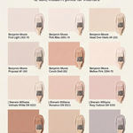
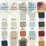
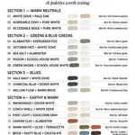
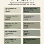
Color choices inside the home have a direct impact on the atmosphere of a room. While neutral grays and cool whites have dominated interior design for years, there is a steady shift toward warmer, more inviting tones. Among these, peachy pinks have emerged as a versatile option for homeowners looking to inject warmth and gentle color without overwhelming their spaces.
By bridging the gap between cheerful orange tones and soft, romantic pinks, these hues offer a balanced approach to color. Below is an assessment of five popular peachy pink paint colors from Benjamin Moore, examining what they evoke and how they can be used effectively throughout the home.
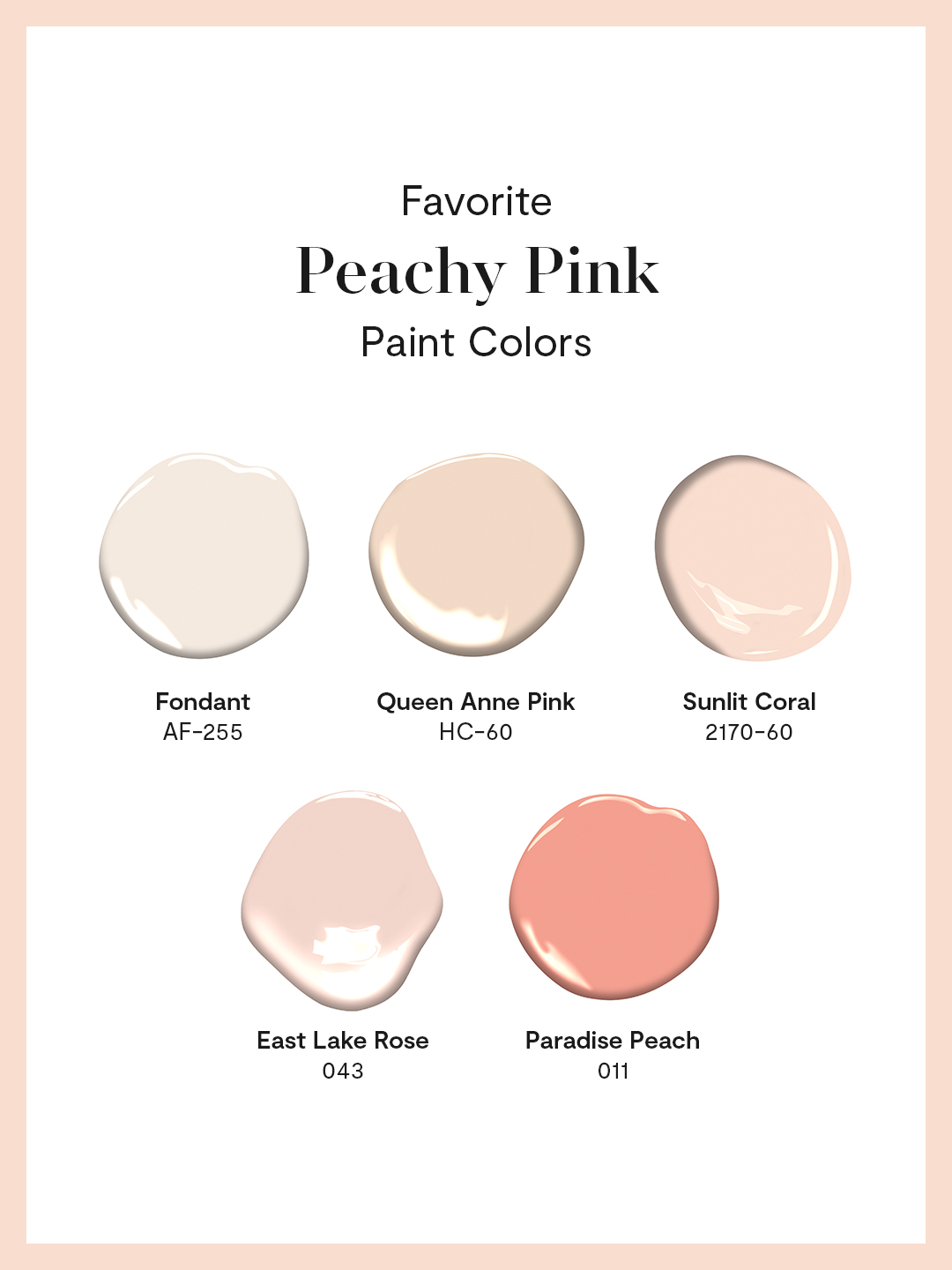
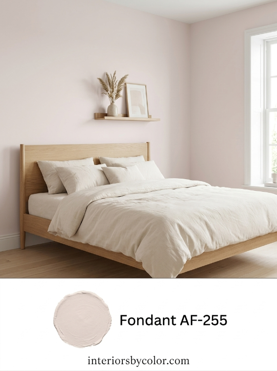
1. Fondant (AF-255)
Part of Benjamin Moore’s Affinity Collection, Fondant is an incredibly subtle, muted pink with soft gray undertones. It sits on the border of being a warm neutral off-white and a whisper-light pink.
- What it Evokes: Serenity, quiet comfort, and cleanliness. Because it is highly desaturated, it does not feel overly sweet or juvenile; instead, it offers a sophisticated, calming presence.
- Where to Use It: Fondant is well-suited for larger spaces where you want a break from standard white but still desire a light, airy feel. It works beautifully in nurseries, guest bedrooms, and long hallways that lack abundant natural light, gently warming up the space without drawing too much attention to itself.
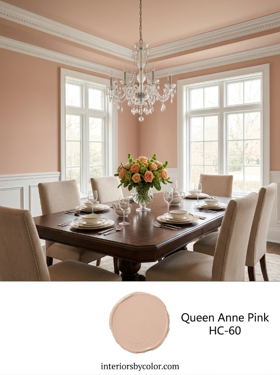
2. Queen Anne Pink (HC-60)
Hailing from the Historical Collection, Queen Anne Pink is a refined, dusty peachy pink. It features subtle beige-brown undertones that keep the color grounded and mature.
- What it Evokes: Nostalgia, timeless elegance, and understated luxury. The historical formulation gives it a classic character that feels both established and welcoming.
- Where to Use It: This shade functions exceptionally well in dining rooms, formal living areas, and entryways. When paired with dark wood furniture, brass fixtures, or crisp white trim, Queen Anne Pink provides a stately yet soft backdrop that encourages conversation.
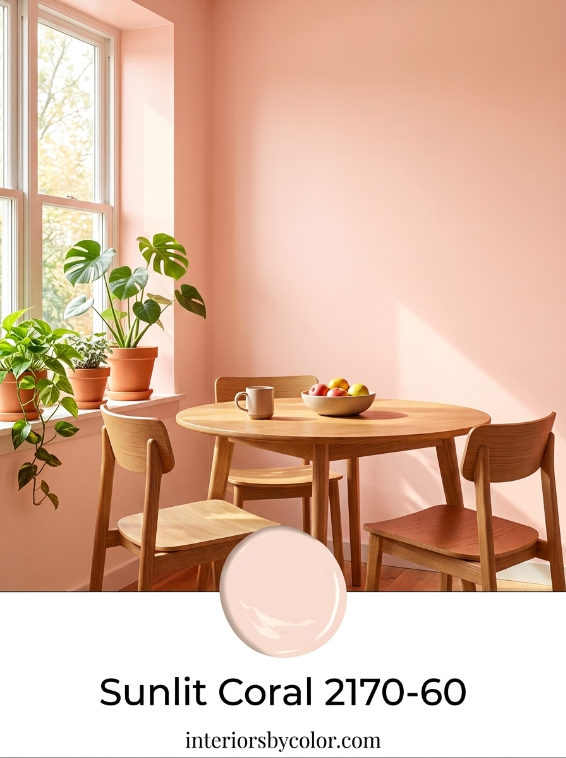
3. Sunlit Coral (2170-60)
Sunlit Coral is a luminous, mid-tone shade that strikes a clear balance between pastel pink and soft orange. It is slightly brighter and more cheerful than the muted historical tones.
- What it Evokes: Optimism, gentle energy, and warmth. It mimics the soft glow of morning sunlight, making spaces feel inherently cheerful and positive.
- Where to Use It: Sunlit Coral is a great choice for spaces associated with morning routines or active daytime use, such as sunrooms, breakfast nooks, and bathrooms. In a bathroom, the warm undertones of this paint color can reflect beautifully on the skin, creating a flattering ambient light.
4. East Lake Rose (043)
East Lake Rose is a classic, mid-tone pink with a delicate peach undertone. It leans slightly more toward the floral side of the spectrum compared to the more orange-based peaches in this palette.
- What it Evokes: Romance, charm, and traditional comfort. It feels soft and gentle, offering a pleasant sense of sanctuary.
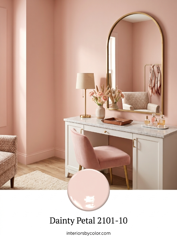
- Where to Use It: This color is highly effective in personal spaces such as master bedrooms, dressing rooms, or walk-in closets. It can also be used on an accent wall in a creative home office to add a touch of personality without creating visual fatigue.
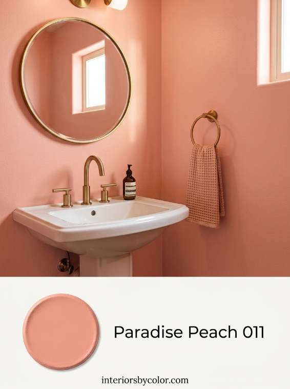
5. Paradise Peach (011)
The most saturated and vibrant option in this selection, Paradise Peach is a rich, warm terracotta-leaning peach. It contains a higher concentration of orange pigment, giving it a distinct depth.
- What it Evokes: Vitality, warmth, playfulness, and creativity. It is a confident color that brings immediate physical warmth to a room.
- Where to Use It: Because of its strength, Paradise Peach is excellent for powder rooms, where it can create a cozy, jewel-box effect. It also works well on interior doors, kitchen islands, or painted furniture pieces to serve as a warm focal point in an otherwise neutral room.
Tips for Integrating Peachy Pinks into Your Home
To keep these colors looking sophisticated and balanced, consider the following design guidelines:
- Assess the Lighting: Peachy pinks are highly sensitive to light. North-facing rooms (which receive cooler, bluish light) can make these colors look slightly more muted or dusty. South-facing rooms (which receive warm, golden light) will intensify the orange and pink tones. Always test swatches on multiple walls before committing.
- Balance with Neutrals: To prevent a room from looking too monochromatic or sweet, pair these shades with grounding neutrals. Warm off-whites (like Benjamin Moore’s Alabaster or White Dove), sandy beiges, and charcoal grays provide an excellent counterweight.
- Incorporate Natural Textures: Peachy pink colors pair naturally with organic materials. Incorporating light oak, walnut, woven rattan, and linen textures helps ground the colors, emphasizing their earthy, terracotta origins.