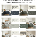
Choosing a living room paint color is rarely about finding one beautiful shade. The combinations matter more.
A wall color that looks wonderful on a sample card can suddenly feel too cold beside a gray sofa, too yellow against warm timber floors, or too stark next to cream upholstery. The living room has to make all of those things work together.
The most successful living rooms in 2026 are using paint in a more layered way. Warm whites are replacing stark whites, soft greens are working with natural timber, blue is being paired with warm neutrals rather than icy gray, and deeper browns, burgundies and terracottas are being used to give neutral rooms more character.
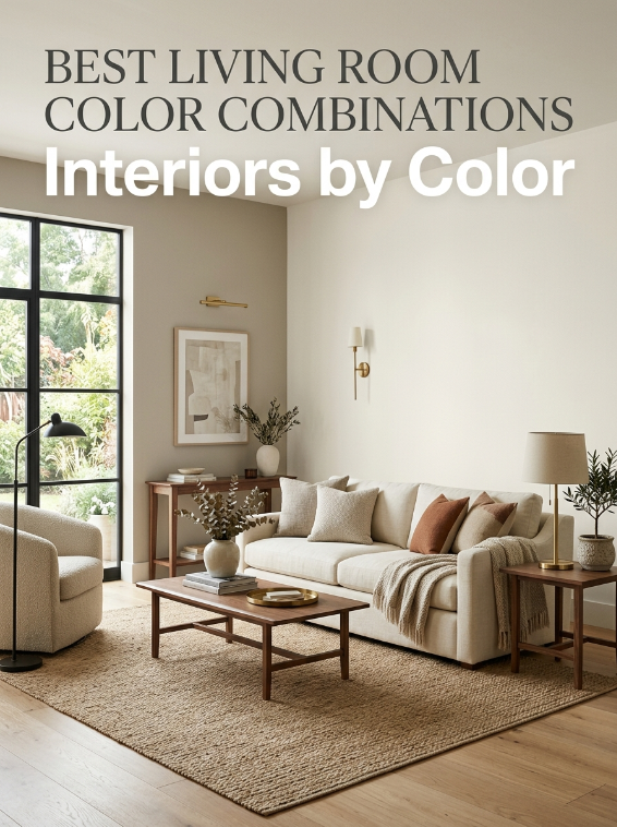
Designers are also moving beyond the idea that every living room needs to be painted a pale neutral. Current color recommendations include muted teal, muddy green, dusky pink, soft blue and warm white, while Sherwin-Williams continues to recommend versatile shades including Pure White, Amazing Gray, Dover White and Charcoal Blue for living spaces.
The trick is not simply choosing trendy colors.
It is choosing colors that have the right relationship with each other.
Here are the living room color combinations that consistently work in real homes.
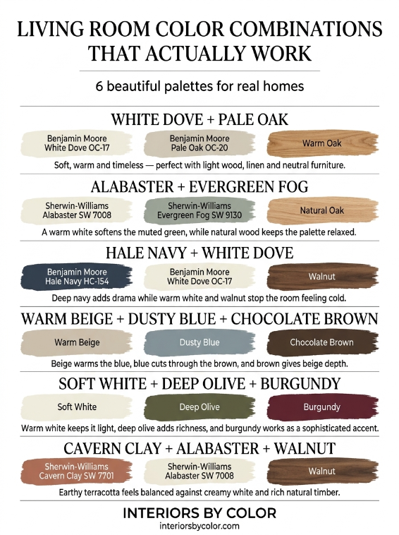
1. Benjamin Moore White Dove + Benjamin Moore Pale Oak
Best for: bright, calm and timeless living rooms
This is one of the easiest combinations to live with.
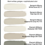
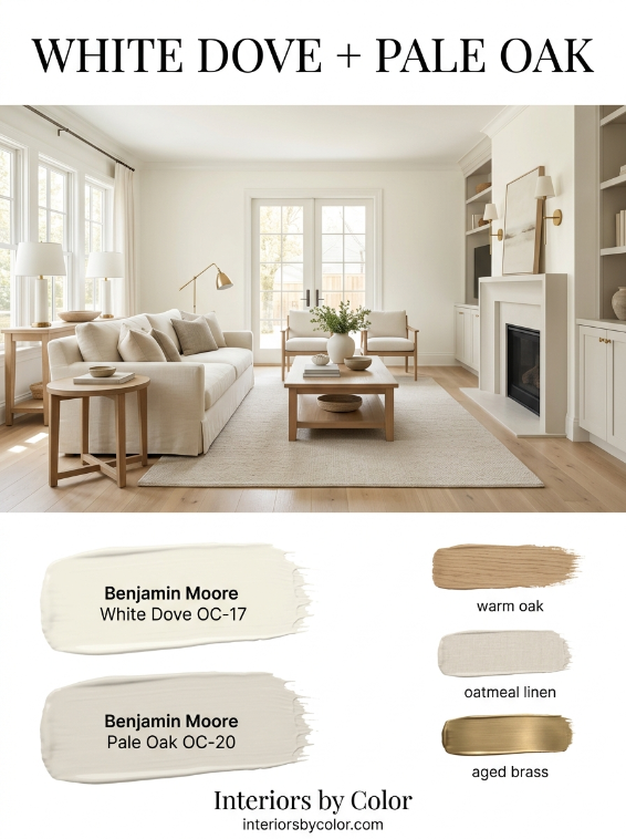
Use Benjamin Moore White Dove OC-17 as the main wall color and bring in Benjamin Moore Pale Oak OC-20 on an adjoining wall, fireplace surround, built-ins or architectural feature.
White Dove is a soft warm white rather than a stark, blue-white. Pale Oak adds just enough depth to stop the room becoming a sea of white.
The combination works particularly well with:
- light oak flooring
- natural linen
- oatmeal sofas
- aged brass
- woven rugs
- warm stone
- cream upholstery
It is an especially good choice for open-plan homes because neither color competes with adjoining rooms.
White and off-white combinations remain remarkably useful because they allow furniture and artwork to provide the stronger color. Designers continue to recommend nuanced whites such as White Dove and Pale Oak for their versatility.
2. Sherwin-Williams Agreeable Gray + Sherwin-Williams Pure White
Best for: a modern neutral living room
If you want a neutral that doesn’t feel completely beige, this is a classic combination.
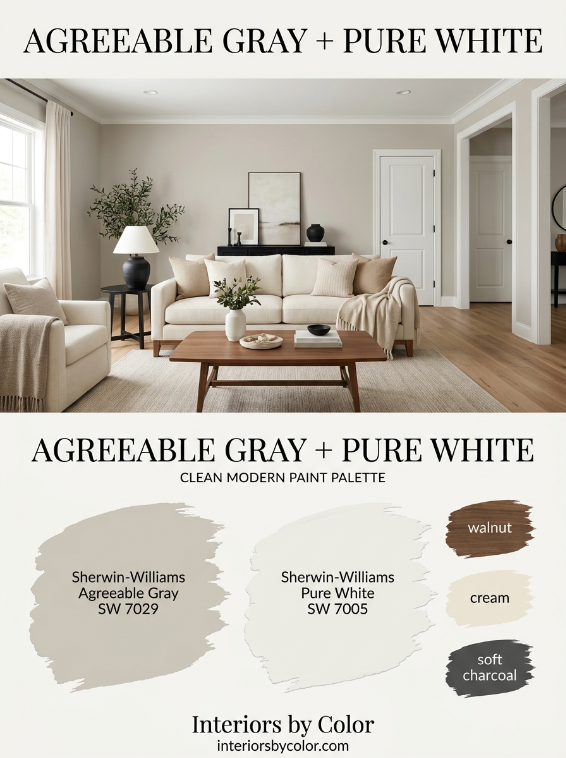
Use Sherwin-Williams Agreeable Gray SW 7029 on the walls with Pure White SW 7005 for trim, doors and ceiling.
Agreeable Gray sits between beige and gray, which is why it works with such a wide range of furniture.
The important part is keeping the white warm enough to sit comfortably beside the gray.
Try this combination with:
- walnut furniture
- black accents
- cream upholstery
- natural oak
- charcoal cushions
- muted green accessories
The result is neutral without looking flat.
3. Benjamin Moore Pale Oak + Benjamin Moore White Dove + Natural Wood
Best for: Scandinavian, transitional and relaxed interiors
Instead of adding a second strong paint color, sometimes the best combination is paint plus wood.
Paint the walls Pale Oak OC-20, use White Dove OC-17 for trim, and let warm oak flooring, furniture or shelving become the third color.
This creates a quiet palette with three different levels of warmth.
It is particularly effective in rooms with large windows because Pale Oak can shift noticeably throughout the day.
Keep the rest of the room simple:
Pale Oak + White Dove + warm oak + cream + soft black
That’s enough.
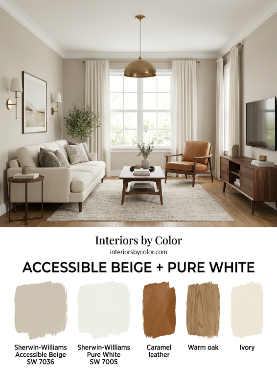
4. Sherwin-Williams Accessible Beige + Sherwin-Williams Pure White
Best for: warm contemporary homes
Accessible Beige SW 7036 is one of those colors that makes sense when you want warmth without committing to a noticeably yellow beige.
Pair it with Pure White SW 7005 on trim and ceilings.
Then add:
- chocolate brown
- cognac leather
- natural timber
- black metal
- ivory
- muted olive
This combination is particularly useful when your flooring or furniture already has warm undertones.
It also works beautifully in homes where a cool gray feels disconnected from the existing finishes.
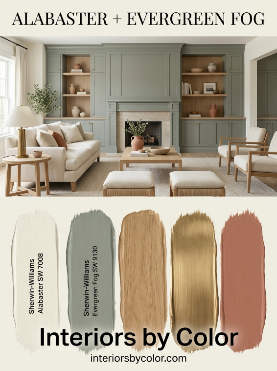
5. Sherwin-Williams Alabaster + Sherwin-Williams Evergreen Fog
Best for: warm, relaxed rooms with green accents
Use Sherwin-Williams Alabaster SW 7008 as the dominant wall color and introduce Evergreen Fog SW 9130 on built-ins, a fireplace wall or an adjoining space.
The combination feels natural without becoming overly rustic.
Add:
- pale oak
- linen
- aged brass
- warm cream
- muted terracotta
Green is particularly useful in living rooms because it can introduce color while still behaving almost like a neutral.
Muddy and earthy greens continue to feature strongly in current living-room color trends.
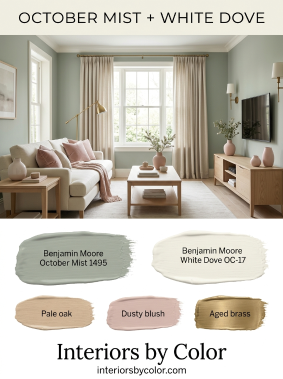
6. Benjamin Moore October Mist + White Dove
Best for: a sophisticated green living room
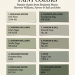
For homeowners who want more color, try Benjamin Moore October Mist 1495 with White Dove OC-17.
October Mist is a soft, muted botanical green rather than a bright leafy green.
Use the green on all four walls and White Dove on trim, or reverse the proportions by keeping the walls White Dove and using October Mist on built-ins.
The combination works beautifully with:
- cane
- oak
- cream
- natural stone
- brass
- warm gray
- dusty pink
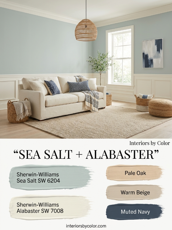
7. Sherwin-Williams Sea Salt + Alabaster
Best for: coastal and relaxed living rooms without obvious beach décor
Sea Salt SW 6204 works particularly well when you want blue-green color without a saturated blue wall.
Pair it with Alabaster SW 7008 rather than a brilliant white.
This keeps the palette soft.
The best supporting colors are:
- sand
- warm white
- pale timber
- muted navy
- stone
- natural linen
The result feels coastal without relying on nautical decoration.
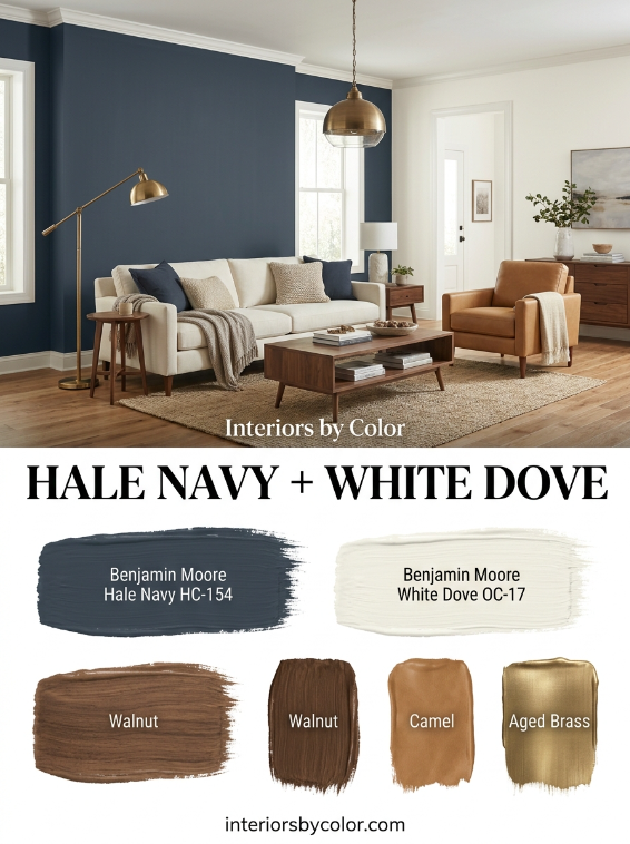
8. Benjamin Moore Hale Navy + White Dove
Best for: dramatic feature walls
Hale Navy HC-154 is a much more sophisticated choice than using a generic dark blue.
Use it on a fireplace wall, built-in cabinetry or a single architectural wall.
Pair it with White Dove OC-17 and introduce warm wood rather than lots of cool gray.
This is the important part.
Dark navy becomes much easier to live with when it is surrounded by warmth.
Try:
Hale Navy + White Dove + walnut + camel leather + aged brass
It is one of the strongest combinations for a classic living room that still feels current.
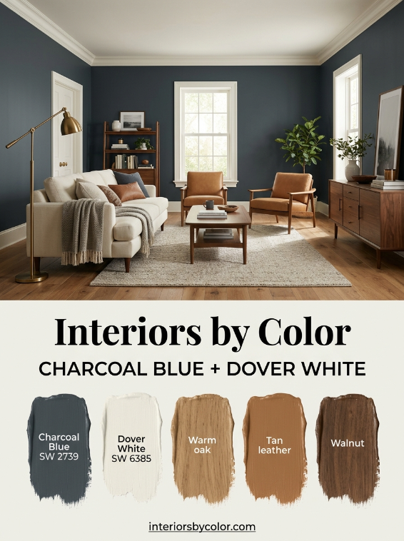
9. Sherwin-Williams Charcoal Blue + Dover White
Best for: moody but comfortable living rooms
Sherwin-Williams specifically recommends Charcoal Blue SW 2739 as a deep, gray-toned navy for a relaxing living room.
Pair it with Dover White SW 6385 rather than an icy white.
The slight warmth of Dover White prevents the navy from feeling cold.
Add:
- warm oak
- tan leather
- cream
- antique brass
- rust-colored textiles
This is particularly effective in rooms with evening light.
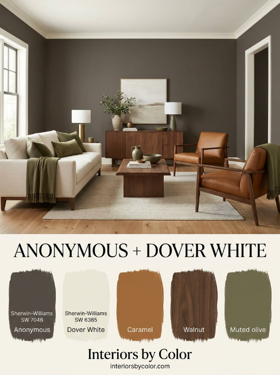
10. Sherwin-Williams Anonymous + Dover White
Best for: earthy modern interiors
One of the more interesting neutral combinations is Anonymous SW 7046 with Dover White SW 6385.
Anonymous is considerably deeper than the average living-room neutral.
Use it on the walls if the room receives plenty of light, or use it selectively on cabinetry, a fireplace or feature wall.
Sherwin-Williams itself describes Anonymous as a deep brown neutral suitable for cozy living rooms.
Pair it with:
- cream
- caramel
- walnut
- brass
- warm white
- olive green
It gives a neutral room considerably more personality.
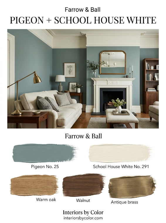
11. Farrow & Ball Pigeon + School House White
Best for: traditional homes and rooms with character
Farrow & Ball Pigeon No. 25 is a muted blue-green-gray that works beautifully with School House White No. 291.
This is particularly good in:
- older homes
- rooms with timber floors
- rooms with fireplaces
- homes with traditional molding
- transitional interiors
The muted quality of Pigeon makes it easier to use than a strong blue or green.
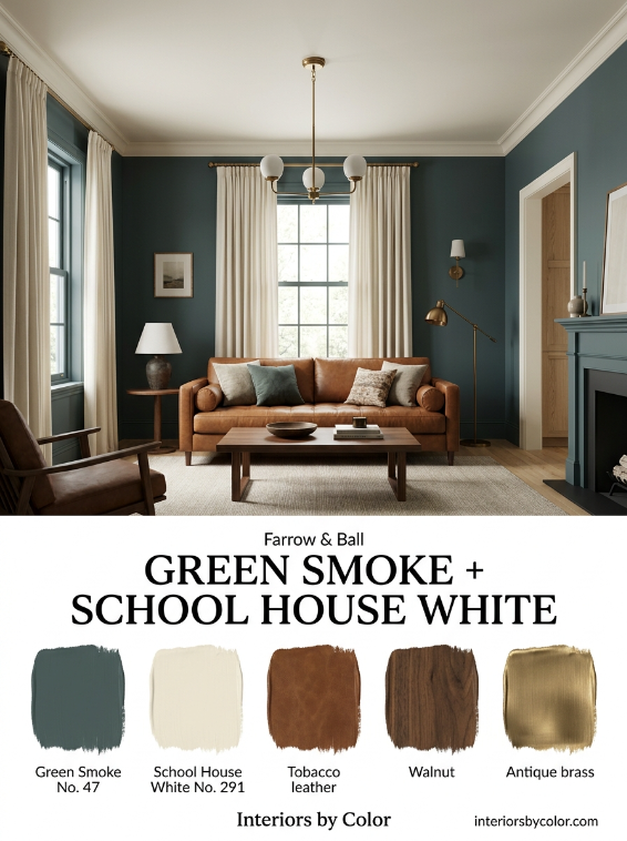
12. Farrow & Ball Green Smoke + School House White
Best for: atmospheric green living rooms
Green Smoke No. 47 is a much deeper green-blue than the typical sage.
Use it when you want a room to feel cocooning rather than simply fresh.
Pair it with School House White No. 291 on trim and ceilings.
Then add:
- tobacco leather
- walnut
- antique brass
- cream
- warm beige
This combination is particularly beautiful in rooms with traditional furniture.
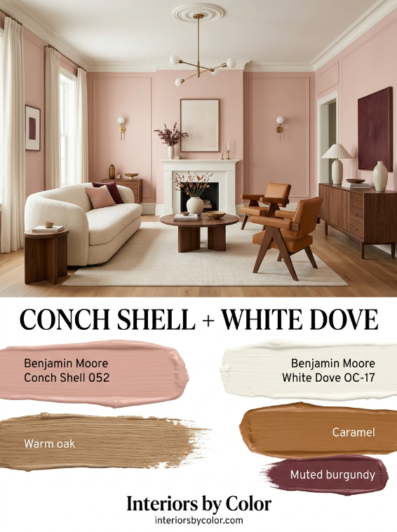
13. Benjamin Moore Conch Shell + White Dove
Best for: warm, sophisticated pink
Pink is becoming more interesting in interiors because homeowners are moving away from bright candy pink toward warmer, more complex shades.
Benjamin Moore Conch Shell 052 is a beautiful example.
Pair it with White Dove OC-17 to prevent the room becoming too sweet.
Then introduce:
- warm oak
- caramel
- burgundy
- brass
- cream
- chocolate brown
Peachy and warm pinks are gaining attention as designers look for more sophisticated alternatives to stronger pinks.
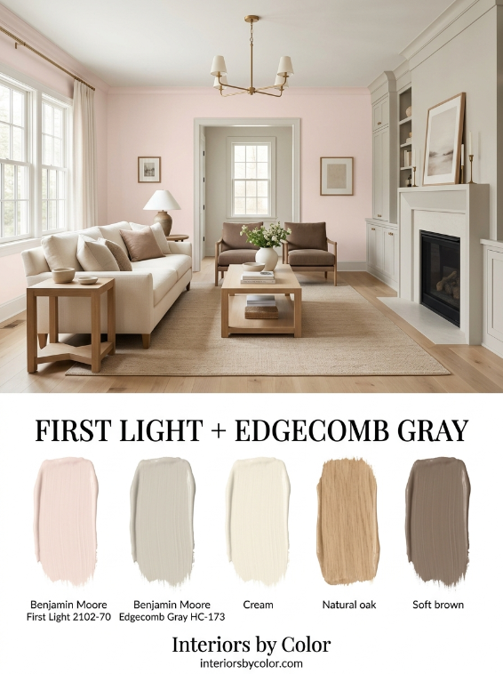
14. Benjamin Moore First Light + Edgecomb Gray
Best for: soft color without a strong pink room
First Light 2102-70 can work beautifully when you want a barely-there blush.
Pair it with Edgecomb Gray HC-173.
The gray-beige grounds the pink and makes the combination feel architectural rather than sugary.
Use the pink on walls and the neutral on trim or an adjoining room.
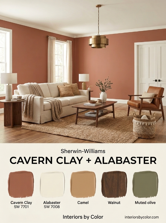
15. Sherwin-Williams Cavern Clay + Alabaster
Best for: earthy and warm living rooms
Cavern Clay SW 7701 is a terracotta-inspired shade that can completely change the character of a living room.
It works best when you don’t fight its warmth.
Pair it with Alabaster SW 7008, natural wood and cream upholstery.
Avoid pairing it with icy gray.
Instead use:
Cavern Clay + Alabaster + oak + camel + dark brown
The result feels collected rather than themed.
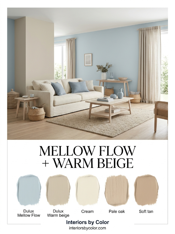
16. Dulux Mellow Flow + Warm Beige
Best for: Australian and contemporary interiors
Dulux’s 2026 color direction puts significant emphasis on layered blues, with Mellow Flow™ positioned as a light, airy blue for living spaces.
Rather than pairing a soft blue with stark white, use it with warm beige, cream or natural timber.
Try:
Dulux Mellow Flow + warm beige + cream + pale oak
This is a particularly good direction for Australian homes where natural light can be strong.
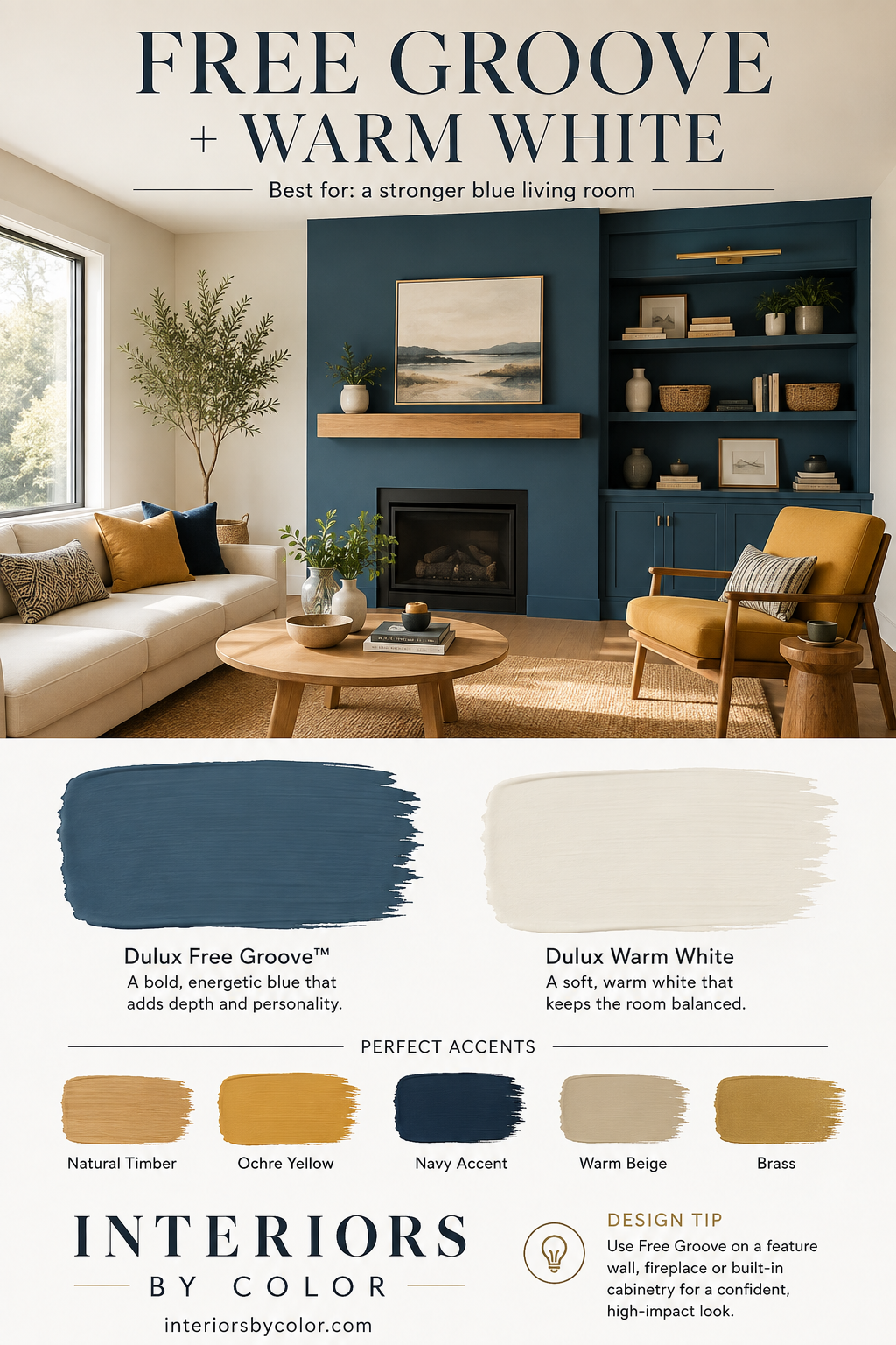
17. Dulux Free Groove + Warm White
Best for: a stronger blue living room
Dulux’s 2026 palette also includes Free Groove™, a more energetic blue that can act as the hero color.
Use it more strategically than a pale blue.
A feature wall, fireplace wall or built-in cabinetry can carry the color while warm white walls keep the room balanced.
Add natural timber and warm yellow or ochre accents.
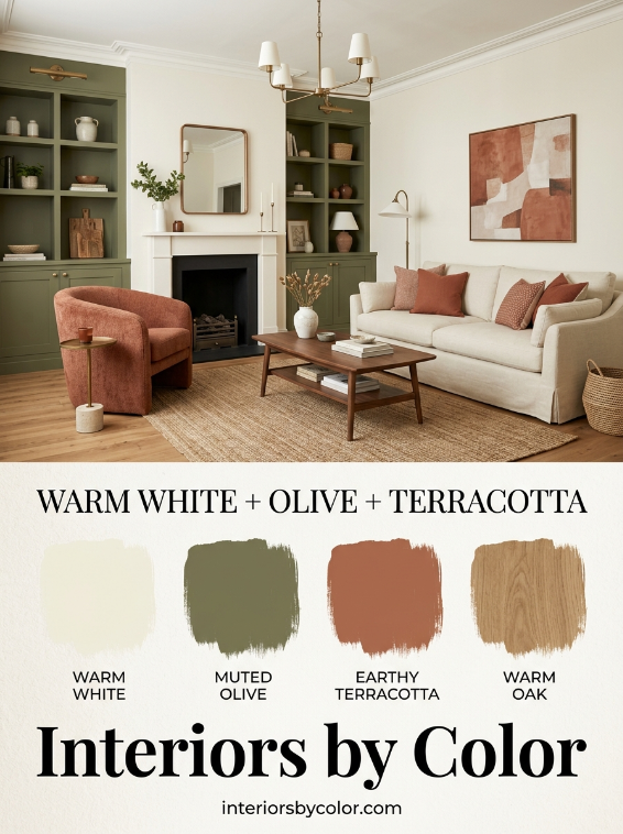
18. Warm White + Olive Green + Terracotta
Best for: an earthy modern living room
This combination isn’t about one particular paint brand.
It is about three colors working together:
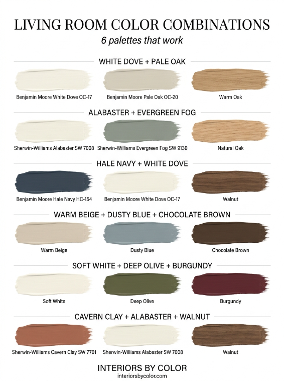
warm white + muted olive + terracotta
Use the warm white as the main wall color, olive on cabinetry or a feature wall, and terracotta through cushions, artwork or occasional furniture.
This is one of the easiest ways to make a neutral room feel more individual without painting the entire room a strong color.
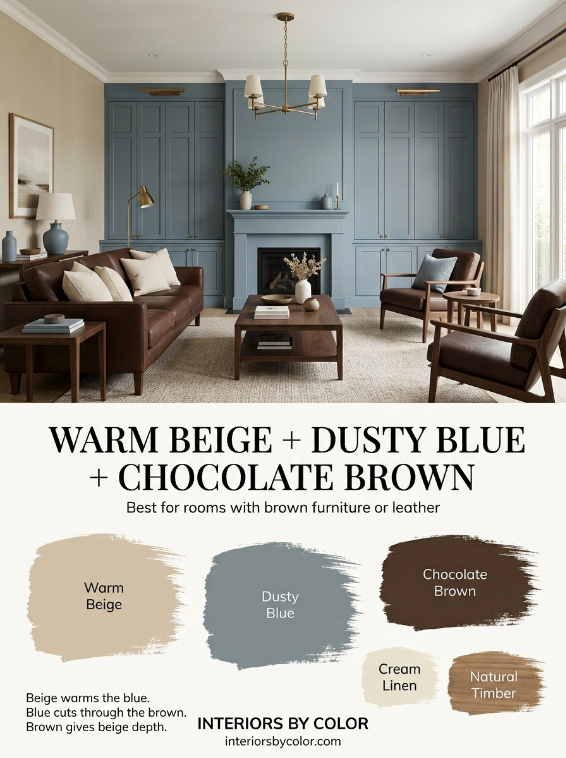
19. Warm Beige + Dusty Blue + Chocolate Brown
Best for: rooms with brown furniture or leather
This is a surprisingly useful combination.
Start with a warm beige wall.
Add dusty blue through an accent wall, cabinetry or textiles.
Then repeat chocolate brown through leather furniture, timber and accessories.
The three colors balance each other:
beige warms the blue, blue cuts through the brown, brown gives the beige depth.
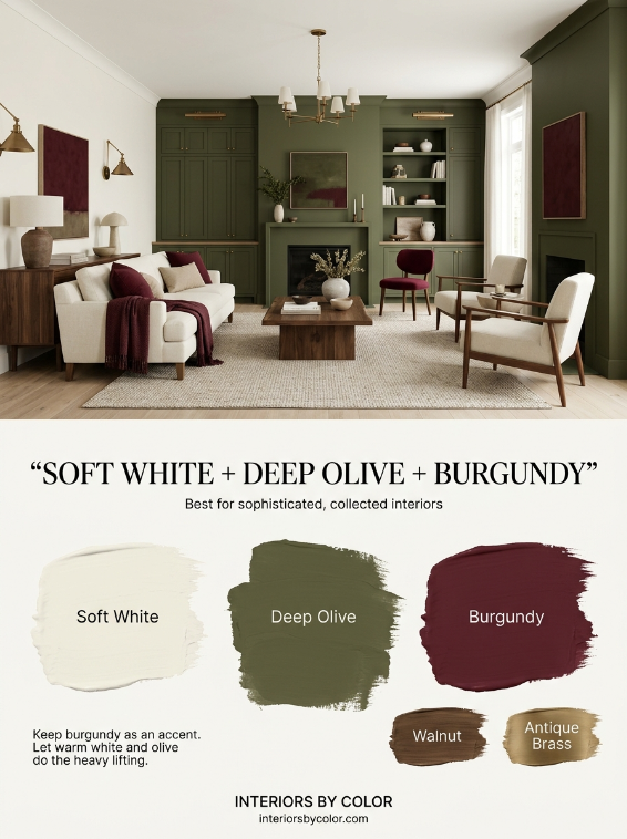
20. Soft White + Deep Olive + Burgundy
Best for: sophisticated, collected interiors
For a more dramatic 2026 palette, combine a warm off-white with deep olive green and small amounts of burgundy.
Keep burgundy as an accent rather than a major wall color.
Use:
- warm white walls
- olive built-ins
- burgundy cushions
- walnut furniture
- antique brass
It is sophisticated without looking overly formal.
How to Make a Living Room Color Combination Actually Work
The easiest way to build a successful palette is to give every color a job.
The 60–30–10 approach
A useful starting point is:
60% — dominant color
Usually the walls, ceiling and larger upholstered pieces.
30% — supporting color
Furniture, curtains, cabinetry, rugs or adjoining walls.
10% — accent color
Artwork, cushions, lamps, books and decorative objects.
You don’t need to follow those percentages precisely.
The principle is what matters: one color should lead, one should support it, and one should provide contrast.
Don’t Match Everything to the Paint
One of the biggest mistakes people make is choosing paint after buying a room full of cool gray furniture, then trying to find a gray paint that matches every piece.
Instead, look at the room as a whole.
Before choosing paint, identify:
- The undertone of your flooring.
- The undertone of your sofa.
- The color of your largest rug.
- The amount of natural light.
- The color of your kitchen if the room is open plan.
- The metal finishes you already have.
- The colors you cannot easily replace.
Then choose the paint.
Warm vs Cool Living Room Paint Colors
If your living room contains warm timber, cream upholstery, tan leather or brass, warm whites and warm neutrals usually make the most sense.
Good starting points include:
- Benjamin Moore White Dove
- Benjamin Moore Pale Oak
- Sherwin-Williams Alabaster
- Sherwin-Williams Accessible Beige
- Sherwin-Williams Agreeable Gray
- Farrow & Ball School House White
If your room has cooler gray furniture, blue textiles or polished chrome, you can move toward cooler greens, blue-grays and cleaner whites.
But don’t assume a room with gray furniture automatically needs gray walls.
A warm wall color can actually make cool furniture look much better.
The Best Living Room Colors for Dark Rooms
Dark rooms are where paint selection becomes particularly important.
Instead of automatically choosing brilliant white, consider a warm off-white, soft beige or muted color.
Good choices include:
Benjamin Moore White Dove
Soft enough to avoid looking stark.
Sherwin-Williams Alabaster
Warm and adaptable.
Benjamin Moore Pale Oak
A subtle neutral that can add more depth than white.
Sherwin-Williams Accessible Beige
Useful when you want a warmer, slightly deeper neutral.
If you want a dramatic room, don’t automatically rule out dark paint.
A dark green, navy or brown can make a poorly lit room feel intentional rather than simply dark.
What About Gray in 2026?
Gray isn’t disappearing.
The shift is toward warmer, more complex grays rather than flat cool gray.
That is why colors such as Agreeable Gray, Pale Oak, Edgecomb Gray and warmer greiges continue to work.
The more important question is not:
“Is gray still fashionable?”
It is:
“Does this particular gray work with everything else in my room?”
That is a much better question.
Should the Living Room and Kitchen Be the Same Color?
Not necessarily.
In an open-plan home, the colors should usually relate rather than match.
For example:
Living room: Pale Oak
Kitchen: White Dove
Cabinetry: muted green
Accent: walnut
Or:
Living room: Alabaster
Kitchen: Accessible Beige
Island: deep olive
Using related undertones creates flow without making the entire house look like one giant painted box.
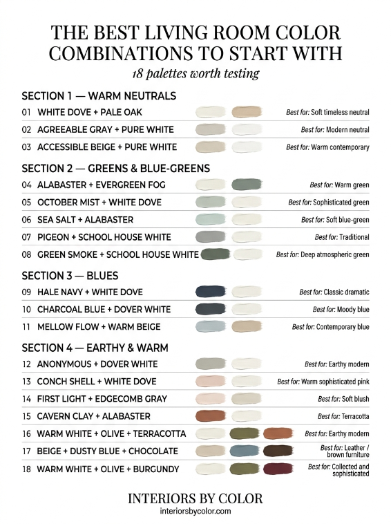
The Best Living Room Color Combinations to Start With
If you want a quick shortlist, these are some of the combinations worth testing first:
| Living Room Palette | Best For |
|---|---|
| White Dove + Pale Oak | Soft timeless neutral |
| Agreeable Gray + Pure White | Modern neutral |
| Accessible Beige + Pure White | Warm contemporary |
| Alabaster + Evergreen Fog | Warm green |
| October Mist + White Dove | Sophisticated green |
| Sea Salt + Alabaster | Soft blue-green |
| Hale Navy + White Dove | Classic dramatic |
| Charcoal Blue + Dover White | Moody blue |
| Anonymous + Dover White | Earthy modern |
| Pigeon + School House White | Traditional |
| Green Smoke + School House White | Deep atmospheric green |
| Conch Shell + White Dove | Warm sophisticated pink |
| First Light + Edgecomb Gray | Soft blush |
| Cavern Clay + Alabaster | Terracotta |
| Mellow Flow + warm beige | Contemporary blue |
| Warm white + olive + terracotta | Earthy modern |
| Beige + dusty blue + chocolate | Leather/brown furniture |
| Warm white + olive + burgundy | Collected and sophisticated |
One Final Rule: Test the Combination, Not Just the Color
A paint sample can look perfect on its own and completely wrong once it is beside your sofa.
Test the actual combination.
Paint large sample boards and place them next to:
- your sofa
- flooring
- curtains
- rug
- cabinetry
- artwork
Then look at them in the morning, afternoon and evening.
This matters because paint changes dramatically depending on natural light, artificial lighting, surrounding colors and surface finish.
The goal isn’t to find the most beautiful paint color.
It is to find the combination that still looks right when everything in the room is together.
FAQ: Living Room Paint Color Combinations
What are the best two-color combinations for a living room?
Some of the most versatile combinations include White Dove and Pale Oak, Agreeable Gray and Pure White, Alabaster and Evergreen Fog, Hale Navy and White Dove, and Pigeon with School House White.
What is the most popular neutral combination for living rooms?
Warm white paired with a soft greige remains one of the easiest combinations to use. White Dove with Pale Oak and Pure White with Agreeable Gray are particularly versatile starting points.
What colors are trending for living rooms in 2026?
Warm whites, earthy greens, muted blues, warm neutrals, dusky pinks and deeper brown-based shades are all prominent directions for 2026.
What colors make a living room look expensive?
Deep olive, navy, chocolate brown, warm white, muted blue, sophisticated pink and warm stone neutrals can all create a more expensive-looking palette when paired with natural wood, quality textiles and restrained accents.
Should living room walls and trim be the same color?
They can be. Color-drenching walls, trim and architectural details in related or identical colors is an increasingly popular approach. Alternatively, a warm white trim can provide subtle definition.
What is the best paint color for a living room with lots of natural light?
Warm whites, soft greiges, muted greens and dusty blues all work well. In very bright rooms, slightly deeper colors can prevent the walls from appearing washed out.
What is the best paint color for a dark living room?
Warm whites, warm greiges and soft beige are reliable choices, but a dark room can also look beautiful in a deep green, navy or brown if the goal is a cozy atmosphere.
See more color schemes:
- Best Wall Color for Bedrooms
- Best Warm Neutral Paint Colors for Living Rooms With Low Light
- Sherwin Williams Neutral Paint Colors
- How to Choose Paint Colors for an Open-Plan House
- Best Paint Colors to Sell a House Fast
- Best Bedroom Paint Colors for Better Sleep: Designer-Approved Palettes
- Best Exterior Color Schemes for Curb Appeal in 2026
- Best Living Room Color Combinations That Actually Work in Real Homes
- Best Accent Wall Colors for Every Room (And Why They Work)
- Best Bathroom Color Schemes for Small Spaces
- Best Kitchen Cabinet Color Combinations: Upper vs. Lower
- How to Choose a Whole House Paint Color Scheme (Step-by-Step)