Sherwin Williams Neutral Paint Colors: 15 Proven Winners
Looking for the perfect neutral paint color? We’ve rounded up 15 proven Sherwin Williams neutrals spanning crisp whites, soft grays, warm beiges, and trendy greiges. Pro tip: Always test a sample in your space, as lighting completely changes how these colors look!
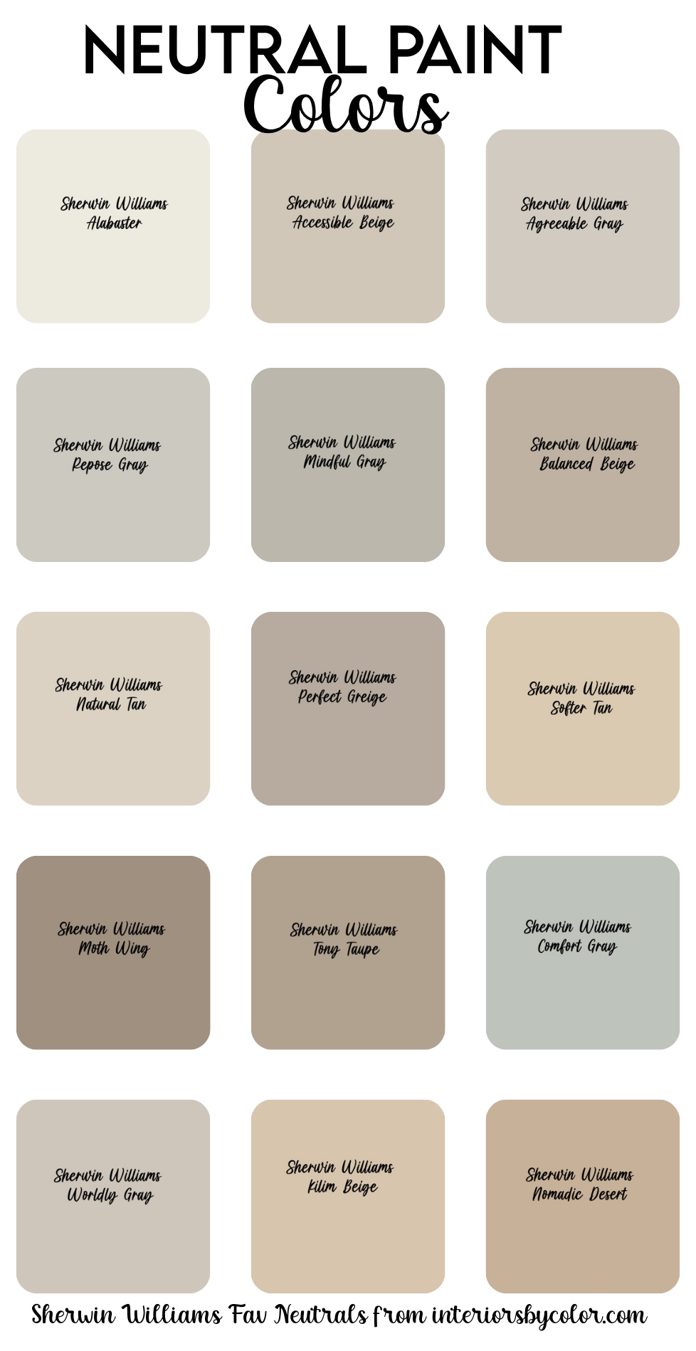
Table of Contents:
- Alabaster (SW 7008)
- Agreeable Gray (SW 7029)
- Repose Gray (SW 7015)
- Accessible Beige (SW 7036)
- Mindful Gray (SW 7016)
- Natural Tan (SW 7567)
- Balanced Beige (SW 7037)
- Softer Tan (SW 7039)
- Perfect Greige (SW 6073)
- Tony Taupe (SW 7038)
- Moth Wing (SW 9174)
- Comfort Gray (SW 6205)
- Worldly Gray (SW 7043)
- Kilim Beige (SW 6106)
- Nomadic Desert (SW 6107)
- How to Choose the Right Neutral For Your Space
- What About Trim and Ceilings?
- Frequently Asked Questions About Sherwin Williams Neutrals
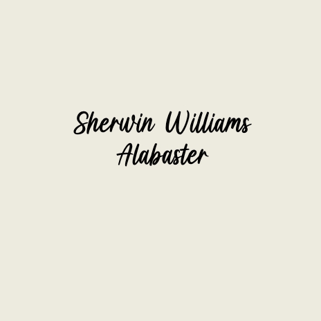
Alabaster (SW 7008) – Sherwin Williams
Sherwin Williams Alabaster (SW 7008) is a warm and inviting off-white color that exudes timeless elegance and sophistication. Described as a soft, creamy white, Alabaster carries subtle undertones of beige and taupe, giving it a versatile nature that complements a wide range of design styles and color schemes.
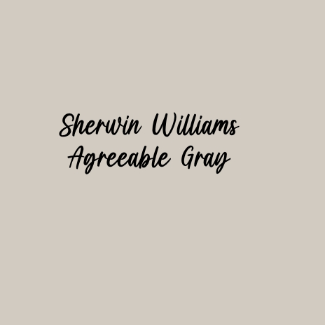
Agreeable Gray (SW 7029) – Sherwin Williams
Sherwin Williams Agreeable Gray (SW 7029) is a popular and versatile greige (gray-beige) paint color that effortlessly bridges the gap between cool and warm tones. Its subtle warmth and soft undertones create a welcoming and neutral backdrop for any interior space. Agreeable Gray is known for its adaptability, complementing a wide range of decor styles, from modern and minimalist to traditional and farmhouse. Its balanced hue makes it an excellent choice for walls, trim, and ceilings, adding a sense of cohesion and sophistication to your home.
Designer Tip: When painting walls white or very pale beige, ask your painter to use a matte or eggshell finish to hide brush strokes and wall imperfections.”
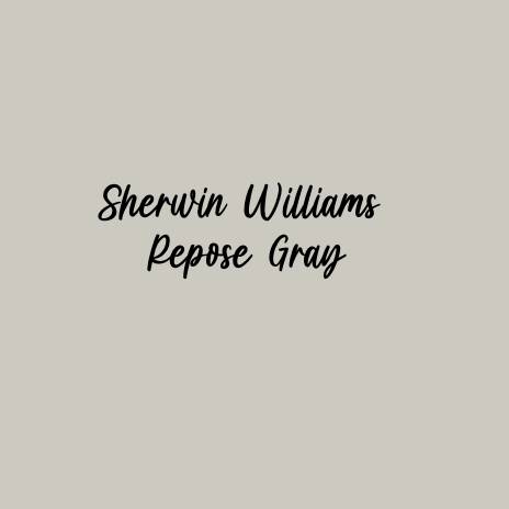
Repose Gray (SW 7015) – Sherwin Williams
Sherwin Williams Repose Gray (SW 7015) is a versatile and popular greige (gray-beige) paint color that effortlessly balances warmth and coolness. Its soft and understated hue makes it an excellent choice for creating a modern and sophisticated atmosphere in any interior space. Repose Gray’s subtle undertones adapt beautifully to different lighting conditions, creating a serene and cohesive backdrop for your decor. Whether used as a wall color, trim, or accent, Repose Gray adds a timeless elegance and versatility to your home design.
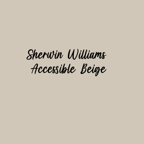
Accessible Beige (SW 7036) – Sherwin Williams
Sherwin Williams Accessible Beige (SW 7036) is a timeless and versatile neutral paint color that exudes warmth and sophistication. With its subtle blend of beige and gray undertones, Accessible Beige offers a soft and inviting backdrop for any interior space. This popular hue complements a variety of decor styles, from traditional to contemporary, making it a go-to choice for homeowners and designers alike. Whether used on walls, trim, or ceilings, Accessible Beige adds a sense of warmth and harmony to any room, creating a welcoming and cohesive atmosphere.
Designer Secret: Try “Color Drenching”
If you want a modern, high-end look, stop painting your trim and ceilings white. “Color drenching” is the designer technique of painting the walls, baseboards, doors, and ceiling all the exact same color. Using a soft neutral like Agreeable Gray or Alabaster for everything erases the visual boundaries of the room, making the space feel incredibly seamless, calming, and larger.
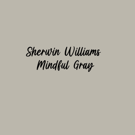
Mindful Gray (SW 7016) – Sherwin Williams
Sherwin Williams Mindful Gray (SW 7016) is a stylish and versatile greige (gray-beige) paint color that strikes the perfect balance between warmth and coolness. With its subtle undertones, Mindful Gray offers a sophisticated and modern backdrop for any interior space. This popular hue transitions beautifully from light to dark, adapting effortlessly to different lighting conditions. Whether used as a wall color, trim, or accent, Mindful Gray adds depth and character to your decor while maintaining a sense of harmony and balance.
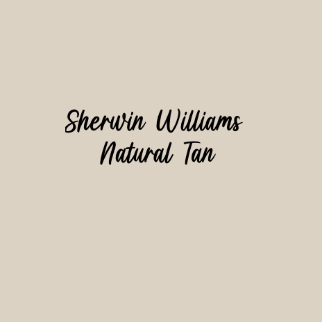
Natural Tan (SW 7567) – Sherwin Williams
Sherwin Williams Natural Tan (SW 7567) is a warm and inviting tan paint color that adds a sense of earthy charm and coziness to any room. With its rich and organic undertones, Natural Tan creates a welcoming ambiance that creates a sense of connection to the natural world. This versatile hue effortlessly complements a variety of design styles, from rustic farmhouse to contemporary chic. Whether used as a wall color, trim, or accent, Natural Tan brings warmth and depth to any room, enhancing the overall aesthetic while providing a comforting backdrop for daily living.
Balanced Beige (SW 7037) – Sherwin Williams
Sherwin Williams Balanced Beige (SW 7037) is a classic neutral paint color that strikes the perfect balance between warmth and sophistication. With its subtle blend of beige and gray undertones, Balanced Beige offers a serene and welcoming backdrop for any interior space. This understated hue adapts effortlessly to various design styles, from traditional to contemporary, giving each room a sense of harmony and cohesion.

How to Match Undertones to Your Home’s Fixed Elements
The biggest mistake people make is ignoring the “pink” or “green” hidden inside their neutral. Look at the permanent fixtures in your room—like your tile floors, countertops, or brick fireplace. If you have granite with busy gray/blue flecks, a warm beige like Kilim Beige will fight with it. Instead, pull a greige like Repose Gray that shares those same cool undertones so everything blends effortlessly.
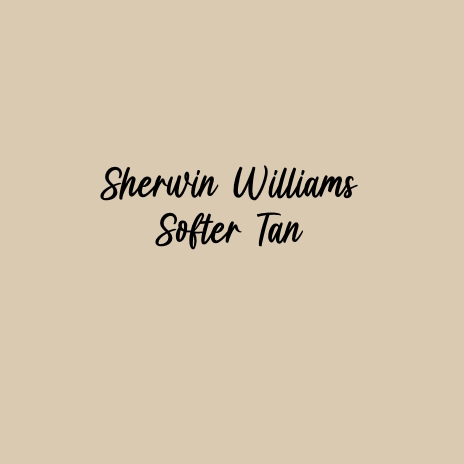
Softer Tan (SW 7039) – Sherwin Williams
Sherwin Williams Softer Tan (SW 7039) creates a soft and inviting space giving it warmth and comfort. With its gentle undertones of beige and taupe, Softer Tan creates a soothing and harmonious backdrop that gives off an understated elegance. This versatile hue seamlessly blends with a variety of decor styles, from traditional to modern, enhancing the overall aesthetic with its timeless charm.
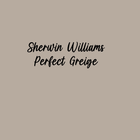
Perfect Greige (SW 6073) – Sherwin Williams
Sherwin Williams Perfect Greige (SW 6073) is a sophisticated paint color that seamlessly combines the warmth of beige with the depth of gray. This unique greige hue offers a perfect balance between cool and warm tones, creating a timeless and elegant backdrop for any interior space.
Don’t Underestimate the Power of Paint Sheen
The finish you choose literally changes how the paint color looks. A high-gloss finish reflects light, making a color appear lighter and cooler. A flat or matte finish absorbs light, making that exact same paint color look deeper, darker, and warmer. For neutral walls, Eggshell is the designer standard—it hides minor wall imperfections but still gives you a soft, washable finish that reflects just enough light to keep the color true.
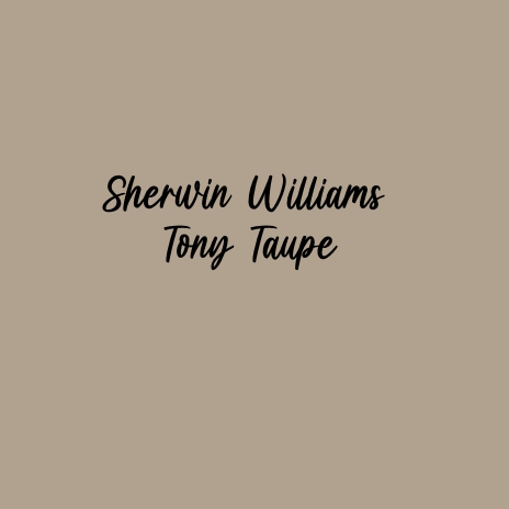
Tony Taupe (SW 7038) – Sherwin Williams
Sherwin Williams Tony Taupe (SW 7038) unveils a captivating dance between warmth and subtlety, infusing spaces with a sense of understated elegance. Like the shifting sands of a desert landscape at dawn, this nuanced taupe hue gracefully marries earthy richness with delicate sophistication. With its harmonious blend of brown and gray undertones, Tony Taupe casts a tranquil aura, inviting serenity into any interior setting. Cozy up to this earthy neutral, warmed by notes of a mushroom undertone. Partners beautifully with wood trim.
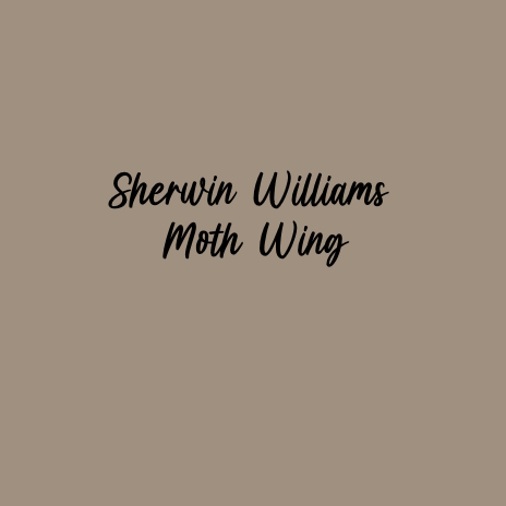
Moth Wing (SW 9174) – Sherwin Williams
Sherwin Williams Moth Wing (SW 9174). This gentle hue, reminiscent of the delicate tones found in nature, embodies a sense of tranquility and harmony. With its understated warmth and whisper-soft undertones, Moth Wing envelops spaces in a serene aura, inviting calmness and comfort. You’ll be drawn to this warm medium beige with gray undertones. Add this inviting shade to a kitchen or living room.
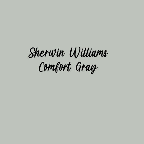
Comfort Gray (SW 6205) – Sherwin Williams
Sherwin Williams Comfort Gray (SW 6205) offers a tranquil retreat from the hustle and bustle of everyday life. This serene hue strikes a delicate balance between cool blue and subtle green undertones, creating a refreshing and calming ambiance reminiscent of a coastal getaway. Comfort Gray’s versatile palette seamlessly transitions from airy and light-filled spaces to cozy nooks, infusing each room with a sense of relaxation and ease. Blissfully light, this cool green-gray may inspire you to curl up with a book or soft blanket. Ideal for tranquil spaces like bedrooms or bathrooms.
The “Ceiling Rule” for Neutrals
Painting your ceiling a bright, stark white when your walls are a warm beige or greige creates a harsh “stripe” around the top of your room. To make the room feel taller and more cohesive, take your wall color (like Accessible Beige or Mindful Gray) and ask the paint store to lighten it by 50%. It will still read as “white” against your walls, but it will seamlessly connect the room from floor to ceiling.
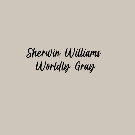
Worldly Gray (SW 7043) – Sherwin Williams
Sherwin Williams Worldly Gray (SW 7043) Is a flexible hue that strikes a harmonious balance between warmth and coolness, offering a timeless palette. With its subtle blend of gray and taupe undertones, Worldly Gray infuses spaces with a sense of understated elegance and refinement. Whether adorning walls, trim, or accents, its adaptable charm effortlessly complements a range of design styles, from modern minimalist to classic elegance. This warm gray breathes life into any room. Pair it with other warm tones to create a sophisticated yet comforting space.
Kilim Beige (SW 6106) – Sherwin Williams
Sherwin Williams Kilim Beige is a warm and inviting hue that conjures images of sun-drenched deserts and rich, earthy landscapes. This timeless beige tone exudes a sense of comfort and warmth, making it an ideal choice for creating cozy and welcoming interiors. With its subtle undertones of yellow and brown, Kilim Beige adds depth and richness to any space, infusing it with a natural and organic feel. Whether used as a wall color to create a serene backdrop or as an accent to add warmth and character, Kilim Beige brings a touch of rustic elegance to any design scheme.

Nomadic Desert (SW 6107) – Sherwin Williams
Sherwin Williams Nomadic Desert (SW 6107) invites you on a journey through warm sands and sun-kissed horizons. This earthy beige hue captures the essence of nomadic wanderlust, infusing spaces with a sense of adventure and tranquility. With its subtle undertones of orange and brown, Nomadic Desert evokes the natural beauty of desert landscapes, creating a serene and inviting atmosphere. This earth-toned neutral is full of intrigue that speaks of travel to exciting and far off destinations. Use anywhere you want to introduce an air of mystery.
How to Choose the Right Neutral For Your Space
Picking the perfect neutral isn’t just about the paint chip—it’s about your room’s lighting. Because neutrals are highly reflective, the natural light in your home will completely change how these colors look on the wall.
- North-Facing Rooms: These rooms get cool, bluish light. Warm up the space by choosing beiges with yellow or red undertones like Accessible Beige or Kilim Beige to prevent the room from feeling icy.
- South-Facing Rooms: Bathed in warm, golden light. You can comfortably lean into cooler grays and greiges like Repose Gray or Comfort Gray without the room feeling stark.
- Low Lighting / Dark Rooms: Stick to the lighter end of the spectrum. A dark beige like Nomadic Desert or Tony Taupe might turn muddy or overly dark in a room with minimal natural light.
What About Trim and Ceilings?
A common design mistake is pairing a warm, creamy neutral wall with a stark, cool white trim—it makes the trim look glaringly bright. Instead, match your trim to the wall color but go a few shades lighter, or use a soft white like Alabaster across both your walls and trim for a seamless, high-end look.
Note:
- 1st published June 2024
- Updated July 2026
Frequently Asked Questions About Sherwin Williams Neutrals
While trends shift slightly year to year, Agreeable Gray (SW 7029) has been the undisputed king of neutrals for a decade. It perfectly walks the line between gray and beige (greige), making it incredibly adaptable to almost any lighting condition and home style.
Beige is a warm neutral with primarily yellow, brown, or orange undertones (like Kilim Beige). Greige is a modern blend of gray and beige. It gives you the cozy warmth of beige but with the cool, sophisticated edge of gray (like Perfect Greige or Mindful Gray).
Alabaster (SW 7008) is widely considered the best soft white. It has just enough cream and taupe mixed in to feel warm and inviting, rather than looking like a sterile, hospital-grade white.
Absolutely. Paint colors react to your specific flooring, furniture, and natural light. What looks like a perfect greige on a tiny paper swatch might pull entirely green on your living room wall. Buy sample pots, paint a 2×2 foot square on your wall, and look at it during the morning, afternoon, and night before committing.