The foolproof system for creating a cohesive, flowing palette that connects every room in your home
Why Most Whole-House Color Schemes Fail
Walk into a house where every room is a different “mood” and you feel disoriented, not delighted. The living room is navy, the kitchen is mint, the bedroom is terracotta, and the hallway is… beige? It feels like four different houses stitched together. On the flip side, painting every room the exact same off-white feels like a rental property, not a home.
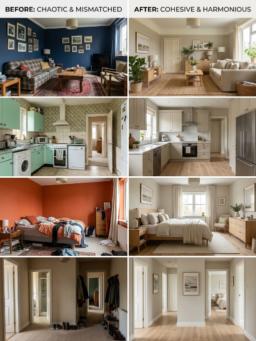
The sweet spot is a connected color story—a palette where rooms flow into each other naturally, share DNA, but each has its own personality. Here’s exactly how to build one.
The 4-Room Rule: Your Foundation
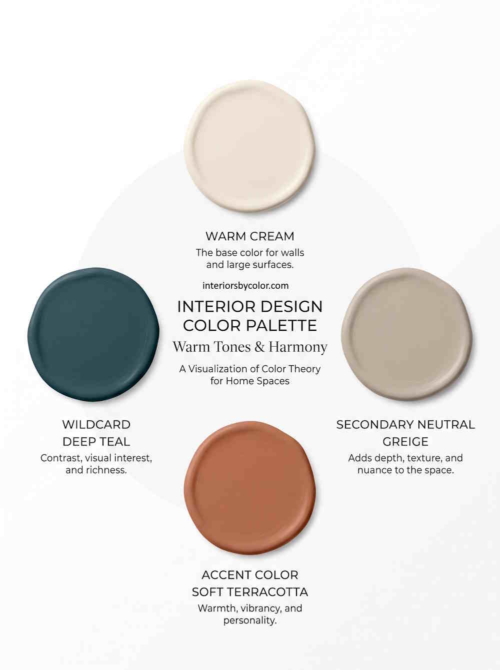
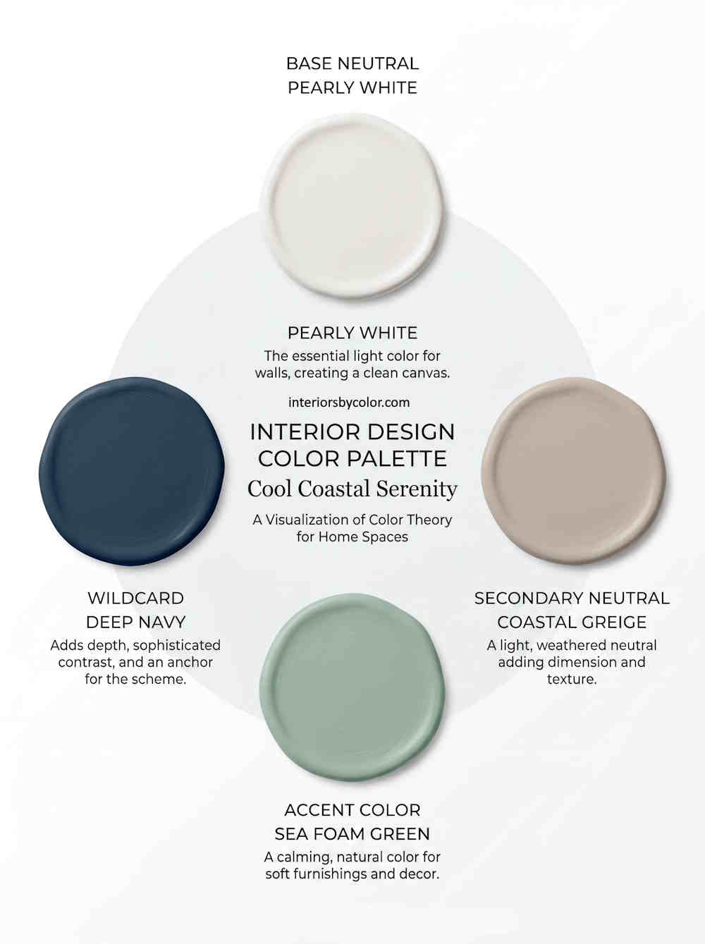
Before you pick a single color, understand this principle: Your eye can comfortably hold about 4 distinct paint colors in a home before it starts to feel chaotic. This doesn’t mean four colors total—you’ll use shades and tints of these colors throughout—but four base hues that everything relates back to.
Your four rooms are:
- The Main Neutral — Your workhorse color (60-70% of walls)
- The Secondary Neutral — A lighter or deeper partner (15-20%)
- The Accent Color — A richer, bolder hue (10-15%)
- The Wildcard — A surprise color for one special space (5%)
Step 1: Find Your Anchor (The Color You Can’t Change)
Every home has at least one immovable element with a strong color presence:
- Honey oak hardwood floors
- Gray porcelain tile in the bathroom
- A brick fireplace
- Black granite countertops
- Warm cherry cabinets
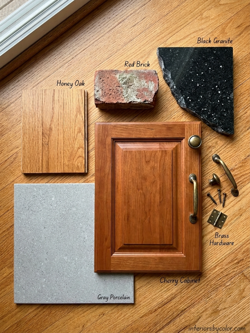
This is your anchor. Your entire palette needs to harmonize with it, not fight it. Fighting your anchor is the #1 reason whole-house schemes feel “off.”
Action: Photograph your anchor elements in natural light. Notice their undertones—are they warm (yellow, orange, red) or cool (blue, green, gray)? This determines whether your palette leans warm or cool.
Step 2: Choose Your Main Neutral
This is the color that will appear in your largest, most-connected spaces: living room, hallways, open kitchen, main bedroom. It should be versatile enough to feel right in every lighting condition.
The 3 Main Neutral Families:
| Family | Character | Best For Homes With… |
|---|---|---|
| Warm White/Cream | Inviting, traditional, soft | Warm wood floors, brass fixtures, traditional architecture |
| Greige (Gray-Beige) | Balanced, modern, adaptable | Mixed metal finishes, transitional style, varied lighting |
| Warm Gray | Sophisticated, calm, contemporary | Cool stone, chrome fixtures, modern architecture |
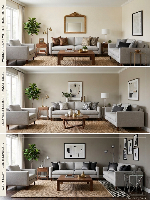
Action: Pick one family. Test 3-4 colors from that family on your largest wall. Live with them for 48 hours. The one that looks “right” in morning, afternoon, and artificial light is your Main Neutral.
Step 3: Build Your Color Story with the 60-30-10 Rule
This classic design principle prevents any single color from overwhelming your home.
| Percentage | Application | Example |
|---|---|---|
| 60% | Main Neutral | Walls in living room, hallways, primary bedroom |
| 30% | Secondary Neutral | Dining room, guest bedroom, ceiling variations |
| 10% | Accent Color | Powder room, built-in bookshelf backs, one feature wall |
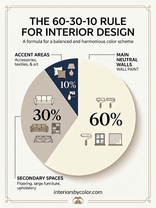
The Wildcard (from the 4-Room Rule) is your 5% surprise—maybe a deep teal pantry or a blush pink nursery. It works because it’s one moment, not scattered everywhere.
Step 4: Map Your Flow
Stand in your front door and trace the path someone takes through your home. Every visible transition should feel intentional.
The Flow Rules:
- Adjacent visible rooms should share an undertone (both warm, both cool, or both greige)
- Hallways are bridges—use your Main Neutral or a lighter tint of it
- Rooms behind doors (powder rooms, offices, bedrooms) have more freedom
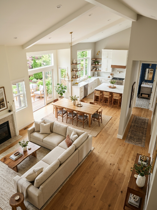
- Open floor plans need the strictest discipline—limit to 2-3 colors max
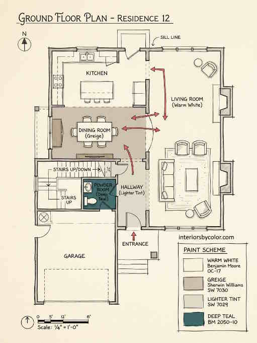
Action: Draw a rough floor plan. Mark which rooms are visible from each other. Note where you need continuity and where you can break the rules.
Step 5: Test for Lighting
A color that looks perfect in the paint store will look different in your home. Every room has its own light fingerprint:
| Room Orientation | Light Quality | Color Behavior |
|---|---|---|
| North-facing | Cool, consistent, flat | Colors appear cooler and darker |
| South-facing | Warm, bright, intense | Colors appear warmer and lighter |
| East-facing | Warm morning, cool afternoon | Morning = golden; afternoon = grayed |
| West-facing | Cool morning, warm afternoon | Morning = flat; afternoon = saturated |
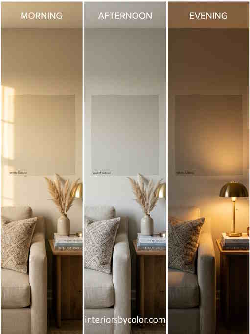
Action: Paint 2×2 foot swatches in every room you’re considering. Check them at 9 AM, 3 PM, and 7 PM with your normal lights on. A color that works in all three conditions is your winner.
Step 6: Lock in Your Trim and Ceiling Strategy
Your trim and ceiling color is just as important as your wall color. It creates the frame for everything else.
| Strategy | Effect | Best For |
|---|---|---|
| White trim + white ceiling | Classic, crisp, defines architecture | Traditional homes, lots of molding |
| Same color, different sheen (color drenching) | Seamless, expansive, modern | Low ceilings, small rooms, contemporary style |
| White trim + colored ceiling | Unexpected, cozy, designer | High ceilings, large rooms, bold personality |
| Natural wood trim + light walls | Warm, organic, craftsman | Homes with original woodwork |
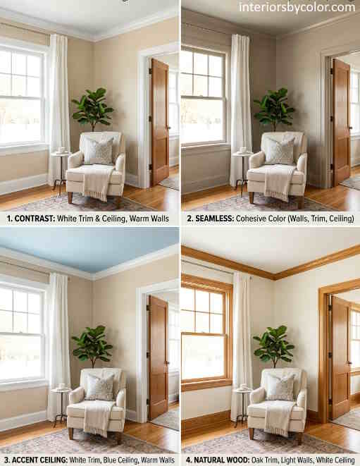
Action: Decide your strategy before you buy a single gallon. Changing mid-project is expensive.
Step 7: Document Your Palette
Once you’ve chosen your colors, create a simple reference document:
THE [YOUR LAST NAME] PALETTE

Main Neutral: [Color Name, Brand, Code]
- Living Room, Hallways, Primary Bedroom
- Sheen: Eggshell

Secondary Neutral: [Color Name, Brand, Code]
- Dining Room, Guest Bedroom
- Sheen: Eggshell

Accent Color: [Color Name, Brand, Code]
- Powder Room, Bookshelf Backs
- Sheen: Satin

Trim/Ceiling: [Color Name, Brand, Code]
- All trim, all ceilings
- Sheen: Semi-Gloss (trim), Flat (ceiling)

Wildcard: [Color Name, Brand, Code]
- [Specific Room]
- Sheen: [Sheen]
Keep this document. When you need to touch up in three years, you won’t be guessing.
5 Proven Whole-House Color Combinations
Here are five complete palettes that work in real homes. Each follows the 60-30-10 rule and includes a Wildcard.
Palette 1: The Modern Farmhouse
| Role | Color | Details |
|---|---|---|
| Main Neutral (60%) | Sherwin-Williams “Alabaster” (SW 7008) | Warm, creamy white. Bright but never cold. |
| Secondary Neutral (30%) | Benjamin Moore “Revere Pewter” (HC-172) | Light warm gray. Perfect for dining rooms and offices. |
| Accent Color (10%) | Farrow & Ball “Hague Blue” (No. 30) | Deep, inky navy. Stunning on built-ins or a powder room. |
| Wildcard (5%) | Benjamin Moore “Hale Navy” (HC-154) | Slightly lighter than Hague Blue. Use in a mudroom or pantry. |
| Trim/Ceiling | Benjamin Moore “Chantilly Lace” (OC-65) | Crisp, clean white. The perfect frame. |
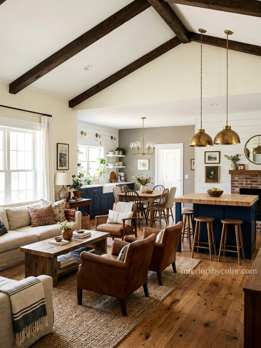
Vibe: Clean, cozy, collected. Works with shiplap, exposed beams, and vintage furniture.
Where it flows: Alabaster in open living/kitchen/hallways. Revere Pewter in the dining room (visible from living room but distinct). Hague Blue on a kitchen island or pantry door. Hale Navy in a powder room off the hallway.
Palette 2: The Warm Minimalist
| Role | Color | Details |
|---|---|---|
| Main Neutral (60%) | Farrow & Ball “School House White” (No. 291) | Warm, chalky white with subtle cream. |
| Secondary Neutral (30%) | Benjamin Moore “Pale Oak” (OC-20) | Warm greige. Reads as a soft tan in low light. |
| Accent Color (10%) | Sherwin-Williams “Tricorn Black” (SW 6258) | True black. Use sparingly for maximum impact. |
| Wildcard (5%) | Farrow & Ball “De Nimes” (No. 299) | Muted blue-gray. Sophisticated and unexpected. |
| Trim/Ceiling | Same as walls, different sheen | Color drenching for seamless flow. |
Vibe: Serene, intentional, gallery-like. Lots of negative space, natural textures, sculptural furniture.
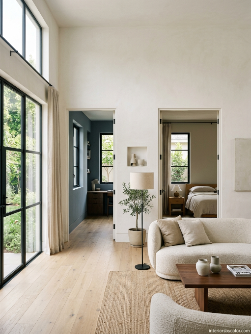
Where it flows: School House White throughout main spaces. Pale Oak in bedrooms for subtle warmth. Tricorn Black on window frames or a single accent wall. De Nimes in a study or primary bathroom for a calming surprise.
Palette 3: The Earthy Organic
| Role | Color | Details |
|---|---|---|
| Main Neutral (60%) | Benjamin Moore “White Dove” (OC-17) | Soft warm white with yellow-gray balance. |
| Secondary Neutral (30%) | Sherwin-Williams “Accessible Beige” (SW 7036) | Warm greige with a hint of green. |
| Accent Color (10%) | Farrow & Ball “Green Smoke” (No. 47) | Deep sage with gray undertones. |
| Wildcard (5%) | Benjamin Moore “Cinnamon Slate” (2113-40) | Warm terracotta. Earthy and grounding. |
| Trim/Ceiling | Benjamin Moore “Simply White” (OC-117) | Clean but not stark. |
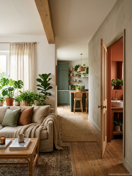
Vibe: Grounded, natural, biophilic. Pairs with rattan, linen, raw wood, and abundant plants.
Where it flows: White Dove in living room and kitchen. Accessible Beige in hallways (creates a warm tunnel effect). Green Smoke on kitchen cabinets or a den. Cinnamon Slate in a powder room or on a fireplace surround.
Palette 4: The Coastal Calm
| Role | Color | Details |
|---|---|---|
| Main Neutral (60%) | Sherwin-Williams “Greek Villa” (SW 7551) | Warm white with a whisper of yellow. Sunny without being yellow. |
| Secondary Neutral (30%) | Benjamin Moore “Gray Owl” (OC-52) | Light gray with subtle green undertones. |
| Accent Color (10%) | Farrow & Ball “Stone Blue” (No. 86) | Soft denim blue. Relaxed but refined. |
| Wildcard (5%) | Benjamin Moore “Wythe Blue” (HC-143) | Blue-green. Evokes sea glass. |
| Trim/Ceiling | Benjamin Moore “Decorator’s White” (CC-20) | Crisp, bright, slightly cool. |
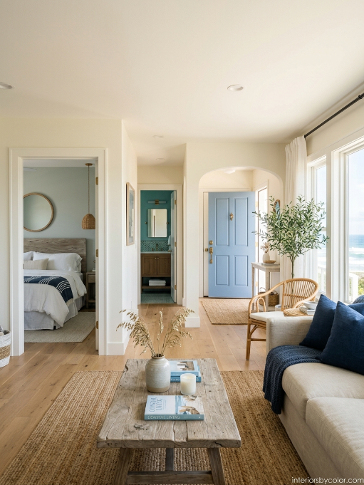
Vibe: Breezy, relaxed, light-filled. Natural fibers, driftwood tones, navy accents.
Where it flows: Greek Villa in main living areas. Gray Owl in bedrooms for a cooler, restful feel. Stone Blue on a front door or shutters. Wythe Blue in a bathroom or laundry room for a fresh pop.
Palette 5: The Bold Traditional
| Role | Color | Details |
|---|---|---|
| Main Neutral (60%) | Farrow & Ball “Skimming Stone” (No. 241) | Warm stony gray with a hint of pink. Elevated and timeless. |
| Secondary Neutral (30%) | Benjamin Moore “Edgecomb Gray” (HC-173) | Warm gray-beige chameleon. |
| Accent Color (10%) | Farrow & Ball “Preference Red” (No. 297) | Deep, rich burgundy. Dramatic and luxurious. |
| Wildcard (5%) | Benjamin Moore “Hunter Green” (HC-109) | Classic forest green. Scholarly and rich. |
| Trim/Ceiling | Farrow & Ball “Pointing” (No. 2003) | Warm, creamy white. Perfect match for Skimming Stone. |
Vibe: Layered, collected, heritage. Antiques, oil paintings, leather, brass, and marble.
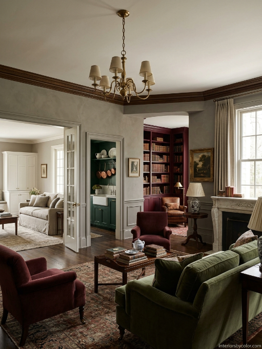
Where it flows: Skimming Stone in formal living and dining rooms. Edgecomb Gray in family rooms and kitchens for a slightly more casual feel. Preference Red in a library, study, or dining room ceiling. Hunter Green in a butler’s pantry or on kitchen cabinets.
Common Mistakes to Avoid
| Mistake | Why It Fails | The Fix |
|---|---|---|
| Testing paint on white poster board | Your existing wall color influences how the new color reads. | Paint directly on the wall, or on a large board you can move around. |
| Choosing colors in the paint store | Fluorescent lighting lies. | Always test in your actual home’s light. |
| Ignoring the ceiling | A white ceiling against a warm wall can look jarring. | Consider painting the ceiling a lighter tint of your wall color. |
| Using too many accent colors | Every room feels like a different house. | Limit to one accent color (used in different rooms) plus one wildcard. |
| Forgetting about sheen | The same color in eggshell vs. semi-gloss looks completely different. | Mark sheen on your palette document. |
Your Action Plan: This Weekend
| Day | Task | Time |
|---|---|---|
| Saturday Morning | Identify your anchor elements. Photograph them. | 30 min |
| Saturday Afternoon | Visit paint store. Grab swatches from one neutral family. | 1 hour |
| Saturday Evening | Tape swatches to walls. Observe under artificial light. | 15 min |
| Sunday Morning | Check swatches in morning light. Eliminate 2. | 15 min |
| Sunday Afternoon | Buy sample pots of your top 3. Paint 2×2 ft swatches. | 1 hour |
| Sunday Evening | Check swatches in evening light. Make your Main Neutral choice. | 15 min |
| Next Weekend | Repeat for Secondary Neutral and Accent Color. | 2 hours |
The Bottom Line
A whole-house color scheme isn’t about finding one perfect color—it’s about finding a family of colors that talk to each other. Start with your anchor, choose a neutral family, follow the 60-30-10 rule, and test relentlessly. The five palettes above are proven starting points, but your home’s unique light and architecture will guide you to the right specific shades.
The goal isn’t a showhouse. It’s a home that feels intentionally connected—where every room belongs to the same story.
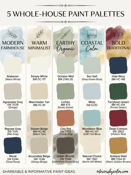
Ready to pick your Main Neutral? Start with the Warm Minimalist palette if you want calm, the Earthy Organic if you want warmth, or the Bold Traditional if you want character. Test, trust your eye, and commit.
See more color schemes:
- Best Wall Color for Bedrooms
- Best Warm Neutral Paint Colors for Living Rooms With Low Light
- Sherwin Williams Neutral Paint Colors
- How to Choose Paint Colors for an Open-Plan House
- Best Paint Colors to Sell a House Fast
- Best Bedroom Paint Colors for Better Sleep: Designer-Approved Palettes
- Best Exterior Color Schemes for Curb Appeal in 2026
- Best Living Room Color Combinations That Actually Work in Real Homes
- Best Accent Wall Colors for Every Room (And Why They Work)
- Best Bathroom Color Schemes for Small Spaces
- Best Kitchen Cabinet Color Combinations: Upper vs. Lower
Frequently Asked Questions About Whole-House Paint Color Schemes
A good starting point is three to four main colors throughout the home: a main neutral, a secondary neutral, an accent color and, if you want it, one wildcard color. You can use lighter and darker versions of these colors without making the house feel disconnected.
No. A whole-house color scheme works best when the rooms are connected rather than identical. Use your main neutral in the largest and most visible spaces, then introduce complementary colors in bedrooms, bathrooms, dining rooms and other spaces.
The 60-30-10 rule suggests using your main color for roughly 60% of the space, a secondary color for 30% and an accent color for 10%. For a whole house, this can translate into using one dominant neutral throughout the main areas, with secondary and accent colors appearing in selected rooms.
Start by looking at the permanent colors in your home, such as flooring, cabinets, countertops, brick and stone. Determine whether their undertones are warm or cool, then choose a neutral that works with those undertones. Always test paint samples in your own home before committing.
The easiest way to create cohesion is to choose colors that share similar undertones. Adjacent rooms don’t need to be the same color, but warm colors generally work best with other warm colors, while cool colors work well together. Using one main neutral throughout hallways and connected living spaces also helps the house flow.
Usually, yes. Hallways act as visual bridges between rooms, so using your main neutral—or a lighter version of it—can make the entire house feel more connected. This is particularly useful in open-plan homes where several spaces are visible at once.
Limit the main open-plan area to two or three related colors. Choose one dominant neutral for most of the walls, then use a secondary or accent color on selected areas such as an island, built-ins or a feature wall. Keeping the undertones consistent is more important than making every surface the same color.
Yes. The direction a room faces can significantly change how paint looks. North-facing rooms tend to make colors appear cooler and darker, while south-facing rooms generally make them look warmer and brighter. East- and west-facing rooms can change noticeably throughout the day, which is why testing paint in different lighting conditions is so important.
They can be, and using a consistent trim and ceiling color is one of the easiest ways to create a unified look. However, you can also use the wall color in a different sheen for a more seamless, modern effect.
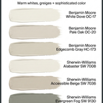
Popular starting points include Sherwin-Williams Alabaster, Sherwin-Williams Greek Villa, Benjamin Moore White Dove, Benjamin Moore Pale Oak, Benjamin Moore Edgecomb Gray and Farrow & Ball School House White. The best choice depends on your home’s natural light, flooring, cabinetry and existing finishes.
Yes. Paint large sample areas—around 2 × 2 feet is a useful starting point—and look at them in morning, afternoon and evening light. A color that looks perfect in a paint store can look completely different once it is on your walls.
Choosing individual colors room by room without considering how they relate to each other. Instead, choose your main neutral and overall color direction first, then select the other colors as part of the same palette. This creates a home that feels connected without making every room look identical.