Choosing paint colors for an open-plan house is different from choosing colors for separate rooms.
When your kitchen, dining area and living room share one large space, the colors need to work together. You don’t necessarily need to paint everything the same color, but you do need a palette that feels intentional from one end of the room to the other.
Here is how to choose an open-plan paint color scheme that works.
1. Start With One Main Wall Color
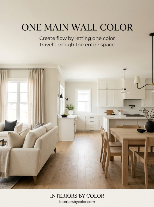
The easiest approach is to choose one main color for the majority of the open-plan space.
This creates continuity and makes the entire area feel larger.
Good choices include soft whites, warm whites, greiges and light neutral colors.
Some excellent options are:
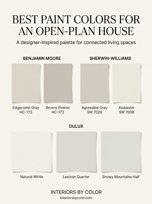
- Benjamin Moore Edgecomb Gray HC-173 – a warm, earthy neutral that works particularly well with timber, stone and warm furnishings.
- Sherwin-Williams Agreeable Gray SW 7029 – a versatile neutral that works with a wide range of furniture and finishes.
- Dulux Natural White – a warm white that works particularly well as a main wall color throughout an open-plan home.
- Dulux Lexicon Quarter – a crisp, cooler white specifically recommended by Dulux for modern open-plan spaces.
If you are unsure, start with the largest uninterrupted wall. It is usually the best place to judge whether the color works across the entire space.
2. Don’t Choose a Different Color for Every Zone
One of the most common mistakes in an open-plan house is trying to visually separate every area with paint.
For example:
Living room: beige
Dining room: green
Kitchen: grey
Even if each color looks beautiful individually, the combination can make a large open space feel disjointed.
Instead, choose one dominant color and one or two supporting colors.
For example:
Main walls: warm white
Kitchen island: muted green
Dining furniture: natural timber
Trim: soft white
The colors don’t have to match exactly. They simply need to share compatible undertones.
3. Pay Attention to Undertones
This is especially important in open-plan spaces because you can see several finishes at once.
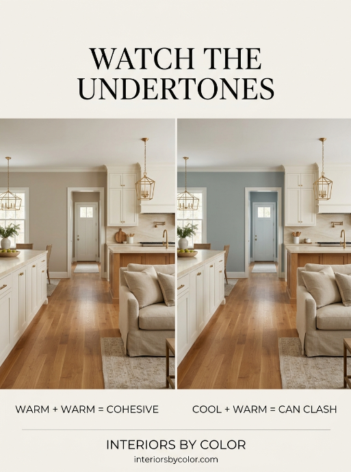
If your kitchen has warm timber cabinets and a beige stone benchtop, a blue-based grey wall can suddenly look cold.
Likewise, a strongly yellow cream can look out of place beside cool white cabinetry.
Look at the permanent finishes in the room first:
- Kitchen cabinets
- Benchtops
- Flooring
- Splashbacks
- Stone fireplaces
- Timber
- Large furniture
Then choose a wall color that works with those undertones.
Benjamin Moore notes that neutrals can have different undertones, including yellow, blue, gold and pink, which is why two colors that appear similar on a paint card can look very different on the wall.
4. Use Color to Define Different Areas
You can still create separate zones without making the space feel chopped up.
A good technique is to keep the main wall color consistent and introduce color through architectural features.
For example:
Warm neutral scheme
Walls: Benjamin Moore Edgecomb Gray
Kitchen island: muted sage green
Trim: soft white
Furniture: walnut and cream
Crisp contemporary scheme
Walls: Dulux Lexicon Quarter
Kitchen cabinetry: soft grey
Accent: charcoal or black
Furniture: oak and natural linen
Dulux specifically describes Lexicon Quarter as suitable for the walls and trim of modern open-plan spaces.
Warm white scheme
Walls: Dulux Natural White
Kitchen: warm white or cream
Accent: earthy green
Furniture: timber, tan and natural fabrics
Natural White is one of Dulux’s popular warm whites and is designed to work across interiors and exteriors.
5. Think About the Light
An open-plan room can have several different light sources.
Your kitchen might receive bright morning light while the living area is shaded for most of the day.
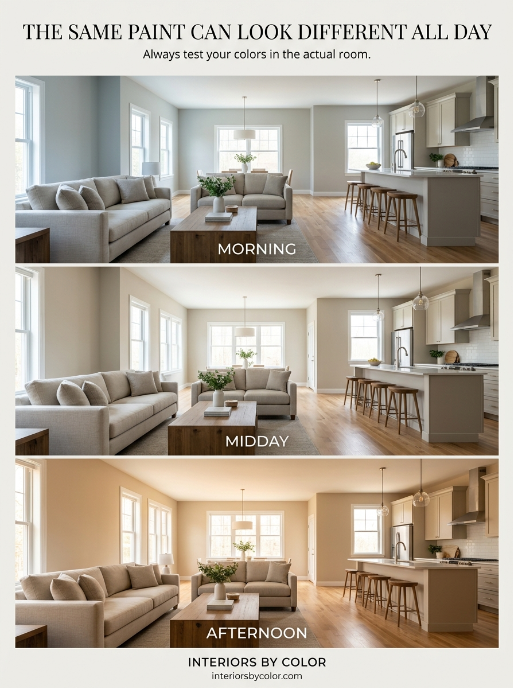
That means the same paint color can look different from one end of the room to the other.
Before committing to a color, test a large sample on different walls.
Look at it:
- In the morning
- Around midday
- In the afternoon
- At night with artificial lighting
Don’t rely entirely on a small paint chip.
6. Consider the Ceiling and Trim
You don’t always need stark white ceilings and trim.
For a softer, more cohesive open-plan space, use a warm white that works with the wall color.
For example, a warm greige wall paired with a very cool white trim can make the two colors look more different than you intended.
If your goal is a seamless, relaxed look, keep the undertones compatible.
The Best Paint Colors for Open-Plan Houses
If you want a short list to start with, these are some of the most versatile choices:
| Paint brand | Color | Best for |
|---|---|---|
| Benjamin Moore | Edgecomb Gray HC-173 | Warm, sophisticated neutral |
| Benjamin Moore | Revere Pewter HC-172 | Classic warm greige |
| Sherwin-Williams | Agreeable Gray SW 7029 | Flexible neutral |
| Sherwin-Williams | Alabaster SW 7008 | Soft warm white |
| Dulux | Natural White | Warm, light whole-house scheme |
| Dulux | Lexicon Quarter | Modern, crisp open-plan spaces |
| Dulux | Snowy Mountains Half | Soft neutral white |
Dulux also recommends Snowy Mountains Half as a slightly neutral white that works with both warmer and cooler colors.
The Easiest Formula to Follow
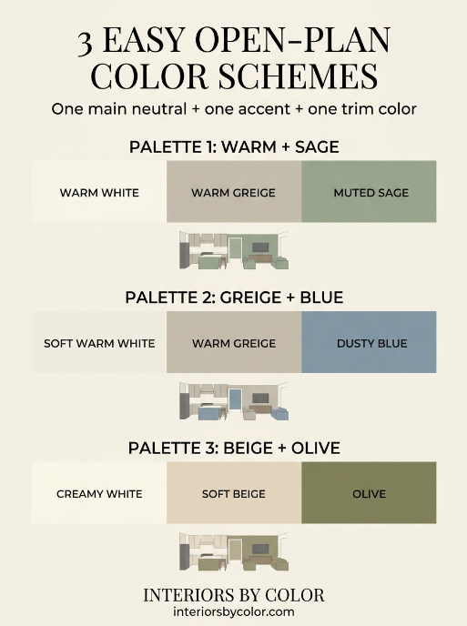
If you’re completely stuck, use this formula:
1 main neutral + 1 accent color + 1 consistent trim color.
For example:
Walls: warm white
Accent: muted sage
Trim: soft white
Or:
Walls: warm greige
Accent: dusty blue
Trim: warm white
Or:
Walls: soft beige
Accent: deep olive
Trim: creamy white
The goal isn’t to make every part of the room the same color.
It’s to make everything belong to the same color story.
Final Tip
Before buying all your paint, test your chosen colors in the actual open-plan space.
Paint large sample areas rather than relying on tiny color cards, and look at them beside your flooring, cabinetry and benchtops.
The right color on a paint card isn’t necessarily the right color in your house.
For an open-plan home, how the colors work together matters more than how any single color looks on its own.
See More:
How to Choose a Whole House Paint Color Scheme (Step-by-Step)
Frequently Asked Questions About Painting an Open-Plan House
Not necessarily, but using one main wall color throughout the connected spaces usually creates the most cohesive look. You can introduce additional colors through kitchen cabinetry, an island, a feature wall or furnishings without making each zone feel disconnected.
Some versatile choices include Benjamin Moore Edgecomb Gray, Benjamin Moore Revere Pewter, Sherwin-Williams Agreeable Gray, Sherwin-Williams Alabaster, Dulux Natural White and Dulux Lexicon Quarter. The best choice depends on your natural light, flooring, cabinetry and the warm or cool undertones of your existing finishes.
A simple starting point is one main wall color, one accent color and one trim color. This gives you enough contrast to create interest while keeping the kitchen, dining and living areas visually connected.
They don’t have to be, but if the kitchen and living room are directly connected, using the same main wall color is often the easiest way to make the space feel cohesive. You can differentiate the kitchen with cabinetry or an island color instead.
Light neutrals, warm whites, soft greiges and pale colors generally help an open-plan space feel more spacious. Keeping the same or closely related wall colors across connected areas can also make the boundaries between spaces less noticeable.
Start with the flooring that occupies the largest area and identify its undertone. Then choose a wall color that works with all the flooring rather than trying to match each floor individually. Warm wood floors generally work well with warm whites, beige and warm greige, while cooler floors can work better with neutral or cooler whites and greys.
Using one consistent trim color throughout an open-plan area can make the architecture feel more cohesive. Choose a trim white that works with the undertone of your main wall color rather than automatically choosing a bright, cool white.
Natural light can significantly change how a paint color looks. North-, south-, east- and west-facing rooms receive different qualities of light, and the same paint can appear warmer, cooler, lighter or darker depending on the time of day. Always test paint samples in the actual space before committing.
Yes. A dark color can work particularly well on a kitchen island, cabinetry, fireplace wall or other architectural feature. If you use a dark color on the main walls, balance it with adequate natural light and lighter furnishings or finishes.
The ceiling does not have to be the same color, but it should work with the wall color. A soft white or slightly lighter version of the wall color can create a more seamless look, while a contrasting white can make the architectural boundaries more noticeable.