If you want a kitchen that feels current without looking like it was designed around a passing trend, one of the easiest places to start is with the cabinet color combination.
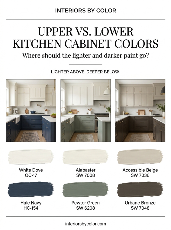
The classic all-white kitchen isn’t gone. But in 2026, we’re seeing much more interest in two-tone kitchen cabinets: a lighter color on the upper cabinets and a deeper, more grounded color below.
It’s a simple idea, but the right combination can completely change how a kitchen feels.
Warm white uppers with navy lowers feel classic. Creamy cabinets with sage green lowers feel softer and more relaxed. Warm greige with deep charcoal feels sophisticated and architectural. And for something richer, chocolate brown or forest green on the lower cabinets can make a kitchen feel much more considered.
The key is choosing colors that actually belong together.
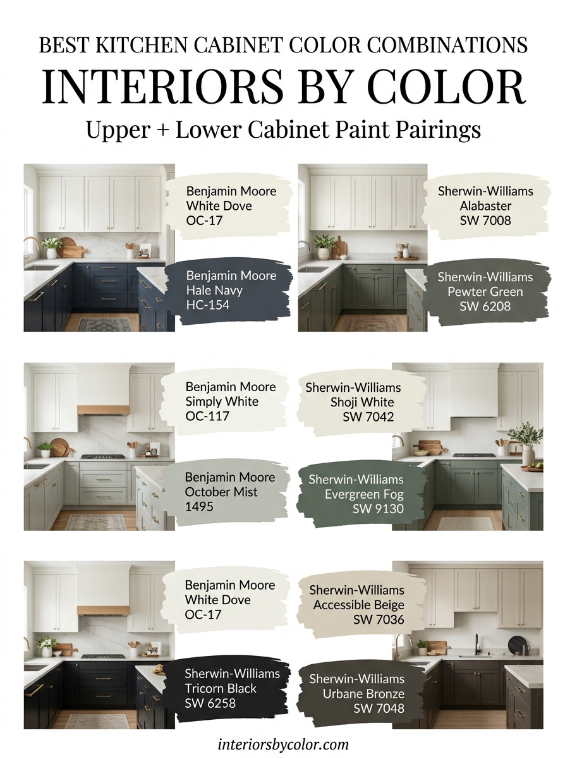
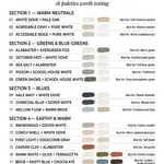
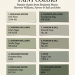
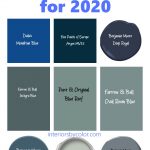
This guide looks at the best upper and lower kitchen cabinet color combinations, including specific Benjamin Moore, Sherwin-Williams and other popular paint colors, plus which combinations work best with white countertops, marble, natural wood, brass hardware and different levels of natural light.
Why Put a Lighter Color on the Upper Cabinets?
The simplest two-tone formula is:
Light upper cabinets + darker lower cabinets.
There is a reason this combination keeps appearing in contemporary kitchens.
Lighter upper cabinets visually recede, helping the kitchen feel brighter and more open. Darker lower cabinets provide weight and definition without putting a large dark block of color at eye level.
This is particularly useful in smaller kitchens, kitchens with limited natural light, or open-plan spaces where you want the kitchen to feel substantial without dominating the room.
Benjamin Moore notes that lighter cabinet colors can make smaller kitchens feel more open, while its kitchen guidance also highlights deeper colors such as Hale Navy for homeowners wanting more saturated cabinetry.
You don’t have to use dramatically different colors, either.
A tonal combination such as warm white + warm greige can create a subtle two-tone kitchen, while soft white + deep green creates much stronger contrast.
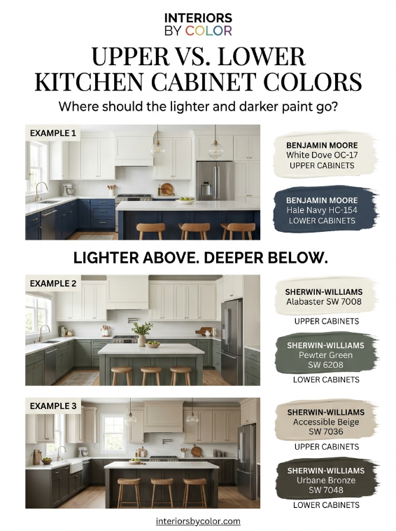
The Best Upper and Lower Kitchen Cabinet Color Combinations
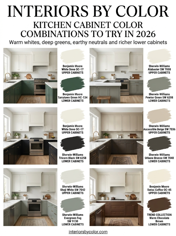
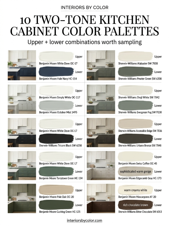
Here are the combinations I would put at the top of the list when choosing kitchen cabinet colors in 2026.
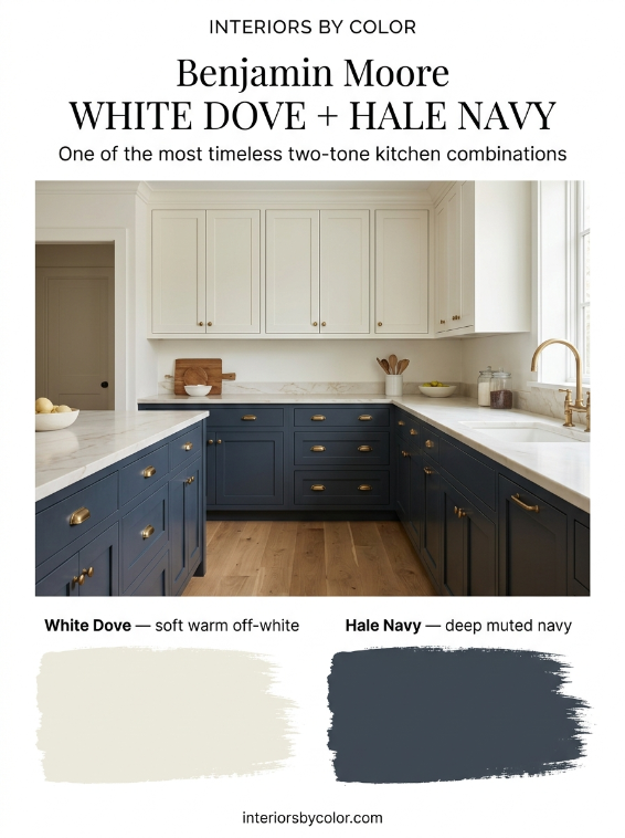
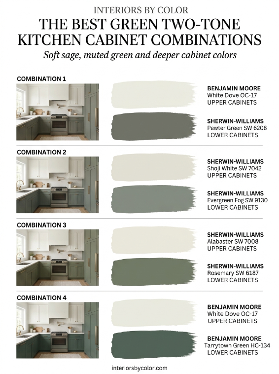
1. White Dove + Hale Navy
Upper cabinets: Benjamin Moore White Dove OC-17
Lower cabinets: Benjamin Moore Hale Navy HC-154
This is one of the safest ways to introduce a strong cabinet color.
White Dove is a soft warm white rather than a stark blue-white, while Hale Navy gives the lower cabinets depth without looking as severe as black.
The combination works particularly well with:
- White quartz
- Carrara-style marble
- Warm white backsplashes
- Brass hardware
- Natural oak floors
- Medium-toned timber
White Dove is widely used on cabinetry, while Hale Navy remains one of Benjamin Moore’s most recognizable deeper cabinet colors.
Best for: Traditional, transitional, coastal and modern kitchens.
Design tip: If your countertops are very bright white, White Dove can look noticeably warmer beside them. That’s not necessarily a problem—it can actually make the kitchen feel more layered.
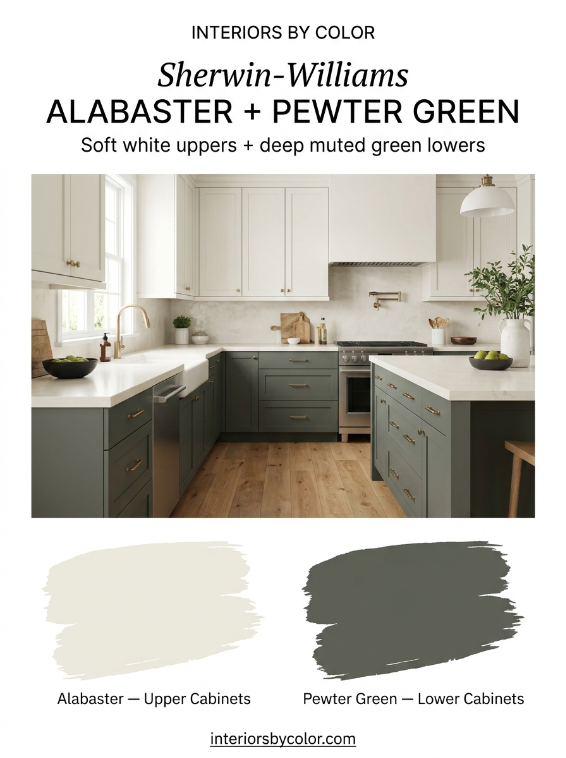
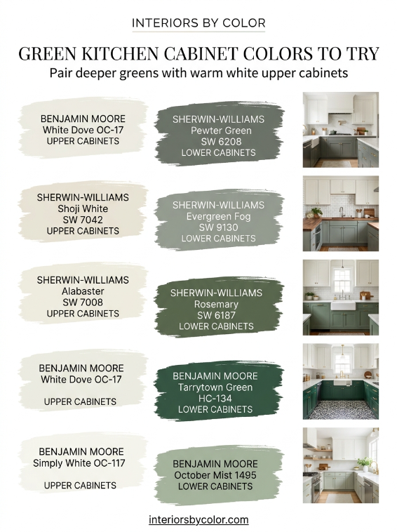
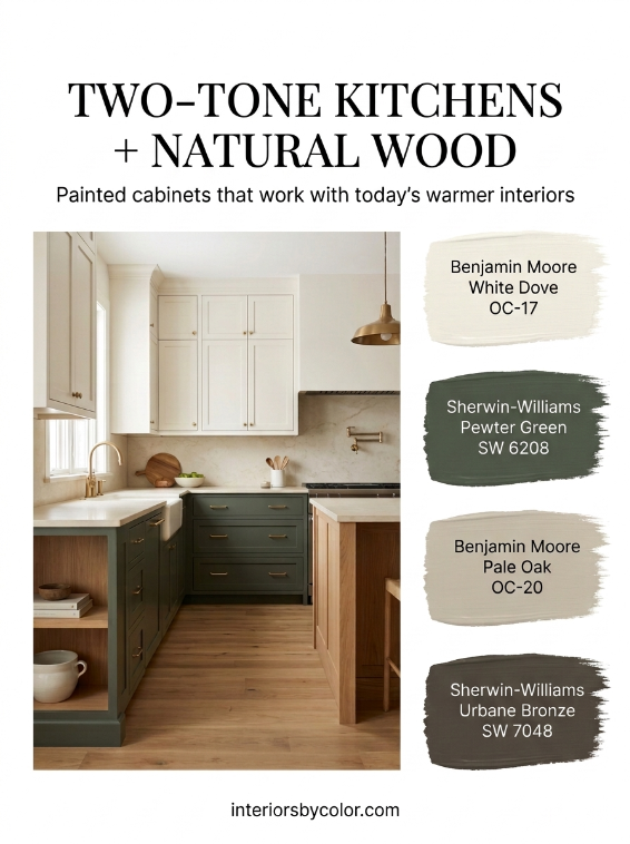
2. Alabaster + Pewter Green
Upper cabinets: Sherwin-Williams Alabaster SW 7008
Lower cabinets: Sherwin-Williams Pewter Green SW 6208
This is one of my favorite combinations for a softer, more organic kitchen.
Alabaster provides a warm, creamy backdrop while Pewter Green adds a muted gray-green depth.
Sherwin-Williams currently features Pewter Green and Alabaster among its kitchen cabinet inspiration, alongside Accessible Beige and other neutrals.
Pewter Green is considerably darker than many of the pale sage greens that became popular earlier in the decade. Its approximate digital reference is a deep, muted gray-green, making it particularly effective on lower cabinets.
Pair it with:
- Aged brass
- White oak
- Cream stone
- Warm white walls
- Handmade-look tile
Best for: Modern farmhouse, organic modern and transitional kitchens.
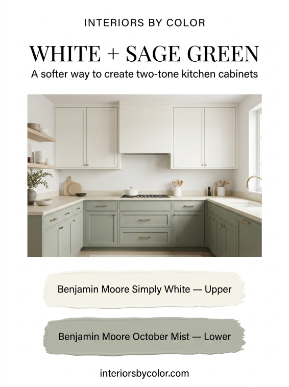
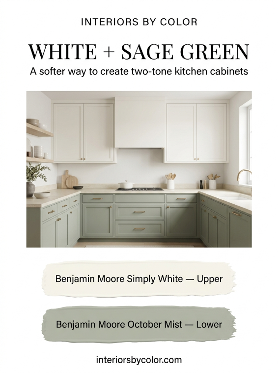
3. Simply White + October Mist
Upper cabinets: Benjamin Moore Simply White OC-117
Lower cabinets: Benjamin Moore October Mist 1495
If you want green without going too dark, this is a beautiful alternative.
October Mist is a muted, sophisticated green that works particularly well when you want color but don’t want the cabinets to become the entire focal point.
The lighter upper cabinets keep the kitchen airy while the green lowers establish a gentle visual base.
This combination works especially well with:
- Light oak
- Warm brass
- Cream countertops
- Natural stone
- Soft beige walls
Best for: Contemporary, cottage, transitional and Scandinavian-inspired kitchens.
4. Shoji White + Evergreen Fog
Upper cabinets: Sherwin-Williams Shoji White SW 7042
Lower cabinets: Sherwin-Williams Evergreen Fog SW 9130
Evergreen Fog has more gray and depth than a traditional sage, which makes it particularly useful for cabinetry.
Sherwin-Williams specifically recommends Evergreen Fog alongside Shoji White, Accessible Beige and Urbane Bronze, making this a particularly well-supported palette rather than a random color pairing.
The result is understated rather than high contrast.
Think:
warm white + muted green + natural wood + aged metal.
It is an excellent choice if you want a kitchen that feels colorful but still calm.
Best for: Modern organic, transitional and contemporary kitchens.
5. Pure White + Naval
Upper cabinets: Sherwin-Williams Pure White SW 7005
Lower cabinets: Sherwin-Williams Naval SW 6244
For a cleaner, more contemporary navy kitchen, try Pure White with Naval.
Naval is deeper and more saturated than many blue-gray cabinet colors. It looks particularly striking when the rest of the kitchen is kept simple.
Try it with:
- White quartz
- Chrome or brass
- Pale timber
- White subway tile
- Black accents
The important thing is not to introduce too many additional colors.
Let the white and navy do the work.
Best for: Modern, coastal, transitional and classic kitchens.
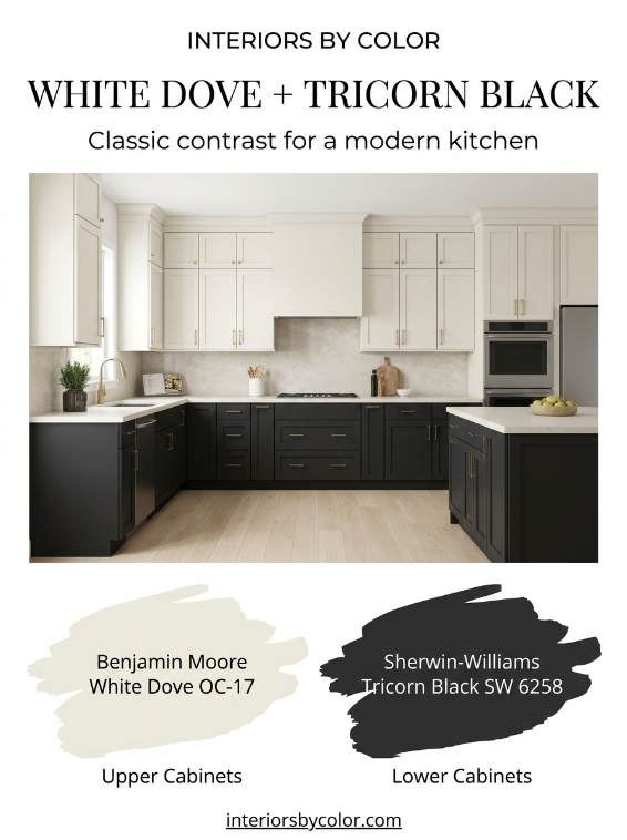
6. White Dove + Tricorn Black
Upper cabinets: Benjamin Moore White Dove OC-17
Lower cabinets: Sherwin-Williams Tricorn Black SW 6258
This is the dramatic option.
Black lower cabinets anchor the kitchen while White Dove prevents the upper half from feeling cold or stark.
Black cabinetry can work particularly well in kitchens with plenty of natural light. Benjamin Moore also notes that dark cabinet colors can be practical because they tend to conceal everyday dirt better than very light colors.
Use this combination with restraint.
The most successful versions usually have:
- Warm white walls
- Pale stone
- Natural wood
- Brass or aged bronze
- Minimal backsplash pattern
Best for: Modern, contemporary and high-contrast kitchens.
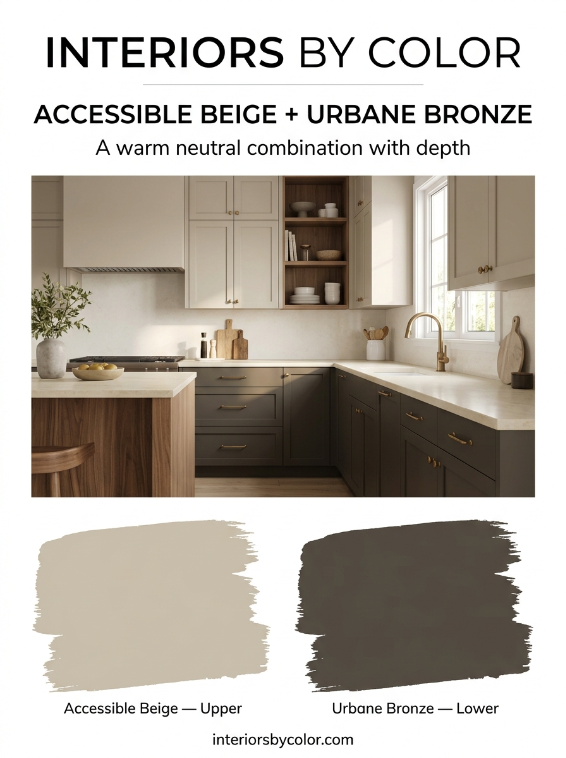
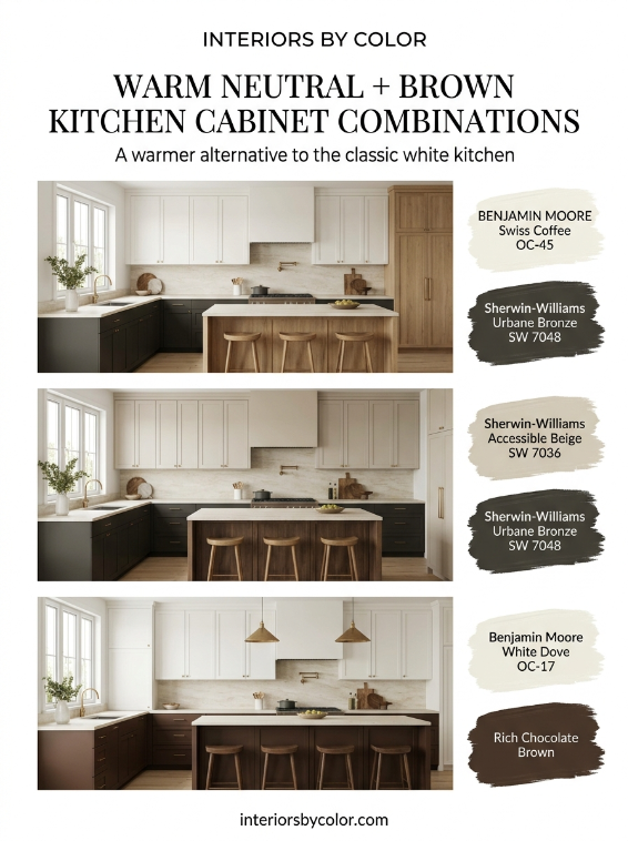
7. Accessible Beige + Urbane Bronze
Upper cabinets: Sherwin-Williams Accessible Beige SW 7036
Lower cabinets: Sherwin-Williams Urbane Bronze SW 7048
This is for anyone who wants something warmer and more sophisticated than the standard white-and-green kitchen.
Accessible Beige is a warm neutral, while Urbane Bronze is a deep brown-gray that gives the lower cabinetry a substantial, furniture-like appearance.
Sherwin-Williams places these colors together within its Method palette and specifically identifies Accessible Beige, Evergreen Fog and Urbane Bronze as coordinating colors.
The combination is particularly good with:
- Walnut
- Oak
- Aged brass
- Cream stone
- Limestone-look tile
Best for: Warm contemporary and modern organic kitchens.
8. Swiss Coffee + Warm Greige
Upper cabinets: Benjamin Moore Swiss Coffee OC-45
Lower cabinets: A warm medium greige
This is the combination to choose if you want two-tone cabinets without a strong color contrast.
The difference between the upper and lower cabinets is subtle, but the kitchen still feels layered.
Swiss Coffee is particularly useful when you want something softer than a bright white. Benjamin Moore’s 2026 color material continues to show Swiss Coffee as part of its warm neutral language.
Try this palette with:
- White oak
- Limestone
- Travertine
- Warm white walls
- Antique brass
Best for: Quiet luxury, contemporary and transitional kitchens.
9. Alabaster + Rosemary
Upper cabinets: Sherwin-Williams Alabaster SW 7008
Lower cabinets: Sherwin-Williams Rosemary SW 6187
If Pewter Green feels too gray and Evergreen Fog feels too light, Rosemary is worth sampling.
It is a deeper, earthy green that works beautifully on lower cabinets.
The combination has enough contrast to look intentional but doesn’t have the visual sharpness of black and white.
Best for: Warm contemporary, farmhouse and traditional kitchens.
10. White Dove + Tarrytown Green
Upper cabinets: Benjamin Moore White Dove OC-17
Lower cabinets: Benjamin Moore Tarrytown Green HC-134
Tarrytown Green is a deeper, more classic green.
It works especially well in kitchens with traditional cabinet profiles, marble countertops and brass hardware.
The palette feels established rather than trendy.
Best for: Traditional, English-inspired and transitional kitchens.
11. Creamy White + Chocolate Brown
Brown cabinetry is becoming much more interesting again.
Instead of the reddish espresso cabinets associated with older kitchens, the current version is warmer, softer and more natural.
Try:
Upper cabinets: warm creamy white
Lower cabinets: rich chocolate brown
The result works beautifully with:
- Cream stone
- Walnut
- Oak
- Brass
- Travertine
- Handmade tile
Chocolate brown is also part of the broader 2026 shift toward warmer, richer interior colors.
Best for: Warm modern, European-inspired and contemporary kitchens.
12. Pale Oak + Deep Green
Upper cabinets: Benjamin Moore Pale Oak OC-20
Lower cabinets: Deep muted green
This is a softer alternative to white and green.
Pale Oak has enough warmth to sit comfortably beside natural wood and stone, while a deeper green gives the lower cabinets definition.
It is particularly effective if your kitchen has:
- Oak flooring
- Cream stone
- Natural timber
- Brass hardware
- Warm lighting
Best for: Soft contemporary and modern organic kitchens.
13. Chantilly Lace + Charcoal
Upper cabinets: Benjamin Moore Chantilly Lace OC-65
Lower cabinets: Deep charcoal
This is a cleaner, sharper combination than White Dove and black.
The upper cabinets remain bright and crisp while charcoal provides depth without the absolute contrast of true black.
It is especially good in contemporary kitchens where you want the cabinetry to feel architectural.
Best for: Modern and minimalist kitchens.
14. Warm White + Deep Olive
Olive is another direction worth considering if sage green feels too familiar.
Choose a soft warm white for the upper cabinets and a muted olive for the lower cabinets.
Unlike a bright green, olive works beautifully with timber, aged brass and natural stone.
It also has enough warmth to work with cream rather than forcing the kitchen toward cool whites.
Best for: Modern organic, European and country kitchens.
15. Warm White + Deep Blue-Green
For something more distinctive, consider a dark blue-green rather than traditional navy.
The combination of warm white above and blue-green below creates considerably more complexity than a simple blue-and-white kitchen.
It looks particularly good with:
- Honed marble
- Aged brass
- Dark timber
- Cream walls
- Natural stone
Best for: Moody contemporary and sophisticated traditional kitchens.
Should Upper Cabinets Always Be Lighter?
No.
The lighter-upper/darker-lower formula is popular because it is easy to live with, but it isn’t a rule.
You can reverse it.
For example:
Deep green uppers + warm white lowers
can look beautiful in a kitchen with a large amount of wall space and plenty of natural light.
However, dark upper cabinets create significantly more visual weight.
For most kitchens, especially smaller ones, I would start with the lighter upper cabinet and darker lower cabinet combination.
What About a Different Color on the Island?
The island can act as a third element, but be careful.
The current design direction is moving away from kitchens where every cabinet section is a completely different color. Recent design commentary has specifically pointed toward more cohesive, tonal kitchens rather than overly contrasting islands.
A better approach is to let the island relate to the lower cabinets.
For example:
White Dove uppers + White Dove lowers + Hale Navy island
or
Alabaster uppers + Pewter Green lowers + Pewter Green island
The second approach feels much more intentional.
How to Choose the Right Combination for Your Kitchen
Before choosing two cabinet colors, look at the permanent elements that are already in the room.
Start with the countertop
If you have a warm white countertop with cream or beige veining, warm cabinet colors will usually be easier to coordinate.
Think:
- White Dove
- Alabaster
- Swiss Coffee
- Accessible Beige
- Warm greige
If the countertop is a very crisp white or cool marble, cleaner whites and cooler colors may work better.
Look at the flooring
Natural oak is extremely forgiving.
It can work with:
- White
- Cream
- Sage
- Olive
- Navy
- Charcoal
- Green
- Brown
Red-toned timber requires more care because it can make warm cabinet colors look considerably warmer.
Consider your natural light
A dark green that looks sophisticated in a sunny kitchen can look almost black in a poorly lit kitchen.
This is particularly important with colors such as Pewter Green, deep navy, charcoal and black.
Always sample the color in the actual kitchen.
Look at your hardware
Brass works particularly well with:
- Navy
- Green
- Cream
- Brown
- Black
- Warm greige
Black hardware is more graphic and contemporary.
Chrome and nickel generally work well when the cabinet colors have cooler undertones.
The Most Reliable Two-Tone Kitchen Formula
If you’re overwhelmed by the choices, start here:
Option 1 — Classic
White Dove + Hale Navy
Option 2 — Green
Alabaster + Pewter Green
Option 3 — Soft Green
Simply White + October Mist
Option 4 — Warm Neutral
Swiss Coffee + warm greige
Option 5 — Dramatic
White Dove + Tricorn Black
Option 6 — Warm and Moody
Accessible Beige + Urbane Bronze
Option 7 — Traditional Green
White Dove + Tarrytown Green
Option 8 — Rich and Modern
Warm white + chocolate brown
These combinations cover most of the looks homeowners are currently asking for, from light and timeless to dark and dramatic.
A Note About Matching Paint Colors on Screens
This matters more than most online paint guides acknowledge.
Benjamin Moore, Sherwin-Williams and other paint manufacturers formulate physical paints. A HEX color is a digital approximation, not a replacement for the actual paint.
The same paint can also appear different depending on:
- Natural daylight
- North- or south-facing windows
- LED bulbs
- Cabinet sheen
- Countertop color
- Flooring
- Surrounding wall colors
- Your computer or phone screen
For example, digital references for Benjamin Moore White Dove vary between online databases, which demonstrates exactly why a screen image should never be treated as the final paint specification.
Use online palettes to narrow your choices.
Then order physical samples.
And test the colors side by side in your actual kitchen.
Two-tone kitchen cabinets don’t have to mean dramatic contrast.
The most successful combinations usually have one simple idea behind them:
Keep the upper cabinets lighter. Give the lower cabinets more depth. Make the undertones agree.
White and navy remains a classic.
White and green feels fresher.
Warm white and greige is quieter.
Black and white is more dramatic.
And the newer combinations—olive, forest green, chocolate brown and warm earthy neutrals—give kitchens considerably more personality without requiring an entire room to be dark.
If you’re choosing cabinet colors today, don’t simply ask, “What is the most popular kitchen cabinet color?”
Ask:
Which two colors will still look good together when the light changes, the countertops are installed and the kitchen has to live with them every day?
That’s the combination worth choosing.
Frequently Asked Questions About Two-Tone Kitchen Cabinet Colors
Not always, but lighter upper cabinets and darker lower cabinets are one of the easiest two-tone combinations to get right. The lighter color keeps the upper portion of the kitchen feeling open, while the darker lower cabinets add visual weight and contrast.
Some of the strongest combinations include Benjamin Moore White Dove with Hale Navy, Sherwin-Williams Alabaster with Pewter Green, White Dove with Tarrytown Green, Shoji White with Evergreen Fog, and Accessible Beige with Urbane Bronze. Warm white paired with green, navy, charcoal or brown is particularly versatile.
Benjamin Moore White Dove OC-17 and Sherwin-Williams Alabaster SW 7008 are excellent starting points if you want a softer, warmer white rather than a stark white. Benjamin Moore Simply White OC-117 is another popular choice when you want a cleaner appearance.
Lower cabinets are a good place for a deeper color because they can anchor the kitchen without making the entire room feel dark. Popular choices include navy, muted green, charcoal, black, bronze-brown, olive and deep greige.
Yes. Green remains one of the most useful cabinet colors because it can range from soft sage to deep, sophisticated green. Sherwin-Williams Pewter Green, Evergreen Fog and Rosemary, along with Benjamin Moore Tarrytown Green and October Mist, offer very different looks.
Warm whites generally work particularly well with green. Consider Benjamin Moore White Dove OC-17, Benjamin Moore Simply White OC-117, Sherwin-Williams Alabaster SW 7008 or Sherwin-Williams Shoji White SW 7042. The best choice depends on the undertones of your green, countertop and flooring.
Natural oak and walnut work particularly well with warm white, sage green, olive, navy, charcoal, deep green, warm greige and bronze-brown. If you have a lot of visible wood, sampling the cabinet color beside the actual timber is important because wood can make paint appear warmer.
It can, but it doesn’t have to. For a cohesive look, matching the island to the lower cabinets is usually the simplest choice. Alternatively, the island can become a subtle focal point in a related color while the rest of the cabinetry stays consistent.
Lighter colors generally make a small kitchen feel more open. Warm whites, soft creams and light greiges are good choices. If you want darker lower cabinets, keeping the upper cabinets light can give you the contrast of a two-tone kitchen without making the room feel enclosed.
Yes, but the undertones need to be considered carefully. A warm white paired with a very blue-gray cabinet can sometimes make the white look yellow. Navy, muted blue-green and softened charcoal are generally easier to combine with warm whites than extremely cool gray-blues.
Yes. Navy is one of the more timeless choices for lower cabinets because it provides contrast without the severity of black. Benjamin Moore Hale Navy HC-154 is a particularly recognizable option for a classic navy kitchen.
Black lower cabinets can look excellent, particularly in kitchens with good natural light. Pairing Sherwin-Williams Tricorn Black SW 6258 with a warm white such as Benjamin Moore White Dove creates a crisp but less stark combination than pure white and black.
A durable satin or semi-gloss cabinet finish is commonly used because kitchen cabinets need to withstand frequent cleaning and handling. The exact finish should follow the paint manufacturer’s recommendations for cabinetry.
Yes. Digital paint colors are approximations, and the appearance can change significantly depending on lighting, surrounding colors, screen settings and the material being painted. Always test a physical sample before committing to a cabinet color.
HEX codes are useful for creating digital graphics and approximate online color references, but they should not be treated as an exact specification for physical paint. Paint manufacturers formulate physical colors, and digital representations can vary. For a kitchen renovation, compare a physical paint sample against your countertop, flooring and lighting.
For most kitchens, two cabinet colors are enough. A light upper and darker lower combination creates interest without making the kitchen feel visually busy. If you also introduce a contrasting island, backsplash, flooring and several wood tones, the room can quickly become too fragmented.
If you want a combination that is relatively easy to live with, start with a warm white upper cabinet and a muted navy, green or warm neutral lower cabinet. Benjamin Moore White Dove with Hale Navy and Sherwin-Williams Alabaster with Pewter Green are two strong starting points.
Paint large sample boards rather than relying on a tiny color chip. Put the samples next to your countertop, backsplash, flooring and hardware, then view them in the morning, afternoon and evening. This is much more reliable than choosing a cabinet color from a screen.
See more color schemes:
- Best Wall Color for Bedrooms
- Best Warm Neutral Paint Colors for Living Rooms With Low Light
- Sherwin Williams Neutral Paint Colors
- How to Choose Paint Colors for an Open-Plan House
- Best Paint Colors to Sell a House Fast
- Best Bedroom Paint Colors for Better Sleep: Designer-Approved Palettes
- Best Exterior Color Schemes for Curb Appeal in 2026
- Best Living Room Color Combinations That Actually Work in Real Homes
- Best Accent Wall Colors for Every Room (And Why They Work)
- Best Bathroom Color Schemes for Small Spaces
- Best Kitchen Cabinet Color Combinations: Upper vs. Lower
- How to Choose a Whole House Paint Color Scheme (Step-by-Step)