An accent wall works best when the color has a reason to be there.
The right accent wall can make a bedroom feel calmer, give a living room a focal point, add depth to a dining room or make a small powder room dramatically more interesting. The wrong color—or the wrong wall—can simply make a room feel unbalanced.
Some of the best accent wall colors are deep navy, muted green, warm brown, burgundy, earthy terracotta and sophisticated plum. But the best choice changes depending on the room, its natural light, the existing wall color and what you want the accent wall to achieve.
Here are the best accent wall colors for every room, including specific paint colors worth sampling.
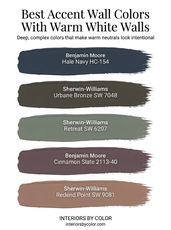
Best Accent Wall Colors at a Glance
| Room | Accent Color Family | Paint Color to Try | Why It Works |
|---|---|---|---|
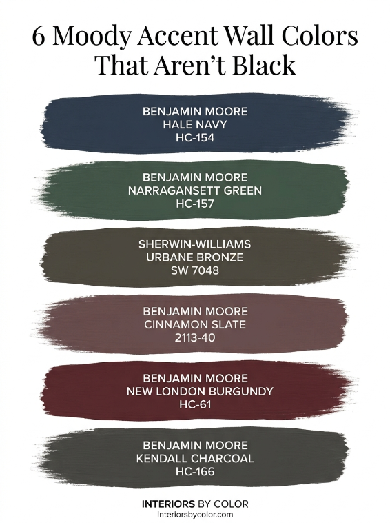
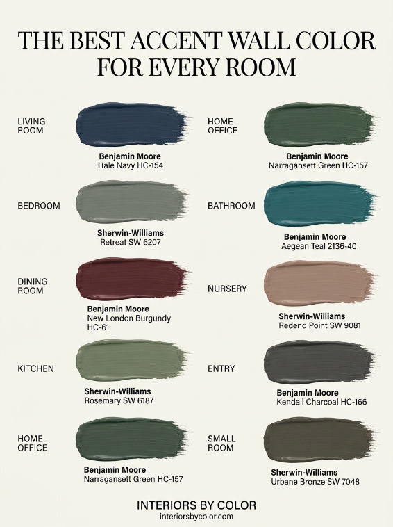
| Living room | Deep navy | Benjamin Moore Hale Navy HC-154 | Creates a strong architectural focal point |
| Living room | Brown-black | Sherwin-Williams Urbane Bronze SW 7048 | Warm alternative to charcoal |
| Bedroom | Muted green | Sherwin-Williams Retreat SW 6207 | Restful and earthy |
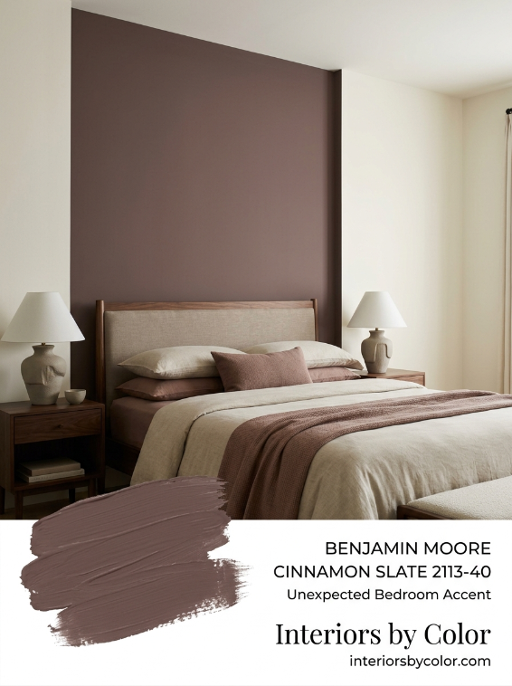
| Bedroom | Plum-brown | Benjamin Moore Cinnamon Slate 2113-40 | Moody without looking harsh |
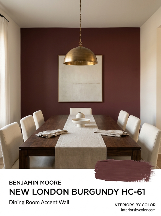
| Dining room | Burgundy | Benjamin Moore New London Burgundy HC-61 | Rich and intimate |
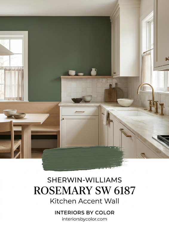
| Kitchen | Olive green | Sherwin-Williams Rosemary SW 6187 | Works beautifully with wood and stone |
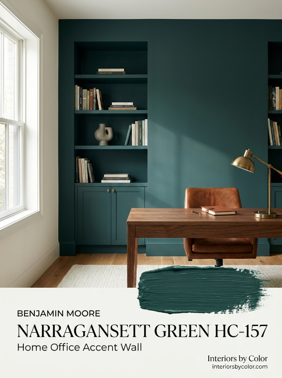
| Home office | Deep blue-green | Benjamin Moore Narragansett Green HC-157 | Sophisticated and focused |
| Bathroom | Dark teal | Benjamin Moore Aegean Teal 2136-40 | Adds depth to a small room |
| Nursery | Muted clay | Sherwin-Williams Redend Point SW 9081 | Softer than conventional pink |
| Entryway | Charcoal | Benjamin Moore Kendall Charcoal HC-166 | Gives a transitional area definition |
| Powder room | Deep aubergine | Benjamin Moore Dark Purple 2073-10 | Makes a small room intentionally dramatic |
| Guest room | Earthy green | Benjamin Moore Boreal Forest AF-480 | Comfortable and cocooning |
What Makes a Good Accent Wall Color?
A good accent color needs enough contrast to be noticeably different from the surrounding walls.
That doesn’t necessarily mean choosing an extremely dark color.
A soft sage wall surrounded by warm off-white can be an accent wall. So can terracotta against beige, dusty plum against cream or chocolate brown against a pale mushroom neutral.
The most successful combinations usually have a clear relationship between the two colors.
Warm walls generally work naturally with warm accent colors. Think cream with olive, beige with brown or warm white with terracotta.
Cooler walls can handle cooler blues, blue-greens and charcoals.
But undertone matters more than simply categorizing paint as “warm” or “cool.”
1. Best Living Room Accent Wall Color: Deep Navy
One of the easiest places to use a strong accent color is the living room.
And navy remains one of the most dependable choices.
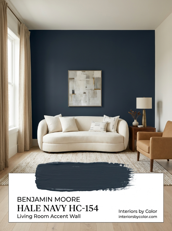
Try: Benjamin Moore Hale Navy HC-154
Hale Navy is a very dark, classic navy with an LRV of 8.36.
It provides enough contrast to establish a focal point without the severity that pure black can sometimes introduce.
Use it on:
- the fireplace wall
- the wall behind a sofa
- built-in shelving and the surrounding wall
- a wall containing substantial architectural detailing
Hale Navy works particularly well with warm whites, medium and dark timber, camel leather, natural linen and antique brass.
Why it works: Navy gives the eye somewhere to land. In an otherwise pale living room, that visual weight can make the furniture arrangement feel much more deliberate.
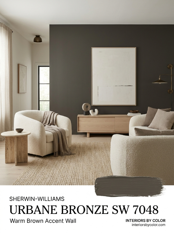
Another option: Sherwin-Williams Urbane Bronze SW 7048
For a warmer living room, skip blue altogether.
Urbane Bronze SW 7048 is a very deep brownish gray with an LRV of approximately 8. It is especially effective alongside pale wood, stone, leather and warm neutrals.
Choose Urbane Bronze when your living room contains beige, greige, oak, walnut, travertine or other earthy materials.
2. Best Bedroom Accent Wall Color: Muted Green
Bedrooms don’t necessarily need to be pale.
In fact, a dark wall behind the bed can visually anchor the bed and make the room feel more enclosed and restful.
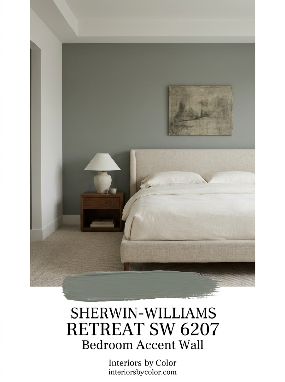
Try: Sherwin-Williams Retreat SW 6207
Retreat is a subdued green that feels considerably more sophisticated than a bright botanical green.
Use it behind a timber, upholstered or linen bedhead and keep the remaining palette restrained.
Pair it with:
- warm off-white
- oatmeal
- natural oak
- walnut
- flax linen
- muted brown
- aged brass
Why it works: Green introduces color without demanding the same attention as brighter reds, yellows or highly saturated blues.
For something different: Benjamin Moore Cinnamon Slate 2113-40
Cinnamon Slate is particularly interesting for bedrooms because it sits somewhere between muted plum and brown.
Benjamin Moore describes it as a combination of heathered plum and velvety brown, and its LRV of 19.71 makes it dark enough to create noticeable depth without approaching black.
This is an excellent alternative if you’ve already seen enough sage-green bedrooms.
Pair it with mushroom, taupe, creamy white, walnut and muted rose.
3. Best Dining Room Accent Wall Color: Burgundy
Dining rooms can tolerate considerably more drama than many other rooms.
That’s why deep red is worth reconsidering.
Not primary red. Not fire-engine red.
Think wine, oxblood, merlot and burgundy.
Try: Benjamin Moore New London Burgundy HC-61
A deep burgundy accent wall can make a dining space feel richer and more intimate, particularly in the evening.
It looks especially good with:
- dark timber dining tables
- walnut
- cream walls
- warm white
- brass
- aged bronze
- artwork in antique or timber frames
Why it works: Dining rooms are typically occupied for shorter periods and are often used under artificial evening light. That gives you more freedom to use a saturated color that might feel excessive throughout an entire open-plan living area.
If your dining room is already dark, don’t automatically rule burgundy out. A deliberately dark wall can often look better than trying to make a low-light room appear artificially bright.
4. Best Kitchen Accent Wall Color: Olive Green
The kitchen is one room where an accent wall needs to relate closely to fixed finishes.
Look at the benchtop, splashback, cabinets and flooring before choosing the paint.
Try: Sherwin-Williams Rosemary SW 6187
Rosemary is a deep, muted green that works particularly well in kitchens containing timber.
Consider it with:
- white or cream cabinetry
- oak cabinets
- natural stone
- soapstone
- warm marble
- brass hardware
- black accents
Why it works: Olive and forest greens sit comfortably beside the natural colors already present in wood and stone.
You can also repeat the accent color on a kitchen island or pantry cabinetry rather than creating a completely isolated green wall.
A softer alternative
If Rosemary feels too dark, look at muted mid-tone greens rather than immediately moving to pale sage.
An accent wall needs enough presence to actually function as an accent.
5. Best Home Office Accent Wall Color: Deep Blue-Green
A home office is one of the best places to experiment with darker paint.
Try: Benjamin Moore Narragansett Green HC-157
Narragansett Green sits in the sophisticated territory between navy, green and charcoal.
Use it behind a desk, on a wall of bookshelves or across built-ins and the wall behind them.
Pair it with warm white, cognac leather, walnut, oak and aged metals.
Why it works: Blue-green provides the visual seriousness of navy but feels less predictable.
For a small office, consider painting the shelves and wall the same color. Reducing the number of contrasting edges can make the installation look more architectural.
6. Best Bathroom Accent Wall Color: Deep Teal
Bathrooms offer an opportunity to use colors that might feel overwhelming in larger rooms.
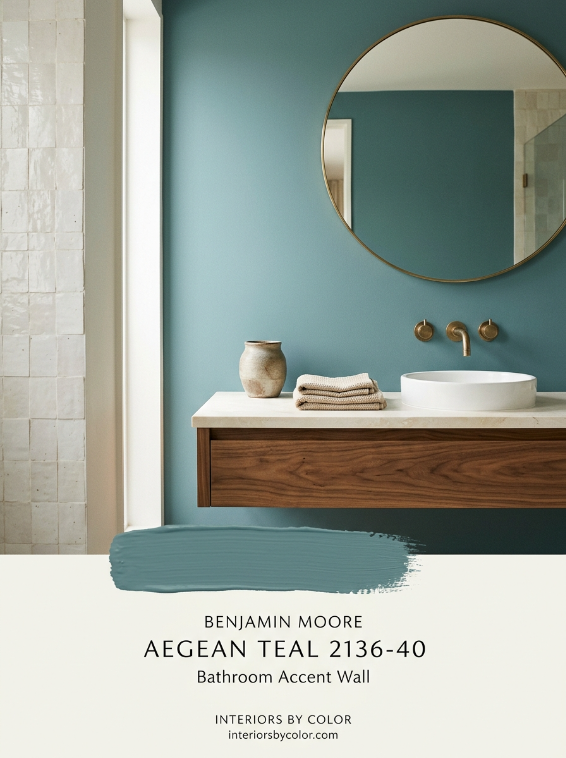
Try: Benjamin Moore Aegean Teal 2136-40
Aegean Teal is a muted blue-green rather than a vivid tropical teal.
That distinction is important.
The grayness in a muted teal makes it easier to combine with stone, tile and timber.
Try it with:
- creamy white tile
- warm marble
- walnut vanity cabinetry
- brushed brass
- off-white walls
- handmade-look ceramic tile
Why it works: Blue-green naturally contrasts with the pale hard surfaces commonly found in bathrooms while still feeling sophisticated.
In a bathroom, the vanity wall is often a better accent wall than a completely blank wall because the mirror, lighting and cabinetry give the color context.
7. Best Powder Room Accent Wall Color: Aubergine
A powder room doesn’t need to follow the same rules as a main bathroom.
It can be darker.
Much darker.
Try: Benjamin Moore Dark Purple 2073-10
Deep aubergine gives a powder room a jewel-box quality without relying on predictable navy or charcoal.
Use warm lighting and combine it with marble, warm white, brass or dark timber.
Why it works: There is little advantage in trying to make every tiny powder room appear large. Using a dark saturated color can make its small scale feel deliberate instead.
In particularly small powder rooms, consider going beyond a single accent wall and painting the entire room—including trim—in variations of the same deep color.
8. Best Nursery Accent Wall Color: Muted Clay
A nursery doesn’t have to be pastel pink, pale blue or mint.
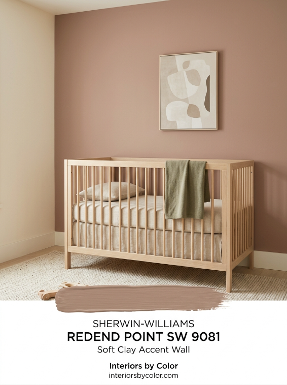
Try: Sherwin-Williams Redend Point SW 9081
Redend Point is a subdued earthy blush-clay shade that can create warmth without making the room look overly sweet.
Pair it with cream, oatmeal, pale oak, muted green and natural textiles.
Why it works: A muted earth tone can transition from nursery to child’s room far more easily than a strongly themed baby color.
It is also soft enough to provide contrast against creamy walls without creating an extremely dark focal wall.
9. Best Entryway Accent Wall Color: Charcoal
An entryway often needs definition more than it needs decoration.
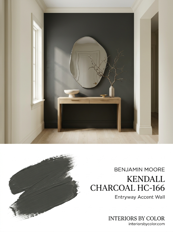
Try: Benjamin Moore Kendall Charcoal HC-166
A charcoal wall provides structure and gives mirrors, consoles and artwork a strong background.
It’s particularly effective where an entry opens directly into a pale living area.
Pair it with oak, walnut, creamy white, black metal and warm brass.
Why it works: The darker entry creates visual compression. The adjoining lighter room can consequently feel more open when you move into it.
This is also an excellent strategy for defining an entry where the house doesn’t have a separate foyer.
10. Best Guest Bedroom Accent Wall Color: Forest Green
Guest rooms are ideal for deeper, slightly more enveloping colors.
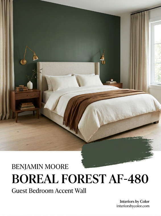
Try: Benjamin Moore Boreal Forest AF-480
A dark forest green behind the bed works with both contemporary and traditional interiors.
Combine it with:
- cream
- oatmeal
- tan
- walnut
- antique brass
- natural linen
Why it works: Forest green is dark enough to make the room interesting but versatile enough to work with neutral bedding and furniture.
Unlike a highly fashionable bright color, a muted forest green is also relatively easy to update around.
11. Best Small-Room Accent Wall Color: Warm Brown
Dark brown deserves far more attention as an accent color.
It provides much of the drama of charcoal or black but usually feels warmer.
Try: Sherwin-Williams Urbane Bronze SW 7048
Sherwin-Williams classifies Urbane Bronze as a neutral and describes it as a brownish gray. Its published digital color data gives it an LRV of about 8.1.
It is particularly good beside light woods, which Sherwin-Williams itself recommends as a complement.
Try it in a small:
- reading room
- den
- office
- guest room
- entry
- snug
Pair it with mushroom, warm white, flax, cream and pale oak.
12. Best Unexpected Accent Wall Color: Muted Plum
If your home is already full of beige, white and sage, consider plum.
Not bright purple.
Look for a muddy, browned-down plum.
Try: Benjamin Moore Cinnamon Slate 2113-40
Cinnamon Slate is one of the more useful examples because the brown component prevents it from reading as obviously purple.
Benjamin Moore pairs it with pale neutrals including Cloud Cover OC-25 and Calm OC-22.
Use it in a bedroom, dining room, reading room or sophisticated living room.
Why it works: Plum creates contrast with green, complements warm timber and provides color without the familiarity of navy or charcoal.
Which Wall Should Be the Accent Wall?
Choosing the right wall is just as important as choosing the color.
The accent wall should normally reinforce something the architecture or furniture is already telling you is important.
Good choices include:
- the wall behind the bed
- a fireplace wall
- the wall behind a dining table
- built-in cabinetry
- the wall behind a freestanding bath or vanity
- the wall behind a desk
- a wall framing an important piece of artwork
- the far wall at the end of an entry or hallway
Avoid choosing a wall simply because it is the easiest one to paint.
If your eye has no natural reason to look at that wall, making it dramatically darker can create an awkward focal point.
Should the Accent Wall Be Lighter or Darker?
Usually darker.
A darker color naturally advances visually and attracts attention, which is exactly what most people want an accent wall to do.
But there are exceptions.
In a very dark room, a warmer mid-tone accent color may work better than an extremely deep navy or charcoal.
You can also create a subtle accent using a color that is only a few shades deeper than the surrounding walls.
The important factor is intentional contrast, not darkness for its own sake.
How to Match an Accent Wall to Your Existing Wall Color
If your walls are warm white
Try:
- olive
- forest green
- burgundy
- terracotta
- warm brown
- muted plum
- navy
Warm white is one of the easiest backgrounds for an accent wall because it works with both earthy and saturated colors.
If your walls are beige
Try:
- chocolate brown
- olive
- deep green
- burgundy
- muted clay
Avoid extremely cool blue-grays unless there is another element in the room connecting the two.
If your walls are greige
Try:
- deep green
- brown-black
- muted navy
- charcoal
- plum
Pay particular attention to whether your greige leans warm or cool.
If your walls are gray
Try:
- navy
- blue-green
- burgundy
- charcoal
- deep muted green
If both colors contain strong gray undertones, however, the room can become flat. Bring in warmer wood, textiles or metals to restore contrast.
If your walls are already colorful
Instead of adding another unrelated color, consider using a much darker version of the existing hue.
For example:
pale green walls → forest-green accent
powder-blue walls → deep navy accent
soft blush walls → burgundy accent
pale terracotta walls → deep brown accent
This creates a tonal scheme rather than a collection of competing colors.
The Accent Wall Mistakes to Avoid
Choosing the wall before considering the room
Start with the focal point, not the paint.
Using a color that appears nowhere else
The accent wall shouldn’t feel pasted onto the room.
Repeat the color subtly through artwork, textiles, upholstery or accessories.
Making the contrast too weak
If the accent color is only marginally different from the surrounding wall, the result can look accidental.
Ignoring undertones
A blue-green wall beside a yellow-beige wall can behave very differently from the same blue-green beside a clean white.
Assuming dark paint makes a small room smaller
Dark paint changes the perception of boundaries, but that isn’t automatically a disadvantage.
A dark wall can add depth and give a small room much more character.
Copying a paint color directly from a photograph
Light exposure, camera processing and screens all change color.
Benjamin Moore explicitly warns that on-screen representations can differ from actual paint colors.
Always test real paint in the room before committing.
Are Accent Walls Still in Style?
Yes—but the style of accent wall has changed.
The highly contrasting feature wall chosen almost at random is less compelling than an accent wall that emphasizes architecture.
The more current approach is to use color to define something:
a fireplace, bed, built-in bookcase, dining zone, vanity, architectural recess or entire end of a room.
There has also been a shift away from predictable bright feature colors toward more complex shades: muddy greens, burgundy, chocolate brown, deep blue-green, clay, plum and brown-black.
That makes the accent wall feel integrated with the interior rather than added as decoration.
The Best Accent Wall Colors to Sample
If you want a shortlist before buying samples, start here:
Deep blues
- Benjamin Moore Hale Navy HC-154
- Benjamin Moore Narragansett Green HC-157
Deep greens
- Sherwin-Williams Retreat SW 6207
- Sherwin-Williams Rosemary SW 6187
- Benjamin Moore Boreal Forest AF-480
Warm dark neutrals
- Sherwin-Williams Urbane Bronze SW 7048
- Benjamin Moore Kendall Charcoal HC-166
Earthy warm colors
- Sherwin-Williams Redend Point SW 9081
Plum and burgundy
- Benjamin Moore Cinnamon Slate 2113-40
- Benjamin Moore New London Burgundy HC-61
The best choice isn’t necessarily the darkest or most fashionable color. It is the one that connects the accent wall to the flooring, furniture, fixed finishes and light already present in the room.
Frequently Asked Questions
What is the best color for an accent wall?
Deep navy, muted green, forest green, warm brown, burgundy, terracotta, charcoal and muted plum are some of the most versatile accent wall colors. The best choice depends on the room’s existing wall color, undertones, lighting and furnishings.
What is the most popular accent wall color?
Dark blue and green remain extremely versatile choices, but warmer colors such as brown, burgundy, clay and plum provide an alternative to the navy-and-sage palettes that have dominated interiors in recent years.
Should an accent wall be darker than the other walls?
In most cases, yes. A darker accent color creates a clearer focal point. However, an accent wall can also be created with a stronger mid-tone or a more saturated version of the surrounding wall color.
What wall should be an accent wall?
Choose a wall that already has a visual reason to attract attention. The wall behind a bed, fireplace, dining table, vanity, built-in shelving or major artwork is usually more successful than an arbitrary blank wall.
Can you have an accent wall in a small room?
Yes. Dark accent walls can work extremely well in small bedrooms, offices, powder rooms and entryways. Rather than simply trying to make the room appear larger, use the accent color to create depth and give the space a clear focal point.
Should an accent wall have a window?
It can, particularly when the window is symmetrical or architecturally attractive. However, a wall with multiple doors, windows or openings can become visually fragmented, so a simpler wall may provide a stronger result.
Can the TV wall be an accent wall?
Yes. A deep charcoal, navy, brown-black or dark green can be particularly effective behind a television because the dark screen creates less contrast against the wall.
Do accent walls make a room look smaller?
Not necessarily. Dark colors can make boundaries less visually obvious and create a sense of depth. The effect depends on the wall chosen, natural light, surrounding color and how much contrast exists between the walls.
Should the accent wall match the sofa?
It doesn’t need to match. In fact, some contrast is usually preferable. Instead, look for a relationship between the undertones of the wall, sofa, rug, flooring and other major elements.
Can you use two accent walls?
Usually one clearly defined focal area is stronger. If you want to carry the color farther, consider color-drenching an architectural section, painting built-ins the same color or using the darker shade throughout a small room instead of creating two unrelated feature walls.
The best accent walls don’t look like someone simply decided that one wall needed a different color.
They make sense.
A deep navy fireplace wall gives a living room structure. Forest green grounds a bed. Burgundy makes a dining room feel intimate. Olive connects a kitchen to timber and stone. Plum gives a neutral room an unexpected layer of color.
Choose the wall first, understand what you want it to do, and then choose the color.
That’s what turns a painted feature wall into part of the room’s design.
See more color schemes:
- Best Wall Color for Bedrooms
- Best Warm Neutral Paint Colors for Living Rooms With Low Light
- Sherwin Williams Neutral Paint Colors
- How to Choose Paint Colors for an Open-Plan House
- Best Paint Colors to Sell a House Fast
- Best Bedroom Paint Colors for Better Sleep: Designer-Approved Palettes
- Best Exterior Color Schemes for Curb Appeal in 2026
- Best Living Room Color Combinations That Actually Work in Real Homes
- Best Accent Wall Colors for Every Room (And Why They Work)
- Best Bathroom Color Schemes for Small Spaces
- Best Kitchen Cabinet Color Combinations: Upper vs. Lower
- How to Choose a Whole House Paint Color Scheme (Step-by-Step)