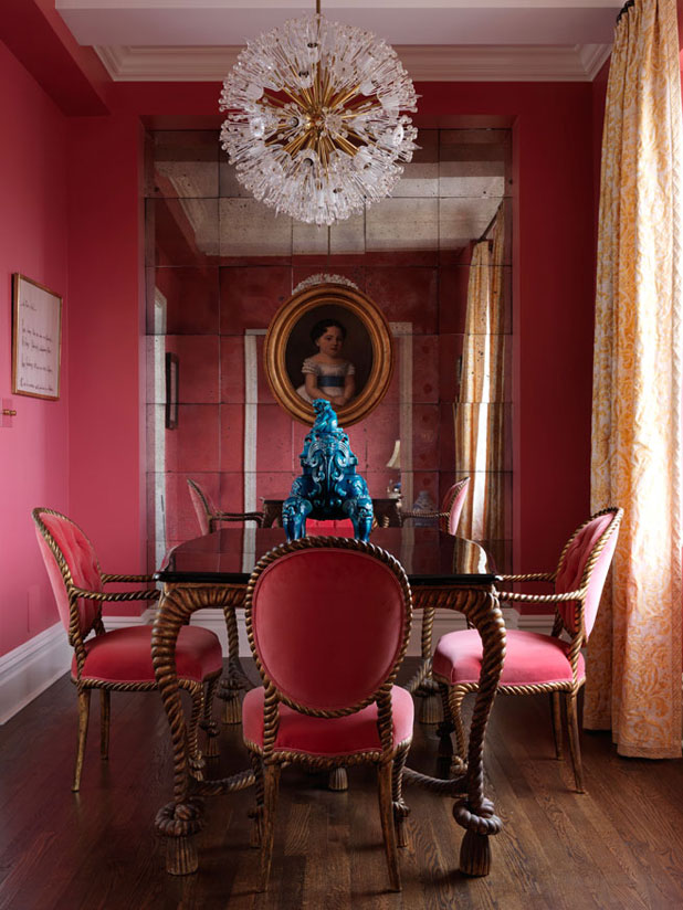
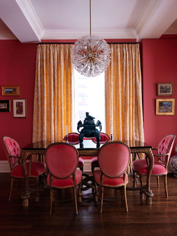
Pink on pink dining room created by New York City-based interior designer Elizabeth Bauer Watt.
The paint color came first and then I found a velvet that matched the wall color… not an easy task!
Since the color is so strong—it has so much weight and personality to it!—I made sure that the other elements in the room would help balance it by being light or reflective. For example, the yellow Fortuny fabric on the drapery is of a much lighter weight;the tabletop, although dark, is a high-gloss lacquer and therefore reflective. Same for the mirrored back wall.
Pantone/Fine Paints of Europe 18-1649 “Deep Sea Coral.” I love the Pantone paint deck because it offers such a depth of colors.
Via: HouseBeautiful.com
Designer: Elizabeth Bauer Watt
Photo: Jonny Valiant


Wonderful!
Please, where can I find this painting (18-1649)? What is its conversion in other systems used to prepare the mixture from home painters? Thanks a lot if you can help me.
Not sure sorry but I will put the question out there for others who may know to answer – Good luck it is a wonderful color!