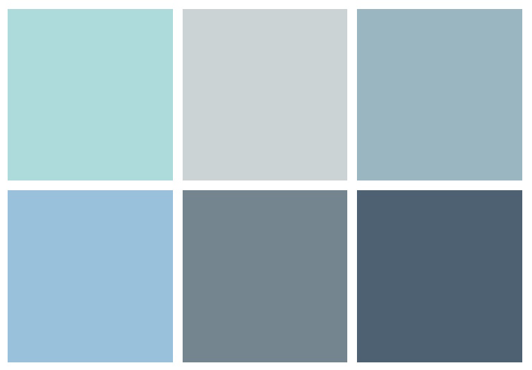
Behr’s 6 Most Popular Blue Paint Colors.
The most popular paint colors from Behr’s blue color family.
Paint Colors
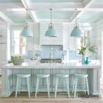
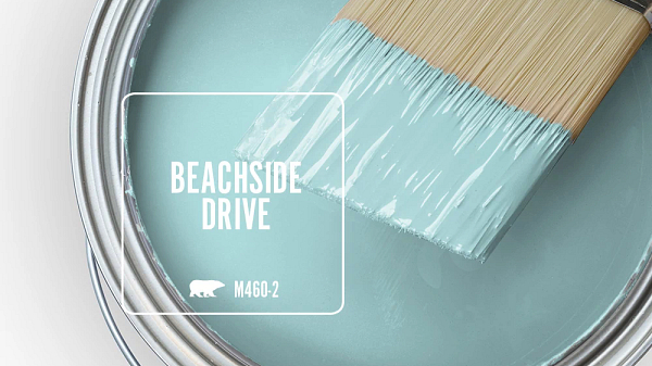
Behr Beachside Drive
Behr Beachside Drive – A promenade down Beachside Drive leads you through an ocean-inspired mix of sky blue, seafoam green and sand from the shore- it’s the perfect getaway color.
Sky blue – A light blue that evokes the daytime sky. It gives a sense of openness, airiness, and tranquility. Sky blue is often quite pale to further evoke clouds and daylight. Using it on walls can make a room feel more spacious.
Seafoam green – A soft, pale green with hints of blue, similar to the colors found in ocean foam. It calls to mind relaxation and the soothing sights and sounds of lapping waves. Seafoam green gives a subtle oceanic feel without being too bold or overpowering.
Sand – Off whites, beiges, tans, and other pale neutrals that mimic the color of beach sand. These warm hues are calming and welcoming. They act as a subtle, natural backdrop that lets the other accent colors shine. Sand colors connect back to the beach through texture as well if used on matte paints that resemble the roughness of sand itself.
In summary, this beachy color scheme relies on light, desaturated versions of blues, greens, and tans. It uses colors actually seen by the ocean to recreate sensory memories of being near the water. The serene, laidback energy of a beach vacation comes through via the cool blue skies, foamy green waves, and endless sandy shores. It’s a transportive yet easygoing color palette for a relaxed aesthetic.
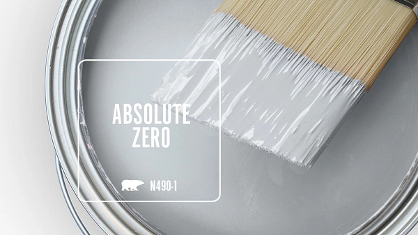
Behr Absolute Zero
Behr Absolute Zero – Proof that neutrals are anything but boring, Absolute Zero is a light blue-gray that illuminates any space.
Light pale gray – The very light gray base evokes a sense of calm, balance, and subtlety. Especially as a pale, muted shade, the gray takes on an airy, neutral quality. It recedes into the background rather than shouting for attention. This allows the color to provide a blank, elegant canvas for other brighter accent colors and décor.
Blue-gray – The addition of slight blue undertones to the gray adds a bit of character and visual interest without drastically changing the overall muted effect. It also connects to blue’s soothing, peaceful qualities. Compared to a true neutral gray, the blue-gray reads as cleaner, cooler, and more refined.
Illuminating – Despite being incredibly pale and neutral, the subtle blue in this gray helps it feel bright and light-reflecting rather than dreary or dull. It lifts up a space with its peaceful luminosity. The color captures light beautifully to create almost an internal glow.
In summary, this analysis shows how the right pale gray can serve as a calm, harmonious base for room décor. It pulls off seeming contradictory feats – being neutral yet interesting, pale yet luminous. The result is a reflective, illuminating color that brings tranquility and balance rather than boredom.
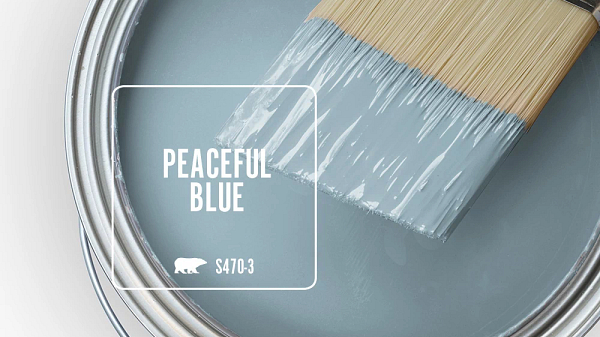
Behr Peaceful Blue
Behr Peaceful Blue – Peaceful Blue is a quiet blue-gray. It crafts a relaxing mood that captures the carefree and hushed beauty of harmonious circumstances.
Pale blue-gray – The lightness immediately gives an airy, soothing feeling. It avoids intensive saturation while maintaining more interest than a plain pale gray. The blue hints add a cool tranquility reminiscent of blue skies.
Quiet – This descriptor reinforces the gentle, receding nature of the color. It does not shout or demand attention. Instead it sits quietly in the background, setting a peaceful stage for other décor without competing.
Crafts a relaxing mood – The muted, desaturated tone allows the color to create a laidback vibe. Its pale neutrality brings down the visual noise or busyness of a room. This enables it to actively craft and encourage relaxation within a space.
Captures carefree beauty – The blue-tinged gray evokes hazy blue skies and lazy, beautiful days by the clouds. Its quietness reconnects to the calm and freedom of having no worries or responsibilities weighing on you.
Harmonious circumstances – This ties back to the tranquil feeling the paint promotes. It speaks to balance, harmony, and an overall sense of things coming together seamlessly without disruption.
In summary, even plain colors like pale blue-gray carry connotations and impressions. This one uses its neutrality and quietness to actively set a peaceful, carefree mood reminiscent of lazy days under calm blue skies. The color both captures and crafted relaxation in spaces through its connection back to harmonious, beautiful scenarios of hazy tranquility.
Behr Charismatic Sky
Behr Charismatic Sky – Charismatic Sky is a light blue that speaks of happiness and utter contentment. It’s lazy summer days on a picnic blanket watching fluffy clouds traverse the heavens.
The sky blue shade specifically connects back to wide open skies, lightness, and airiness. It feels friendly and approachable.
Light blue – The lightness keeps it soft, gentle, and subtle rather than harsh. It has an inherent warmth and sweetness from being a lighter, more faded blue. The pale tone also enhances feelings of relaxation and freedom.
Happiness & utter contentment – The cheerful optimism of sky blue enhances positive emotions like joy, satisfaction, and contentedness. Its ability to recall peaceful, leisurely days lends itself to happiness and fulfillment.
Lazy summer days – This descriptor further cements the color’s association with carefree relaxation during the warmer months. The fanciful phrase helps you picture hazy blue skies overhead as you laze without a concern under the clouds.
Watching fluffy clouds – The whimsical detail reinforces the color’s soft dreaminess with images of airy clouds drifting by. It’s very calming and pleasant imagery that enhances the positive feelings.
In summary, a happy sky blue can symbolize the very emotions and atmosphere it hopes to evoke in spaces – cheerfulness, fulfillment, leisure, and harmony. It uses summery outdoors imagery to lend itself to contentment and joy.

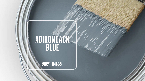
Behr Adirondack Blue
Behr Adirondack Blue – A stable and reassuring slate blue, Adirondack Blue echoes the calm respite of natural settings and refined sophistication.
Slate blue – A muted, grayish blue that still reads as a cooler tone. Its subtle saturation gives it more depth than a pale pastel blue. Slate blue has an inherent sophistication – it avoids seeming too bold or playful.
Stable – As a darker, more saturated blue, slate blue feels grounded and steadfast. Unlike brighter blues, it promotes calm rather than energy. Its grayish undertone reinforces a feeling of composure and restraint.
Reassuring – The maturity of slate blue makes it seem trustworthy and comforting. Its tranquil quality brings reassurance that it will always maintain a sophisticated, put-together atmosphere.
Echoes calm natural respite – Slate blue calls to mind serene natural imagery like mountain lakes at dusk or a forest under a cloudy twilight sky. These are grounded yet peaceful settings, reinforcing the color’s stability and tranquility.
Refined sophistication – From its description as “slate” to its muted darkness, this blue carries an air of intelligence and elegance. It effortlessly elevates spaces without overpowering them.
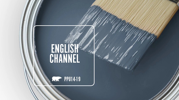
Behr English Channel
Behr English Channel – The color of deep, dark seas English Channel pays homage the expanse of Atlantic Ocean that separates two important lands.
Deep, dark blue – This describes a rich, intensely saturated shade of blue that mimics depths of open ocean waters. The darkness evokes mystery and adventure, like the unseen worlds in the sea’s depths. It feels enveloping and endless.
The color of deep seas – Specifically calling out bodies of water like the English Channel grounds the color in real-world landscapes. This oceanic blue would capture the living energy and opaque beauty of waves in motion.
Pays homage…Atlantic Ocean – The homage relates the rich blue back to the vast, imposing Atlantic between North America and Europe. This gives historic weight and almost mythic proportions to the color.
Separates two important lands – Framing the Atlantic Ocean and its bluish depths as dividing two entire continents enhances the feeling of an epic, grand color. It takes on political and cultural significance spanning populations.