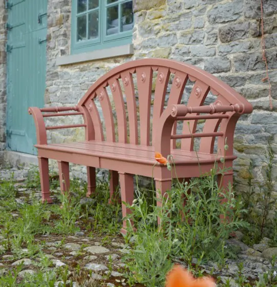
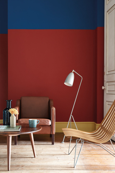
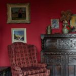
Red Interior Color Schemes for 2023. Red is a strong and vibrant colour to choose for an interior, it created a statement, it is loud and radical. Red creates contrast and demands the viewers attention. Red is a designers valuable tool to create dynamic contrast.
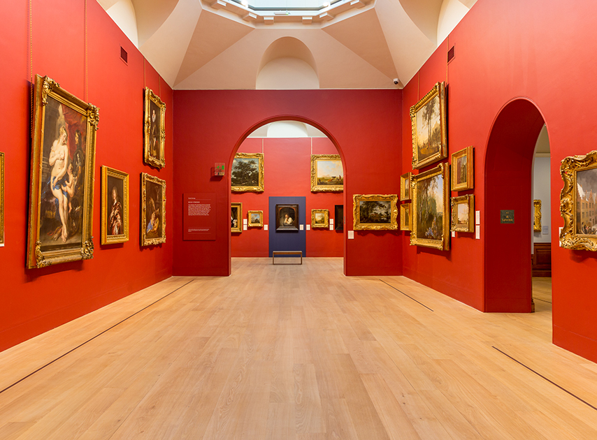
The use of red paint colour is most effective in small spaces like an entrance, bathroom, hall or study or in massive and impressive rooms like dining rooms and galleries.
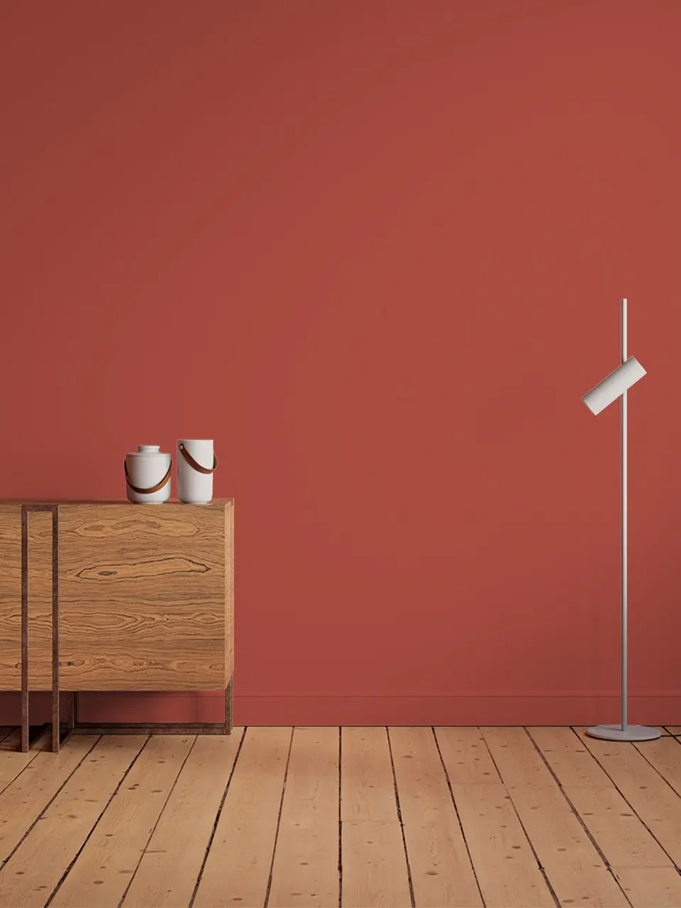
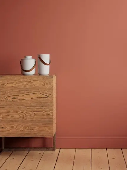
Consider using a muted red with a touch of yellow for dining rooms, it looks great when partnered with a crisp white.
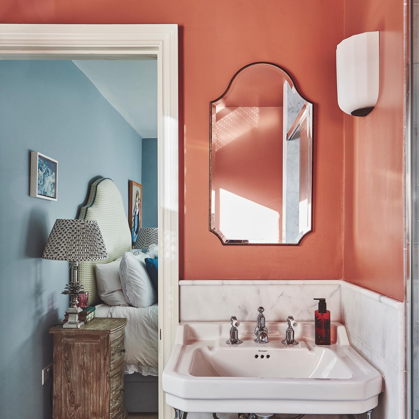
Red Painted Bathroom Interior Design
I’m loving warm red terracottas with blue tones at the moment. This picture features a spare en-suite in a West London project. Edward Bulmer paint ‘s Etruscan Brown is such an inviting colour for a bathroom and against Little Greene Paint Company ‘s Bone China Blue it really stands out. I always think you can be a bit braver with colours in a spare room.
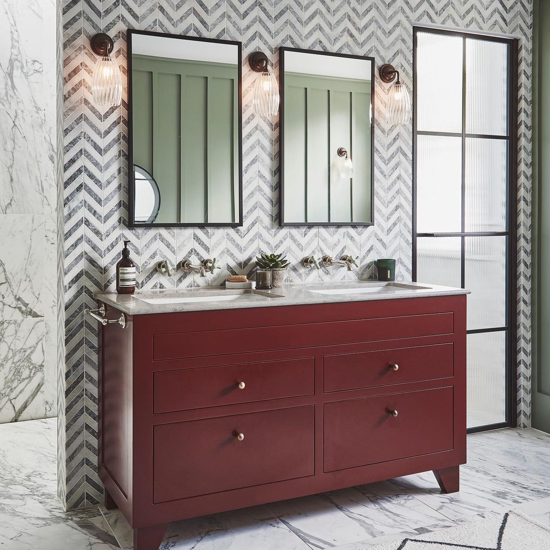
The red vanity in this bathroom provides a focal point among the herringbone feature wall and marble flooring.
This double vanity unit packs a punch at our new build project in Gerrards Cross. This principle en-suite is simple yet full of interesting details, colours and textures.
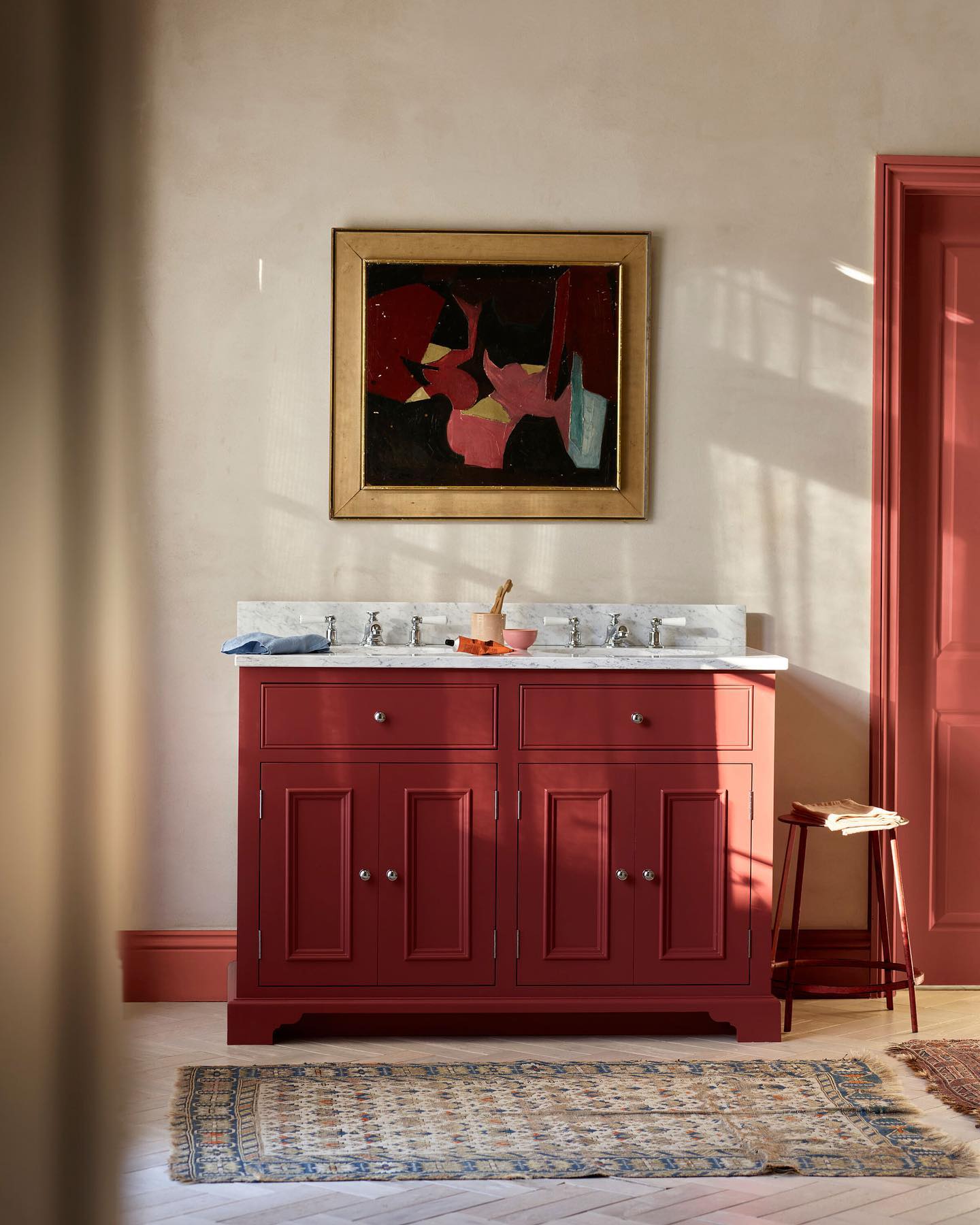
Artwork offers a natural springboard for setting the colour palette of a room.
In this bathroom, the abstract oil painting inspired us to use Rhubarb – our new seasonal colour – for the woodwork, and Paprika for our Chichester washstand.
The soft, earthy hue of Cotswold on the walls completes the balanced palette.
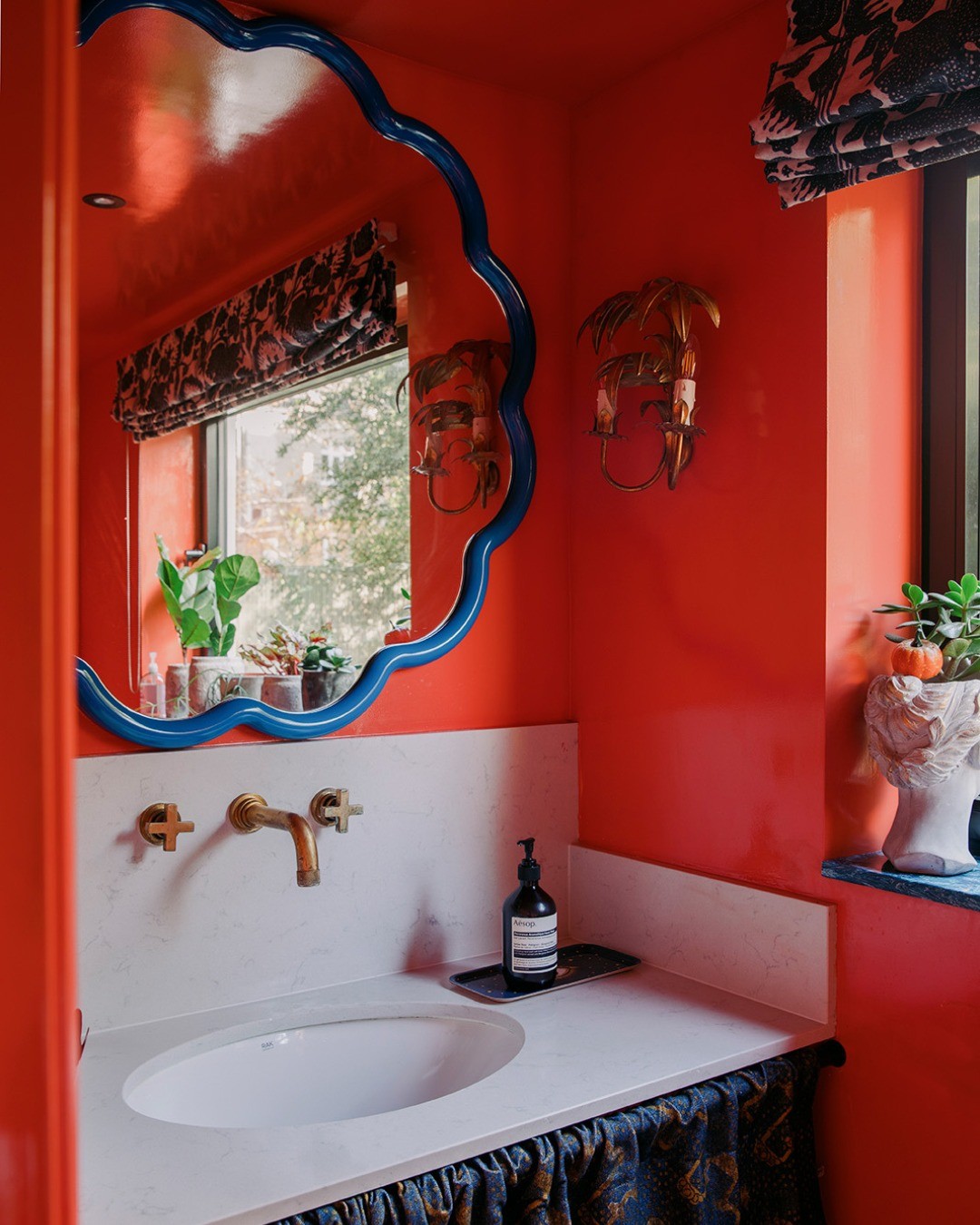
Red paint color for the walls and ceiling really bring this small bathroom to life! This cherry red looks great with true blue accents. Via Inigo House.
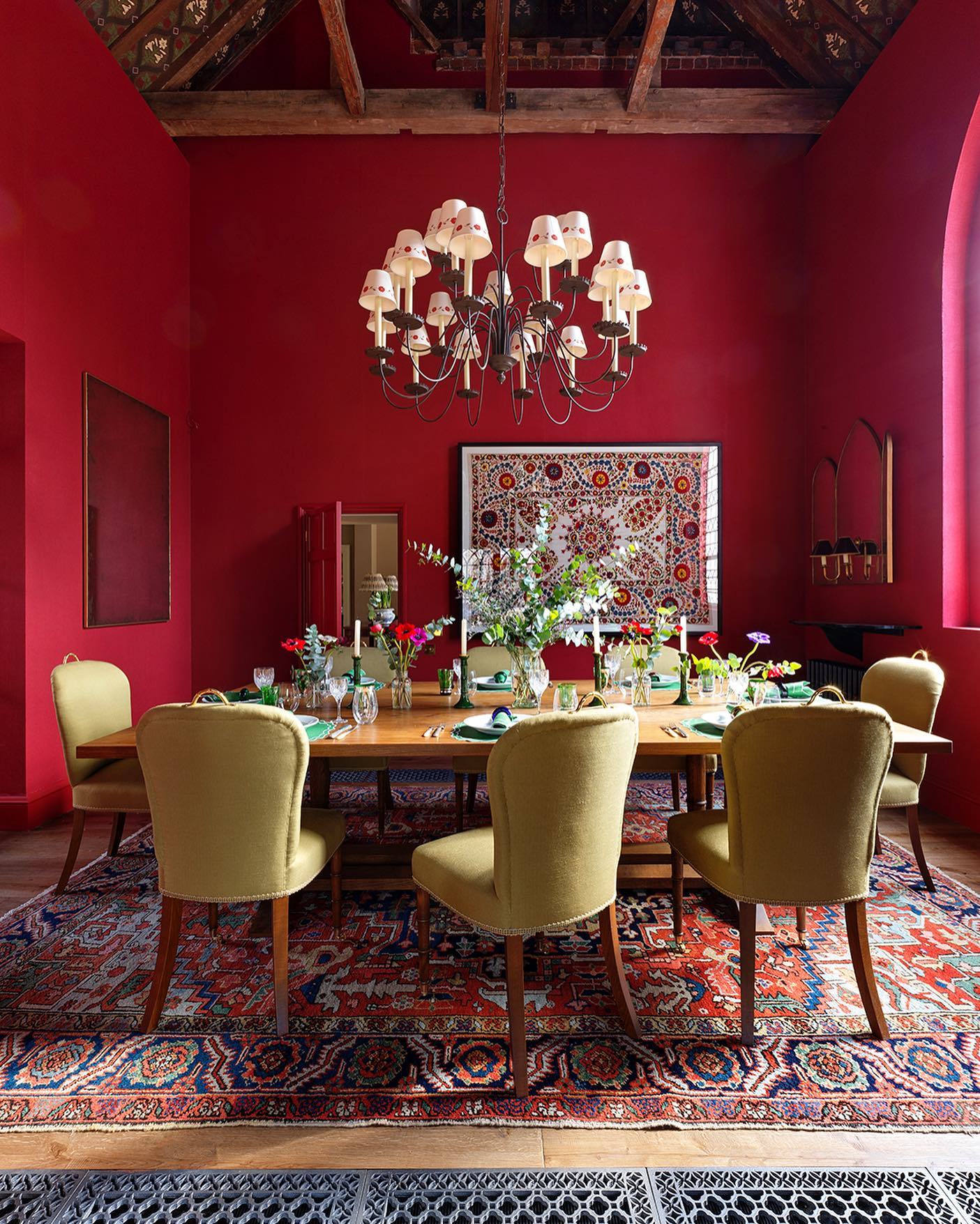
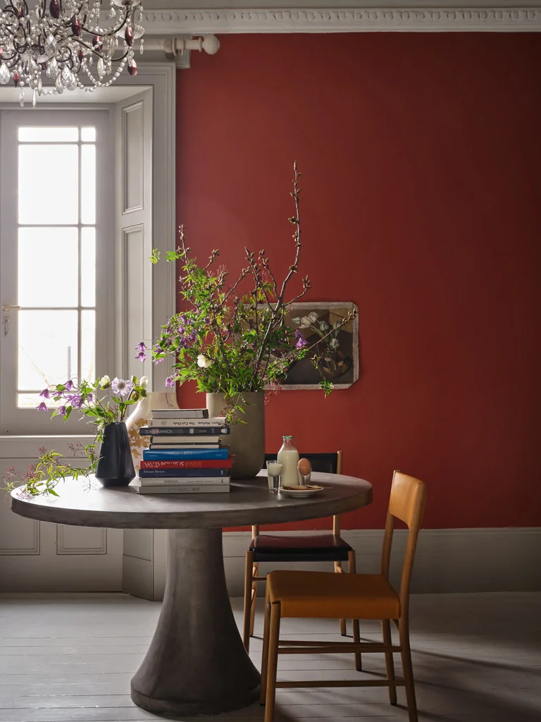
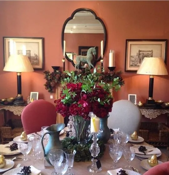
Red Dining Room Colour Schemes for 2023
A luxurious red dining room. A rich dining room in a once cold and unused space. It was originally a chapel so when we needed to get more warmth in to the room we stayed on theme and laid brass pipes and original church floor grills to distribute the heat throughout and the room is now warm and welcoming. We wanted the walls to have depth and texture so we paper backed hessian and then painted it a deep dining room red to bath the diners in flattering light. Bespoke mirrors were added to bounce candlelight around the room. via salvesengraham.
Deep russet hues create a cosy atmosphere, the walls painted here using the shade ‘Toffee’, which is just one of our new Rose Uniacke Paint shades.
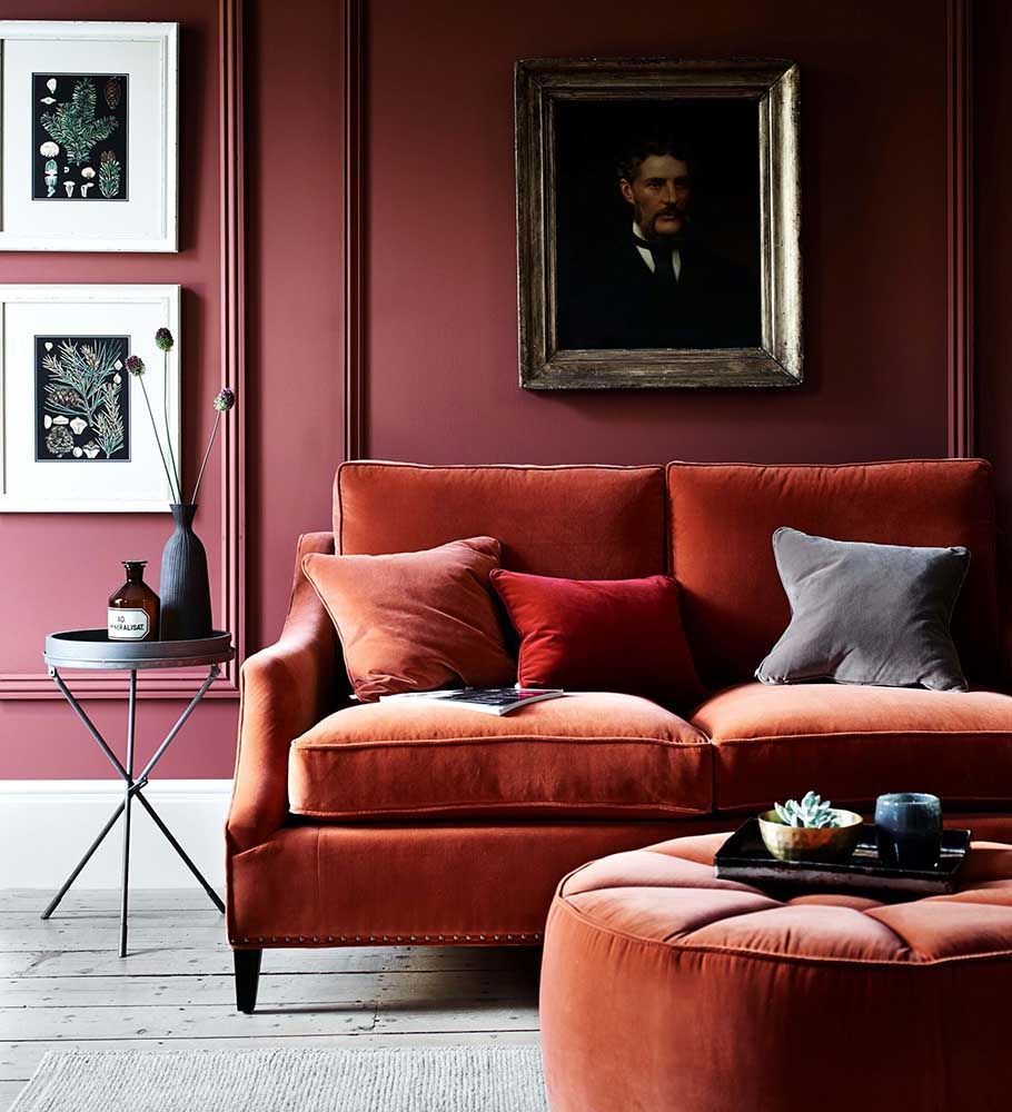
A place for relaxation and reflection, the humble sofa can often be overlooked when it comes to making a statement in interior design. However, tactile velvet sofas are the perfect choice for bringing a touch of luxury and drama to living rooms.
English Home Mag
With an unapologetic intensity and extraordinary depth of colour, this dramatic paint can be used in rooms of all sizes. For an incredibly smart and sophisticated interior, go bold with Crimson’s immersive richness.
Paint: Crimson by Zoffany
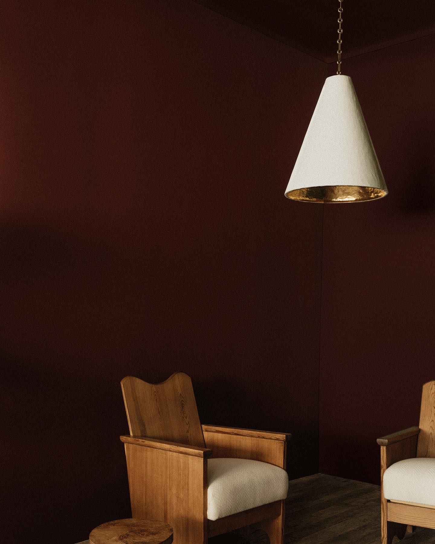
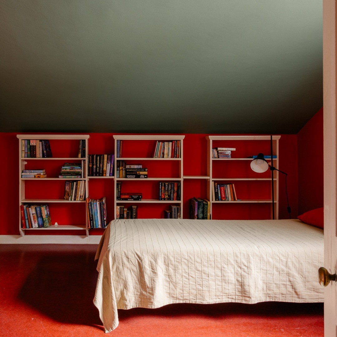
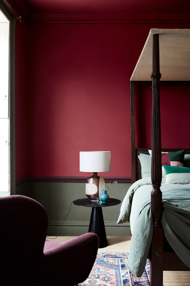
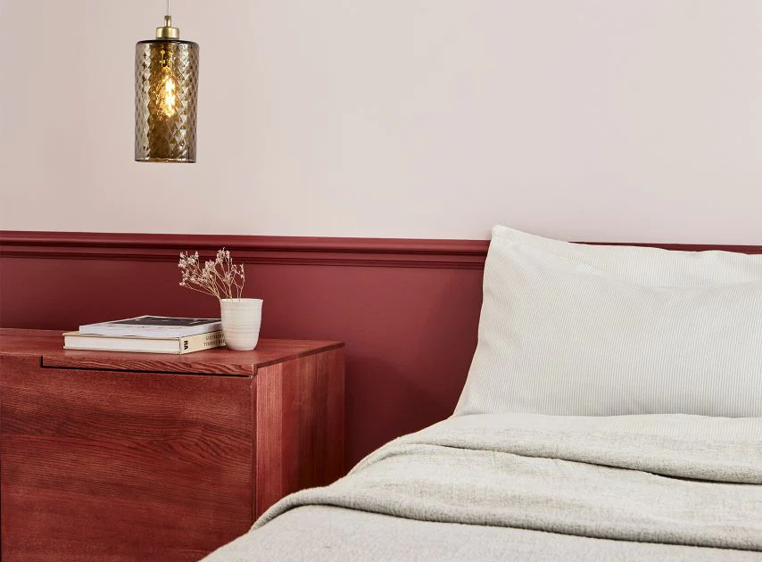
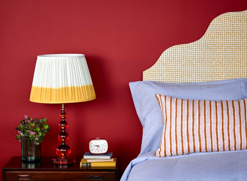
Red Interior Designs for Bedrooms
An attic bedroom with red painted walls and floor.
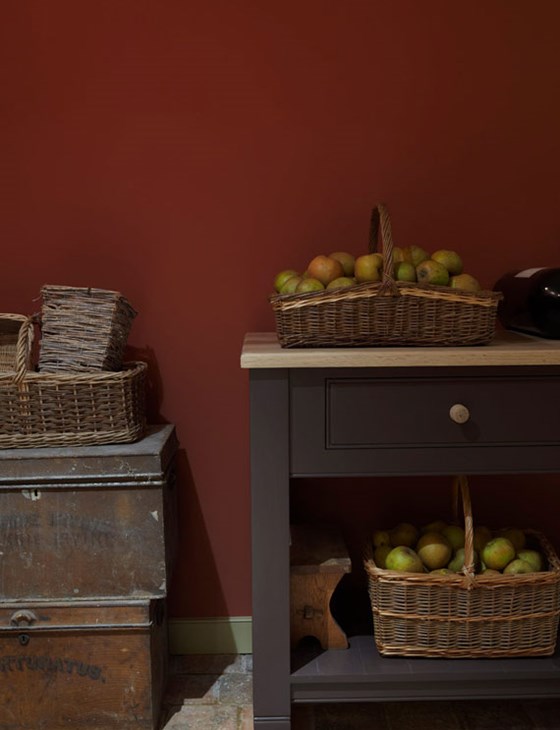
Red Paint Colours for Interiors in the UK 2023
Farrow & Ball Rectory Red
This rich clean red is named after the charming village houses built over the years for the clergy. Rectory Red is a blackened and aged version of Blazer and feels much more sophisticated, especially when contrasted with Warm Neutrals such as Joa’s White. It is a warming colour which will intensify when used in a small space to create the most welcoming of rooms.
Farrow & Ball Incarnadine
This richest crimson originally takes its name from Latin, but is now a much used term for crimsons and reds. Similar to the deep glossy red used by David Hicks at Barons Court in the 1970s, Incarnadine is unashamedly classic and glamorous. It can be used to sumptuous effect in halls when offset with Tanner’s Brown on woodwork, or feel more edgy and graphic when paired with All White.
Farrow & Ball Red Earth
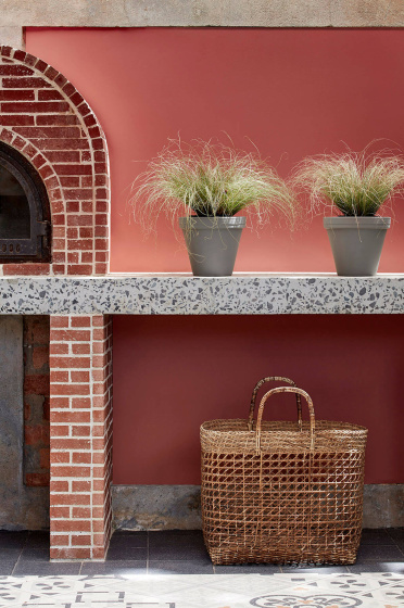
This light terracotta hue takes its name from the very soil beneath our feet. Red Earth is a rich blend of red and yellow pigments which create a warm earthy feel in homes both old and new. Often best used in smaller spaces, this warm colour responds extraordinarily to the changes of light throughout the day, becoming deeper and cosier as the sun drops.
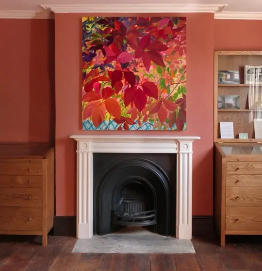
Farrow & Ball Picture Gallery Red
This timeless red is based on the rich colour of the magnificent gallery at Attingham Park. A generous helping of brown pigment deepens Picture Gallery Red, bringing a unique warmth and character. As its name suggests, this ruddy hue creates a striking backdrop for works of art, be they hand drawn in crayon or expertly painted in oil.
Farrow & BallBamboozle
A spirited red, the name of this fiery hue was originally used to describe the deceit of pirates. Full of buccaneering spirit, Bamboozle brings joy and warmth to any room scheme and is easy to use in both traditional and modern homes.
Farrow & BallEating Room Red
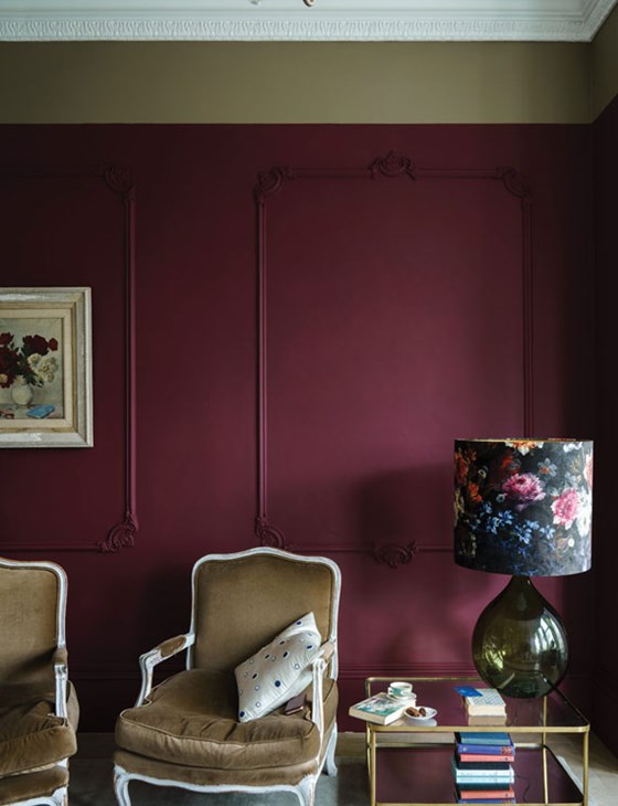
The deep blackened pigmentation of Eating Room Red gives a rich burgundy finish with a wonderfully aged feel. This elegant red, takes its name from the colouring of the red damasks so popular in dining rooms in the mid-19th century and reads almost like a saturated purple if you compare it to the more modern looking Incarnadine.
Farrow & BallPreference Red
The deepest and richest of our reds, this Baroque colour is named in honor of our original trade name, Preference Paints. It can be used with any of the Warm Neutrals but is particularly striking when seen in combination with Paean Black and Sulking Room Pink. The preferred red of modern homes!
Edward Bulmer Sang de Boeuf
Millennia ago bull’s blood would literally have been used to colour distempers and limewashes. The same effect can be achieved with a mixture of red oxide and yellow ochre and my mixture gives a browny red tone that is calm but serious and makes a room a statement.
Edward Bulmer Red Ochre
A true earthy red is often best if just made from a true red earth. In the past it often was, as well as being created from heating yellow ochre to turn it red. Our red ochre is a deep, rich hue that would be recognised by an 18th century painter but is still the best way to get a red that does not dominate a room and is a great backdrop for the display of all sorts of art and objects.
Edward Bulmer Brick
We have been firing clay to make bricks for a very long time and we are used to seeing them mellowed with age. The soft red that the bricks age to is the colour we have used as the prompt for this shade of red. A great colour to eat too!
Edward Bulmer Pompadour
A high-class historical name for a deep and meaningful colour which is basically a purple brown dark iron oxide pigment. We come by our colour with a range of earth and mineral pigments to arrive at a rich reddy tone that turns walls into a serious exercise in colour. This tone is surprisingly accommodating however and will give you a dramatic backdrop for the display of artwork.
Lick Red 06 Matt
Red as full-bodied as a fine wine. Warmed with lilac and mellowed out by grey, Red 06 is a wine red paint with a deep, rich and delicious colour. While the full-bodied hue itself is Cabernet-comforting, the Merlot-smooth matt finish will help even out any imperfections on your walls.
Lick Red 02 Matt
Dusty, poppy red. Rich, warming with earthy tones, Red 02 is guaranteed to make your walls pop. A very grounding hue, this loud and proud poppy red paint is bold yet unafraid. A crisp matt finish will leave you with the perfect paint job.
Lick Red 05 Matt
Bold, lively and energetic red. Seeing red? No surprise. Red 05 is one of our most vibrant red paints, a bold shade with yellow undertones, a warming base and a cheeky hint of chestnut. The matt finish is super smooth, too, so you can iron out any imperfections on your walls.
Lick Red 01 Matt
Warm burnt umber red. Red 01 is burnt in tone, warming in feel, and earthy and grounding in looks. Take it to the dining room to make everyone feel welcome, with a crisp, imperfection-masking matt finish that won’t reflect light from bulbs and centrepiece candles alike.
Lick Red 03 Matt
A mid terracotta paint with warm pink and brown undertones. Red 03 is bold and full of character, paired perfectly with our crisp matt finish. Equal parts grounding and physically stimulating, it makes a room feel lightly energising.
Little Greene Tuscan Red
Chalky and intense deep terracotta red; found naturally as a complex oxide of iron,this pigment has been used over the centuries to colour paints and cosmetics.
Little GreeneAtomic Red
Atomic Red is another of the powerful, primary shades that made its way to the English decorative paint market in the 1970s.
Little GreeneHeat
A strong and contemporary burnt orange, Heat is a highly pigmented paint that can be used effectively as an accent in many schemes. It works especially well in outdoor spaces, to add subtle vibrancy to garden fences or wooden gates. Or use sparingly on architectural features to add relief to dark colour drenching schemes.
Little GreeneBaked Cherry
Sumptuous and wonderfully rich, Baked Cherry is a classic crimson red. Hugely popular for dining rooms and studies.
Little GreeneBronze Red
A name more commonly used to describe the bronze lustre of printing inks, but taken from a late 19th century book of paint colours. For a bold statement, pair this dark red paint with strong, contrasting shades, like Deep Space Blue or Yellow-Pink.
Annie Sloan Primer Red
Primer Red is a dark red Chalk Paint colour found in practically every culture, appearing in everything from Venetian palaces to Vietnamese temples, where red earths were plentiful and relatively easy to come by.
Mylands Dulwich Red
Taking inspiration from Sir John Soane’s ‘Pompeian Red’ from his famous library, this rich warm hue has been updated with a hint of terracotta, to emphasise the light of Dulwich in the Gallery’s exceptional Enfilade.
Mylands Arts Club
An archive deep red used down the years by performing art companies. Pink Primer and Undercoat.
This traditional red paint is rich and sophisticated, with depth that creates a warm and welcoming environment. Its regal and nostalgic colour is perfect to add contrast or intensity to a space.
Mylands Theatre Land
A traditional Mylands’ red highly favoured by the performing arts in and around London. Pink Primer and Undercoat.
This rich, saturated red paint has plenty of undertones including hints of magenta, which gives the colour depth and interest. It creates a classic, confident feel, whilst being perfect for use in modern spaces.
Mylands Red Post Hill
Named after a South London Road, this classic post box red contains a mix of six pigments: bright red, magenta, violet, black, yellow, and white.
Mylands Mortlake Red
A pale red made popular by Thomas Parson’s colour book in the 1920’s and 1930’s. Pink Primer and Undercoat.
A dusty pastel, slightly terracotta red paint, Mortlake Red™ No.290 is great for creating a memorable accent colour with a relaxed aura. It has a slightly muted, yet still vibrant appearance, unique in tone and perfect for a modern look.
Mylands Huguenot
A sumptuous crimson red from our archives and named after the rich silk weavings of the Huguenots. Pink Primer and Undercoat.
This deep red paint has hints of magenta and orange, with darkness and depth which make it thoroughly intriguing. It has a traditional, elegant presence and is a great choice to create a warm, welcoming environment.