Color Theory: Color Power and How to Put it to Work
Color Theory 101: Color has almost unlimited power to alter our perception and mood. Subtle hues gently soothe, while vivid tones energize. Any color takes on different traits depending on the textures, other colors, and proportions it’s combined with. Versatility is color’s essence.
Favorite colors reflect personalities. When planning a room, explore your own preferences first, rather than following someone else’s scheme, unless it deeply resonates with you. Recognize that color trends come and go, but no hue is ever truly new – what feels novel is how it’s used.
When considering a color scheme, first decide what you want it to accomplish. You may face problems like box-shaped rooms lacking character, hodgepodge architecture, oversized furniture, undersized rugs, etc. Purposeful color use can help resolve these quandaries.
Start your planning by identifying any advantageous or challenging room features, any delightful hues or fabrics, any personal treasures you wish to highlight. Then proceed decisively, as color fails if you don’t respect its power. For instance, a vibrant, multi-hued theme like the one pictured would become chaotic without balancing simplicity of white and neutrals. Conversely, an all-neutral scheme easily appears dreary without vitalizing contrasts of light/dark, texture, black/white accents.
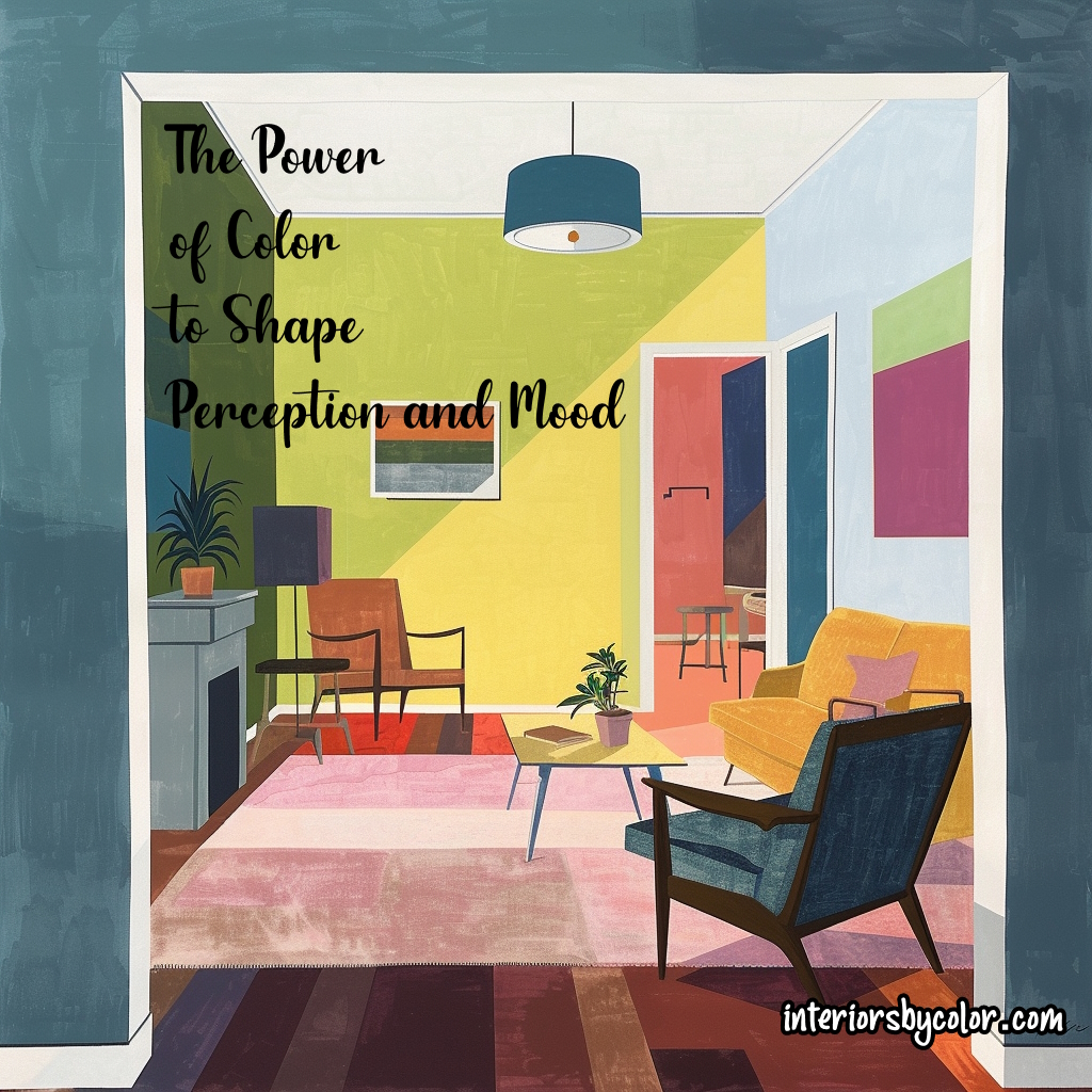
Take advantage of color’s camouflaging genius – it can alter proportions, make bulky chairs seem smaller, narrow rooms wider, high ceilings lower. It can emphasize or minimize anything’s importance. The color flow between adjoining rooms should feel effortless, with dominating hues changing unpredictably. A vibrant room could spill a color accent through the door to connect with more neutral tones next door.
Table of Contents:
- Evolution of Color
- The Personal Nature of Color Choice
- The Big Six Colors
- The Top Ten Most Frequently Asked Questions
Exploring the Evolution of Color: A Historical Perspective
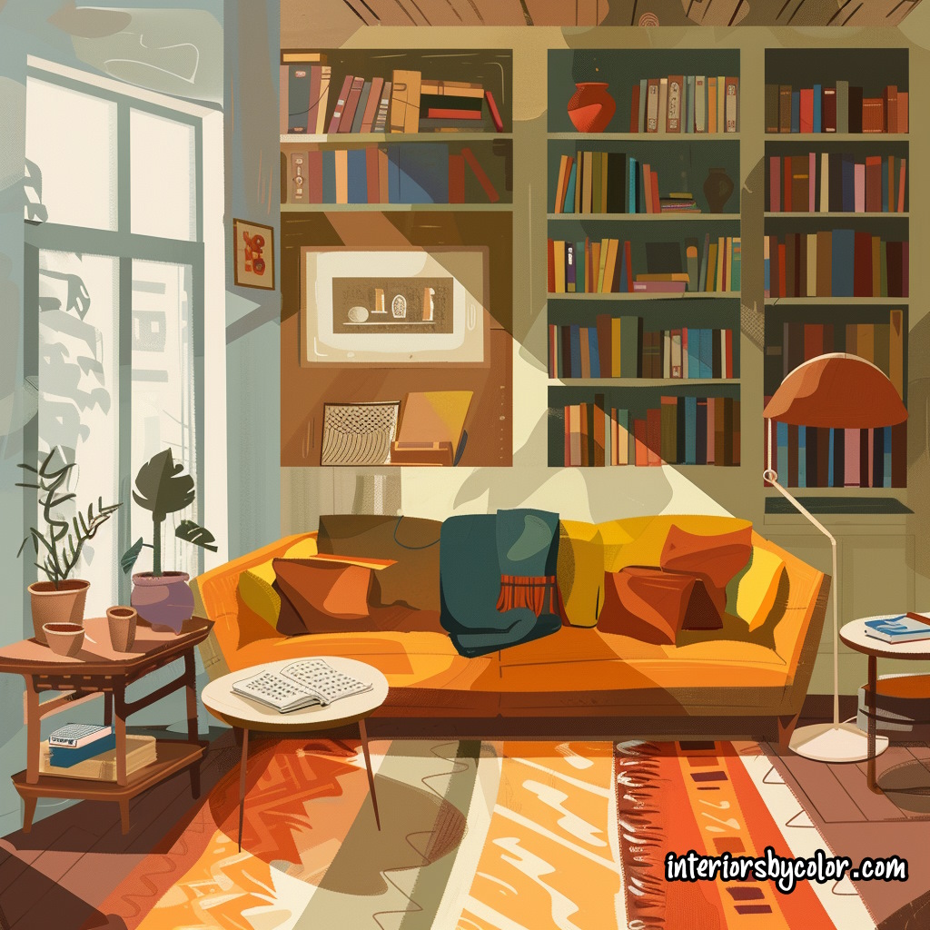
In today’s world, the palette of colors available to us is vast and exhilarating. Yet, this abundance is a relatively recent development, evolving gradually over time. Traditionally, people relied on local coloring materials, leading to variations in pigments based on the earth’s hues in their region. However, as trade routes expanded and technological advancements emerged, new colors entered the scene, enriching civilizations’ palettes.
Historical Milestones in Color Evolution
- Medieval Trade Routes: The opening of Far Eastern trade routes during the Middle Ages introduced Europe to new pigments like indigo, broadening its color spectrum.
- Nineteenth-Century Synthetic Dyes: The development of synthetic aniline dyes in the mid-19th century ushered Western civilization into a vibrant phase characterized by colors like livid green and magenta.
- Twentieth-Century Advancements: After World War I, the quality of white pigment was revolutionized with the introduction of titanium dioxide, offering unprecedented brilliance to 20th-century paintwork.
Cultural Influences and Color Exploration
The exploration of new lands and cultures brought forth fresh perspectives on color. European encounters with civilizations like the Aztec and Inca in the 16th century, as well as the opening of China to trade in the 18th century, exposed Western artisans to new color palettes and techniques. Travelers to ancient sites in Rome, Greece, and Egypt during the 18th century also inspired architects to experiment with bold color combinations.
Contemporary Considerations: Adapting Imported Color Ideas
While travel continues to inspire color schemes, it’s crucial to adapt imported color concepts judiciously. The quality of light, regional climate, and existing decor style all influence the perception of color. For instance, vibrant hues suited to bright climates may appear garish in subdued lighting conditions, emphasizing the importance of context in color selection.
The Personal Nature of Color Choice
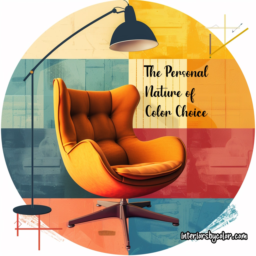
- Subjectivity of Color Perception: Color preferences are deeply personal and subjective. What one individual finds delicate and subtle, another may perceive as insipid or drab.
- Impact of Associations: Color associations can profoundly affect mood and well-being. A color scheme that resonates positively with one person may evoke entirely different emotions in another.
- Final Criterion: Personal Preference: Ultimately, personal preference should guide color selection. No amount of expert advice or color theory can compensate for dissatisfaction with the chosen scheme.
Furthermore, consider your favorite shade of blue. It might be the rich, luminous glaze adorning a cherished ceramic piece, the deep slate-blue of a turbulent seascape, the delicate clarity of a bird’s egg, or the distant, misty texture of faded denim. Certain objects have a way of eliciting sheer delight, igniting within you the desire to capture and utilize that color.
When you recognize this profound connection with a color, embrace it fully. Take the time to reflect on the specific qualities that draw you to it—the texture, depth, and other nuances—and keep these aspects in mind as you explore ways to incorporate it into your surroundings.
Sometimes, what you seek may already exist in a combination of colors—a beloved fabric’s pattern, the hues of a cherished childhood toy or book illustration, an artifact from a museum visit, or the vibrant landscape of a memorable holiday. In such instances, you already possess the foundation of a color scheme, waiting to be realized.
Conversely, negative associations can taint our perception of a color. Reflect on your own biases against certain colors, as they may contradict the theories espoused by experts. Remember that while instinctual reactions hold significance, it’s equally crucial—and thrilling—to remain open-minded about how colors interact in various combinations and contexts.
The evolution of color reflects a dynamic interplay of historical, cultural, and personal influences. From ancient trade routes to modern-day travels, color continues to inspire, delight, and shape our lived experiences in profound ways.
The Big Six Colors of the Colors Wheel and their influence in Interior Design
Green Color Theory
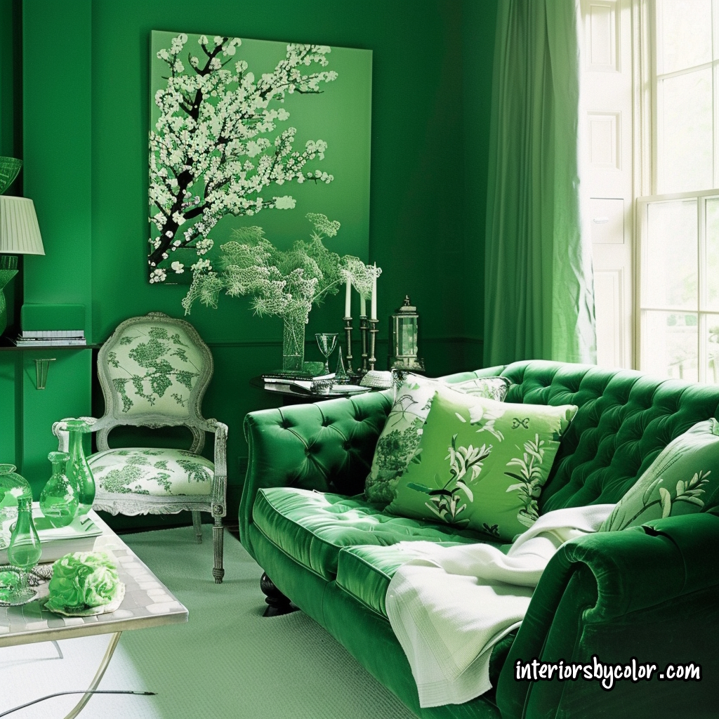
Easy to live with and deeply satisfying, it can pull a disjointed room together more than any other color. Green brings the freshness of summer and growing things into a room, the lushness of leafiness. Anyone who has lived with only sand, sea and sky for even a brief time knows the hunger for green to cool the eye. Many greens work well together; nature has set the example by weaving them into an ever-changing harmony. Green runs like a strong theme through the history of decorating, its range reaching from the darkest to the lightest, the grayest to the most intense, the near-yellow to the near-blue hues.
Related: Green interior design ideas
Yellow Color Theory
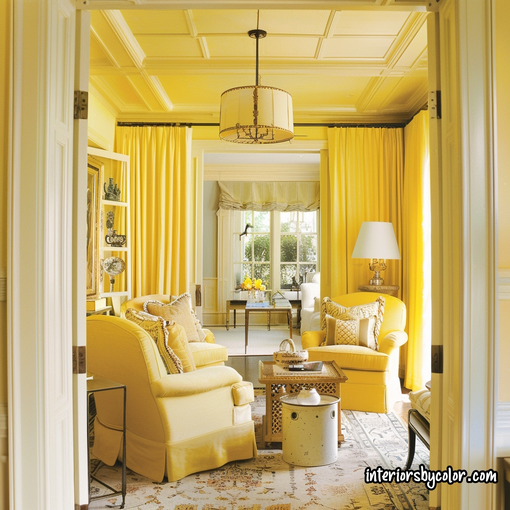
A near-synonym for southern exposure, clear yellow can fill a room with sun and brightness. It is the lightest of all the major colors and the least demanding. You can have it bland as sweet butter, sharp as a lemon, pungent as mustard or curry. It has an affinity for mellow wood finishes, stone, slate, brick. Like blue, yellow is pleasant on a ceiling-and for the same reason: we are accustomed to turning our faces up to the sun.
Yellow in all its variations reacts kindly to white and to the sharp edges and shapings of black. It can be the only color in a room or its only accent, and lends itself to mergers with other hues.
Related: Yellow interior design ideas
Blue Color Theory
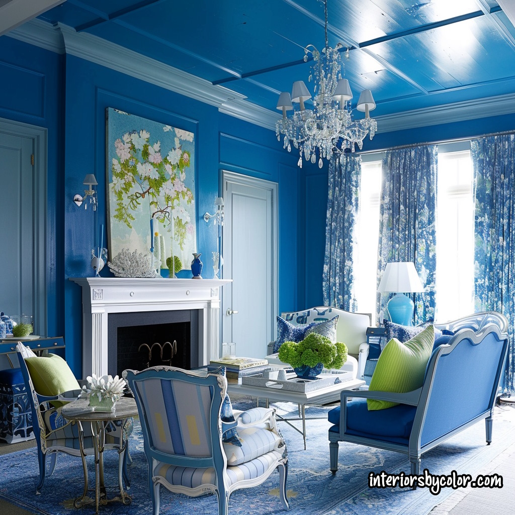
Like green, blue is one of nature’s dependables, arching in varied moods above our heads, bringing infinite changes in sea and shadow, flowers, birds, berries. The lighter values of blue open up space more than any other color, and blue lowers a ceiling most gracefully, because we are accustomed to a canopy of sky. Turquoise, peacock, aqua-marine are all blue-cooled; so are blue-violets and purple-blue. Blue is right out front today, in all its many tones, values and possible teamings. It is particularly effective when combined with white, a clean, china-pattern partnership that never fails.
Related: Blue interior design ideas
Red Color Theory
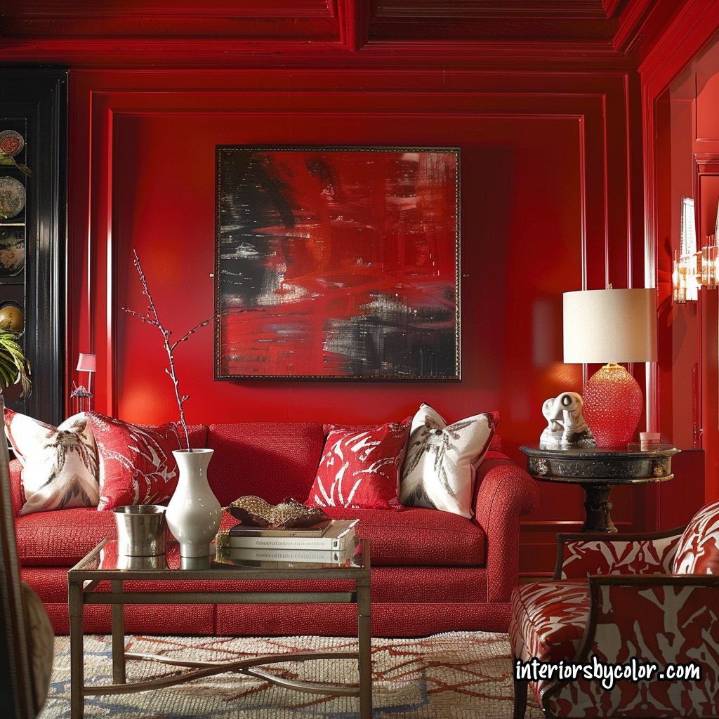
Red is a versatile color that can be earthy yet elegant, brazen yet appealing. It stretches in value from deep garnet to delicate pink. Two benchmark reds are vermilion, which leans slightly orange, and the cooler crimson seen in our flag.
Though bold, red can be tamed if you understand its nature. Use bright red sparingly for maximum impact. Make it one of several colors for a bold scheme. Go all-out red with white for contrast, dark woods and black to ground the intensity.
Related: Red interior design ideas
Orange Color Theory
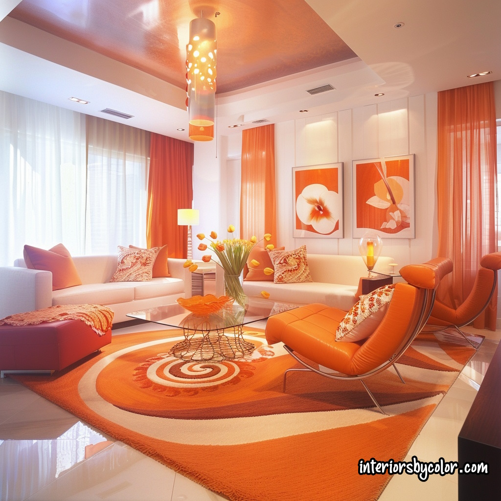
Orange can vibrate with heat or exude cozy warmth depending on saturation. Rare in nature save sunsets, harvest moons, fruits, flowers and flames, orange has innate magnetism. As an accent, its exhilarating punch is invaluable. In bolder doses like a painted floor or rug, it lifts rooms skyward. An all-orange scheme kept in check by generous white and dark neutrals makes a lively statement.
Related: Orange interior design ideas
Purple Color Theory
At full strength purple dominates, but its many dilutions from pale to deep are lyrically lovely. The lavenders, magentas, plums and eggplants form a versatile palette spanning delicate to intense. Red-leaning purples are lively and warm, blue-leaning ones serene and cool. A clean accent with white, green-blues and some pinks, purple can also be an undiluted color in multi-hued schemes. Slightly calmed, it elegantly spills across walls, floors and fabrics.
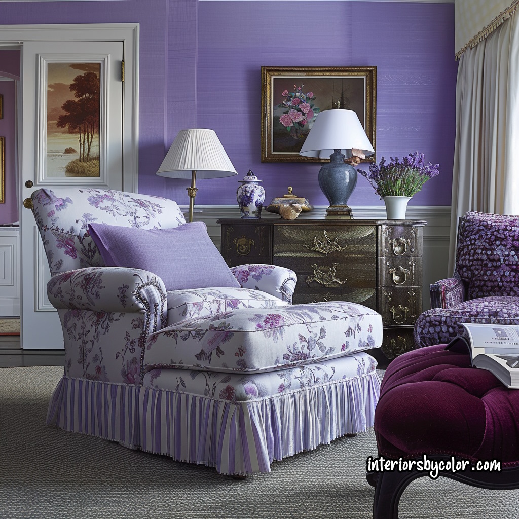
Related: Purple interior design ideas
The Top Ten Most Frequently Asked Questions
Here are our top 10 most frequently asked questions about how to use color in your home.
Design Dilemmas and Solutions
Q: When two rooms adjoin, like a living room and entrance hall, must I use the same color scheme in both or is there flexibility?
A: There are no hard rules. Focus on your personal tastes. Related hues and patterns, not necessarily identical ones, promote a continuous flow between adjoining areas. In the living room, let an accent color dominate, then echo it in the hall. Or use one patterned fabric on chairs in both rooms but vary the floor coverings.
Q: What’s the best way to brighten up a small, dark room with few windows and a dreary view?
A: Use a light wall color like airy blue and extend vibrant carpeting wall-to-wall. White curtains also maximize light.
Q: How can I make my living and dining rooms feel cooler for summer without major expensive changes?
A: Inundate the rooms with white, cool blues and greens in table linens, pillows and containers. Swap out silver candlesticks for white ones. Remove clutter and store away darker decor until winter. Add potted greens, fruit centerpieces or collections like shells to enrich the light summery look.
Q: When should I paint doors, windows and trim a contrasting color to the walls?
A: When they have pleasing proportions and details, a contrasting color or white nicely highlights them. Otherwise, blend them into the background by matching the wall color.
Q: Can color help correct a room’s poor proportions, like one that looks too tall?
A: Yes, paint the upper walls and ceiling a darker shade to visually lower the ceiling. Add color-matched molding about a foot from the top to strengthen the effect.
Q: How can I update my color scheme without changing too much in the room?
A: If you currently have multiple colors, pare back to just one, keeping the hue you like best. Introduce that color in a rug, pillows, slipcovers. If the room is monotonous, punch it up with vibrant accents in one or more colors via furniture, lamps, art.
Q: What paint colors work well with pine paneling?
A: Buttery yellows or vivid hues in rugs/fabrics complement light pine. Darker pine suits dramatic color contrasts; here an Oriental rug shines.
Q: In a dining room full of wood furniture, how can I alleviate the monotonous wood-on-wood effect?
A: Layer in fabrics for texture and color – a room-size vibrant rug, a festive Mexican rebozo on the table, a round cloth draping to the floor.
Q: How can I enliven a long, dark hallway without impeding the limited floor space?
A: Paint the high ceiling an accent color. Paint each door a different vivid hue. Evoke outdoors with white trelliswork on lettuce green walls, cove lighting or frosted ceiling globes.
Q: What paint colors work well with a typical red/blue Oriental rug?
A: Use the rug’s dominant hues as your theme. Add a missing rug color like green for accents. Try light red walls, blue sofa, bright green lacquered tables.